Wade, you have far to many Pzr IVs to worry about before you even think of a Churchill !! 
1 Like
Concur. Researchers at museums such as the Smithsonian have stated that very thing. I recall one august researcher (Dana Bell?) who noted that some B/W film emulsions would develop a light/bright yellow to appear darker than insignia blue.
1 Like
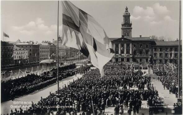
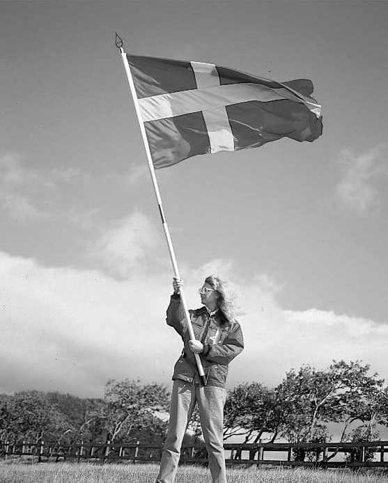
The Swedish national flag at a ceremony in Gothenburg 1923
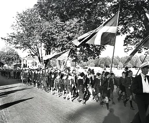
Boyscouts marching with the national flag on the 6th of June 1941
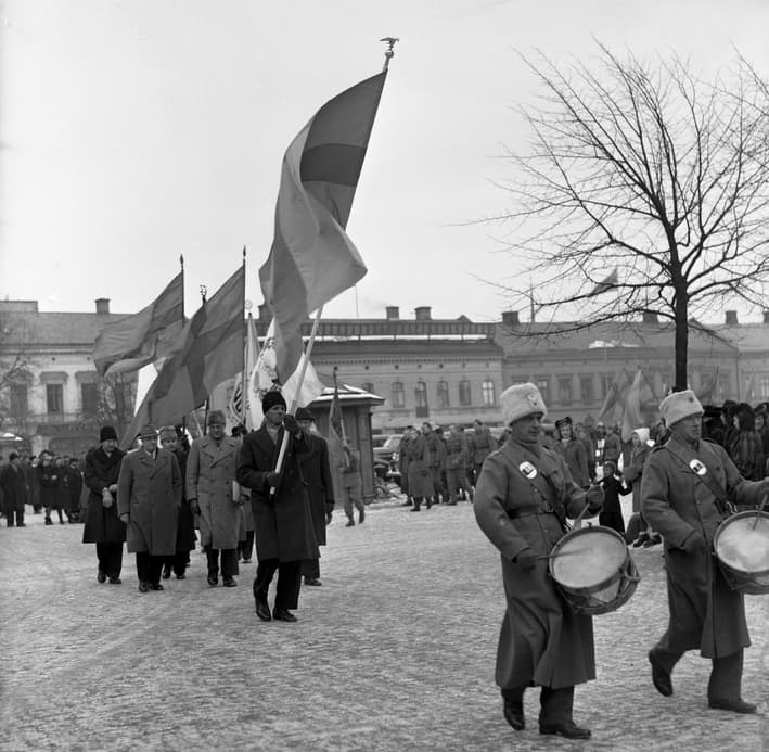
Sometime 1940 - 1942
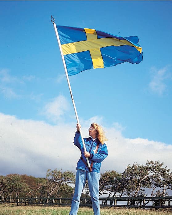
Wawed about on a recent colour photo
4 Likes
Yes, please.
Brian, I hope you son has recovered.
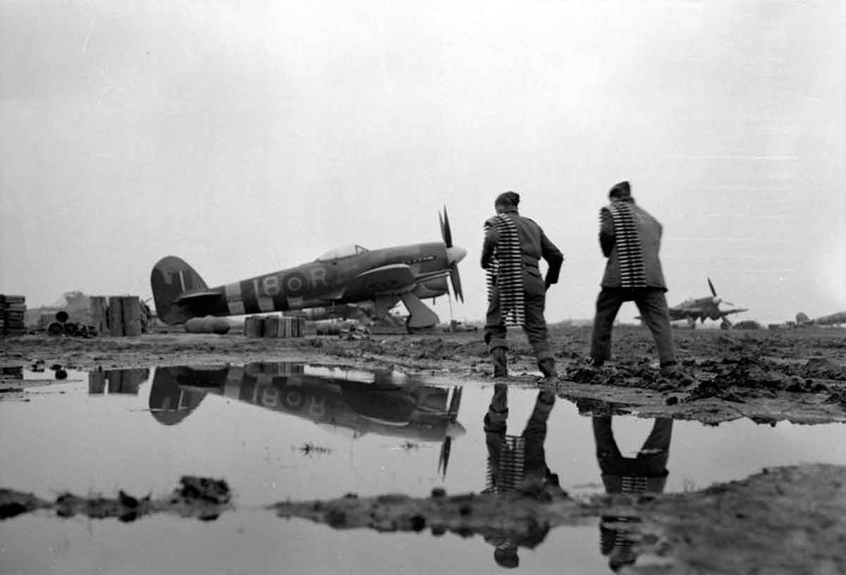
Thanks for those photos. Wonderful source material. And FWIW, tanks aren’t necessarily the only things that get caked in mud, wingy-thingies do, too:
2 Likes
Robin, superb examples. Only the photo of the Boyscouts marching shows the correct light/dark of colors. FWIW, for the benefit of others, here is your color photo in B/W.
1 Like
The interesting part is that the photographers for the 40-ies photos seem to have used
different chemistry, the boyscouts photo is the right way around while the winter march has the yellow as dark a blue as very light.
The grown ups marchin in the winter were part of a campaign to raise money for war bonds to finance rearmament.
It’s the film types used. I haven’t had a photography class in over 40 years now, but I remember certain film types, pan chromatic, ortho chromatic, etc. being described by the teachers are red or blue sensitive. With one type of film, I don’t recall which, blues would take on very dark tones, and reds light tones. For the other type, the opposite was true. The effects can be modified by using colored lens filters on the camera.
1 Like
Keep graphite in mind. Powdered or on a 6B pencil it provides a very convincing metal finish.
1 Like
@Johnnych01, with ~35+ Pz IV’s, I have to build a few Allied tanks to keep them in line, otherwise they’ll organizing as a Panzer regiment 
Those are fantastic examples of color vs black & white.
pseudo-science is too kind and concrete, I should have said believing in B&W to color interpretation is nearly like believing in superstition.
2 Likes
Agreed! Big time!
Here’s a good quick rundown on basic black and white film types, and some of their properties. Without a solid known variable, and knowledge of which type of film is being used, it can be like setting a coding wheel on the wrong setting, and then trying to decode a message.
A lot of what gets labeled as WW2 period color photos have been colorized after the fact. Some actual color photos may have been restored due to fading.
Very true. The only ones you can really trust come from “official” archives: the various US service ones or Life, as well as the IWM from the UK. All the computer colorized ones are a pet peeve of mine. The flesh tones and sky tones are usually a giveaway to the computer altered ones somebody is trying to pass off.
Much of the real German color photography, regularly seen in Signal magazine, is often very grainy due to the film type used.
2 Likes
Carlos, outstanding photo. I recall a Spitfire in N.Africa or Sicily that was mud spattered but I can’t find that images on-line. Those Tiffies look like they got washed after landing.
I recall the colour/tone issue of early B/W photographs of WWI aircraft where some yellow would actually pass for dark even black because of the type of film used.
Keith
I used the Swedish national flag, yellow cross on medium blu background as examples of this.
Two photos from the early 1940’ies, one shows a medium dark cross on a light background, the other shows a very light cross on a dark background
Well, thanks for your sentiments. He’s recovered as much as one can minus a leg and a career, (and that’s not meant to be a smartarse comment I assure you) but true to form he’s getting on with life(!)
I wouldn’t wish to clog up the thread with endless pics of a Challenger 2; perhaps if you sent me a PM with a personal email I can send you the remaining pics (probably no more than a dozen or so?
An unresolvable debate since it pits two style biases and preferences against each other. Neither is absolutely right nor wrong. Which is the “right” art and which is the “wrong” art - impressionism or realism?
In the end, neither is “reality” and both are intended to communicate between the artist and the viewer. Is one artist’s message the only “true” one?
Scale models can only ever be approximate reproductions of their prototype subjects, so no matter how one is finished or how much detail it has, it will only ever be an approximation. Only the viewer’s comprehension of the artist’s message can be used to judge whether or not the artist was successful in conveying that message.
Beauty is indeed in the eye of the beholder.
2 Likes
I both agree and disagree. Hows that for a solid stand. I like the realistic approach. I want my finished kits to be accurate in both detail and finish. There are techniques out there I don’t use because they move beyond an accurate finish. However I do like a well done artistic impression type finish. It would however, not be on my shelf unless it was part of an artistic campaign. I think of my build approach to be photographic in style and the artistic approach would be more like a painting, to be admired for it’s impression. Maybe I am limiting myself and who knows, I could flip flop, never say never. I do think the artistic approach reduces some stress on accuracy to free up the enjoyment factor.
3 Likes