I would opt for the historical correct grey ![]()
![]()
I would use the color you find most appealing and absolute accuracy be damned - it’s your model so build it your way . The exception would be if it was a commission build for someone else - then you might be obligated to do as the client expects/prefers.
2 Likes
Personally I’d go with the grey, however it would also depend on the final finish you’re doing, museum clean then red hull, weathered in use then definitely grey.
In the end it’s your model.
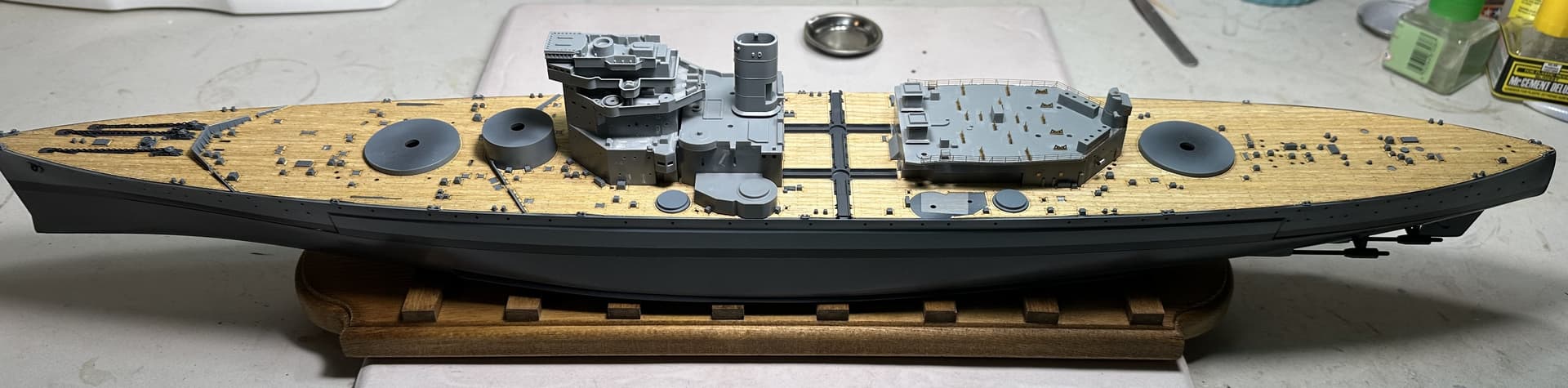
Started work on the aft superstructure. One of the things I enjoy about Eduard photo etch is that it isnt over the top. Adds just enough to look good but not enough to drive you crazy.
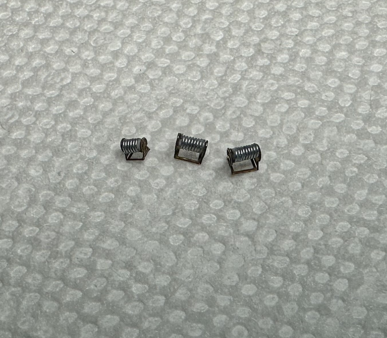
I stole one of @TimReynaga techniques for doing cable reels. Wire pre-wrapped around rod and then cut to length.
I used 1mm rod for this:
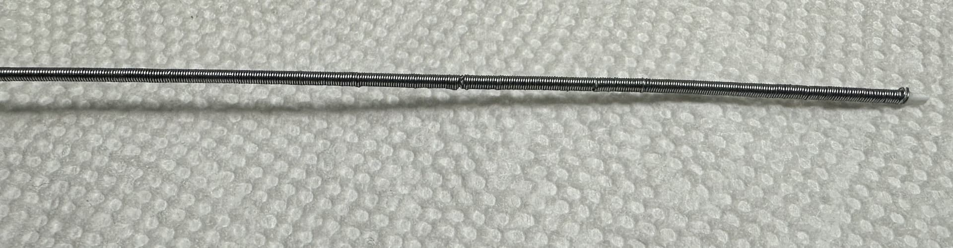
And I made up a lot. The ship has quite a few reels but also any left over will be good for other projects.
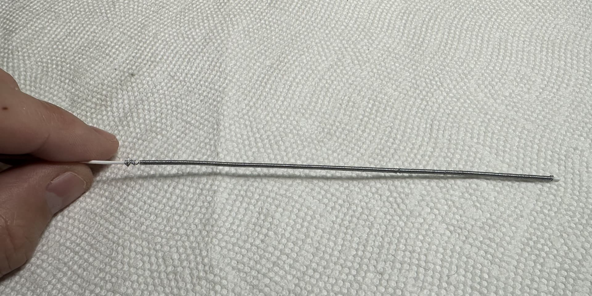
Once added I think they look great!
For the aft superstructure I didnt have to do much. Just remove and replace the boat cradles and some vents/doors/cable reels etc. Also went ahead and added the railings and one of the main battery direction finders.

6 Likes
Looks cool mate. I like the cable reel method, I do the same thing for hatch springs and spring coils for underneath the German motorbike seats.
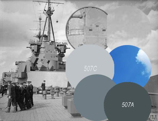
I am trying to decide what colour to paint my PoW. My research has been frustrating. It seems like she may have been painted 507A but when I compare that to photos it seems way to dark.
I know that trying to compare old B&W photos is tricky but these images do not seem to reflect a ship painted in a dark grey colour which makes me think more of a 507C

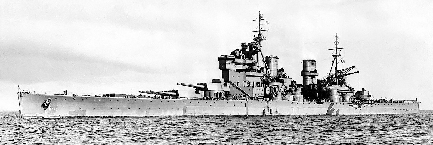

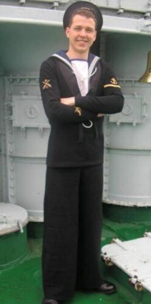
The rating uniform and the 507A are similarly dark but when comparing the rating against the turret in the first picture, the uniform is waaay darker.
Makes me think the 507C is the way to go but maybe some other eyes will see something different?
4 Likes
Erring towards C … the images do look very light and the bottom image with the contrast between uniform and metal does stand out a lot.
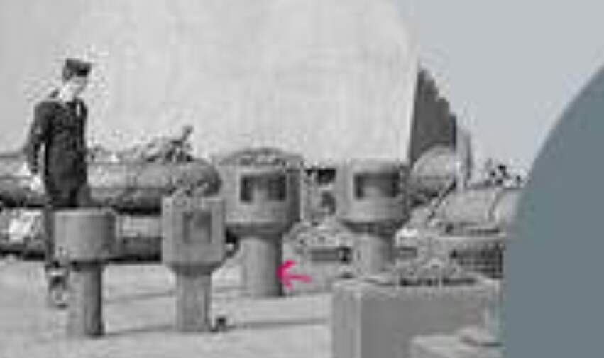
I am no pro at this but when I need to figure out how dark a color is I start with a known color. For your image I picked the sky. I believe the sun would be behind you in your image which would make the gray a shade lighter
Hope this helps
3 Likes
From the shadow, the sun is at the cameraman’s 8 o’clock and low, therefore this area would be least lightened or shadowed?
Cheers,
M
2 Likes
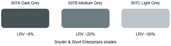
507C all the way to Tipperary… A is too dark and B is plausible but would look dull with the grey lower hull
Hi Rory,
According to Alan Raven and John Roberts’ exhaustive British Battleships of World War Two, The Development and Technical History of the Royal Navy’s Battleships and Battlecruisers from 1911 to 1946, Prince of Wales only wore two schemes: the famous Admiralty First Disruptive Type from August 1941 until sunk, and “overall medium grey” (507B) before that.
1 Like
I also opt for this one ![]()
Think we have a winner, especially since it looks like a fairly popular substitute for this is XF-66 or XF-25 which I have in stock so no need for mixing ![]()
3 Likes
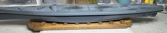
I decided to go the historical route and paint the lower hull in a dark grey. I was worried it would look pretty bland and monotone but I have been pleasently suprised.
XF-66 for the upper portion and XF-24 (Dark Grey) for the lower. In all honesty I think the XF-24 is a bit too light and I even sprayed over a black base. I may go back and redo it but will have to think about that. Hull has a gloss coat on it.

I layed down a bunch of masking tape on the deck to protect the bare plastic to give the wooden deck something to adhere to when it goes on.
6 Likes
Following (at last) with interest Rory!
Couple of points to mention. Since our first forays into the hobby, not only have we learnt so much since those early builds, but the aftermarket available to us has increased exponentially, making our builds so much more interesting/accurate. Also, yep, definitely go with the grey anti fouling paint. I wish I’d known that for my build of KGV, but I’m not going back to change it now, Lols!
Lot’s of references available on the net for these ships, but they did change over time, but with POW’s limited in-service life, you’ll be ok.
Lastly, I’d not normally get on my soap box here, but those so-call salvagers have committed disgusting acts by desecrating those war graves!
4 Likes
The Prince is looking good!
![]() … and I’m even starting to get used to the unusual look of that grey antifouling!
… and I’m even starting to get used to the unusual look of that grey antifouling!
4 Likes
I know, its weird and looks unpainted but I am also starting to like it. I felt the same about my USS Independance LCS-2 which has an all black lower hull.
I think the different colour hulls will add a nice splash of “Different” to my display shelf, especially when I get to my RM Zara which has that lovely green lower hull.
3 Likes
Although I didn’t think I’d like the grey/grey scheme … It doesn’t look to bad … I suppose everyone is just used to seeing the red/ grey … Looking good ![]()
1 Like
Today I worked on getting the deck installed. Usually I battle with these decks as they are so sticky. They end up sticking to themselves, me, parts of the kit I dont want them to but this deck didnt do that. And it fit perfectly which I was not expecting for a cheapo deck.

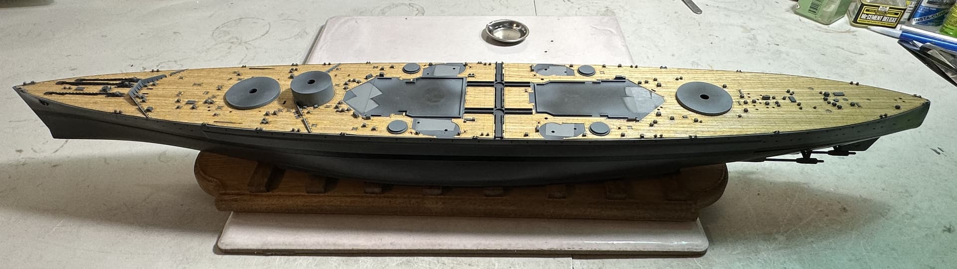
And with a bit of superstructure mocked up, she is starting to look awesome!
15 Likes
Looking great Rory…the decks make a big impact visually for me…looks so much more authentic…
It’s always struck me funny, that even with a ship that has a male name, they are still referenced as She …
1 Like