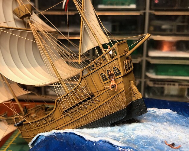
I think that your crew figures are looking good. I like the fact that you have one crew figures in the water and another one diving off of the doomed ship.
I think that your crew figures are looking good. I like the fact that you have one crew figures in the water and another one diving off of the doomed ship.
Thanks Tom!
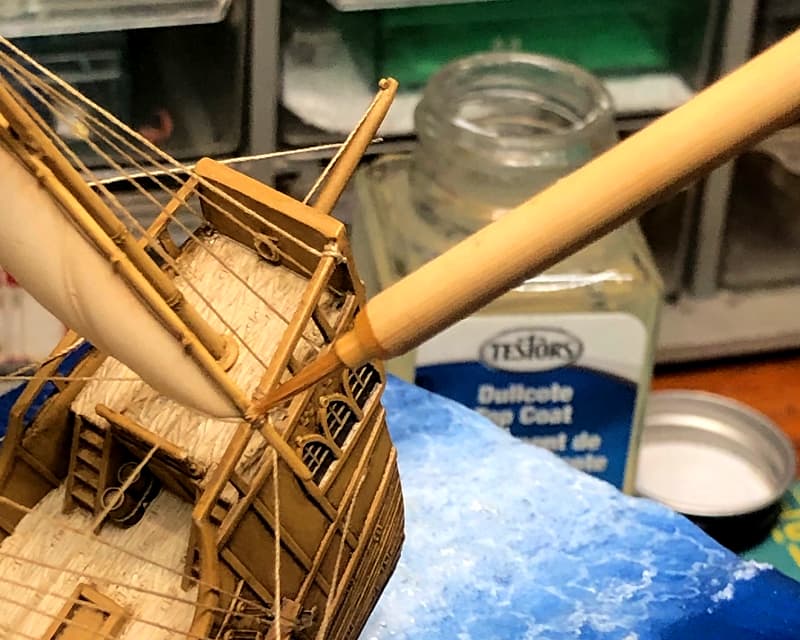
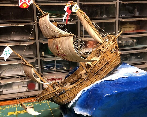
Before placing the figures aboard the ship, I went back and touched up the model with Testors Dullcote to kill the unrealistic shiny spots where some of the knots had been reinforced with super glue. The rigging also got some minor repairs with various lines that had become slack or disconnected being once again squared away.
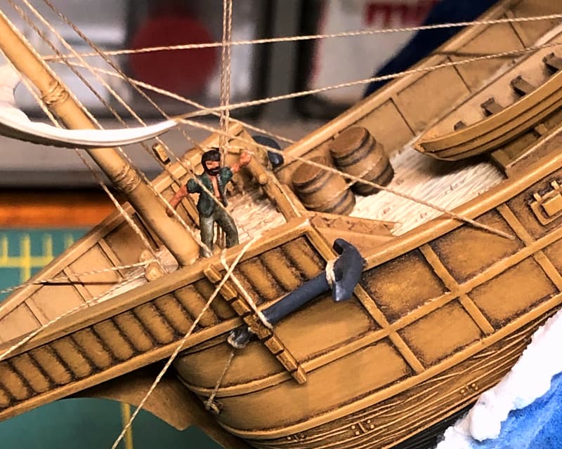
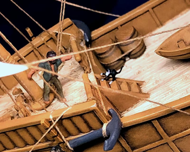
The first sailor to come aboard is Disco Diego. He still looks pretty stylish, but I’m hoping that in this context he looks like he’s leaning aft against the angle of the ship and reaching his hand out for balance – rather than doing the Hustle!
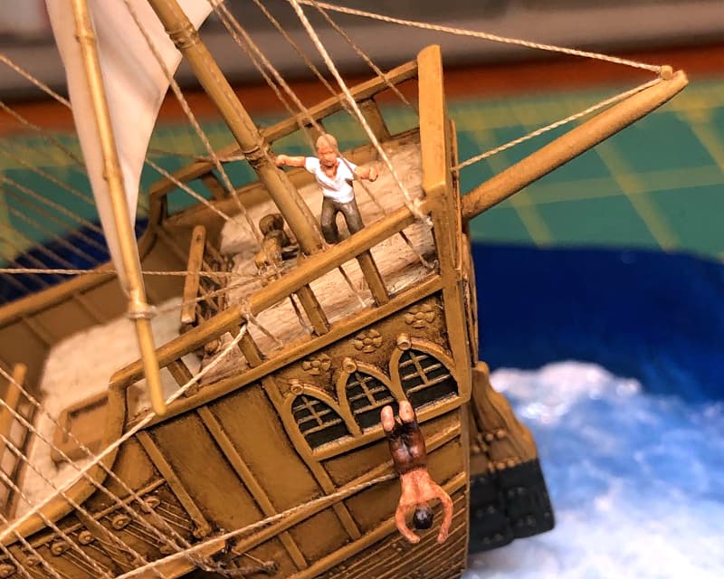
White shirt guy and the young basketball dunker are better. The former looks to be crouching and balancing himself against the mast, and seaman Swandive definitely looks the part. Suspended a short distance from the hull on a small steel wire, he is unaltered except for the removal of the basketball originally molded in his hands and a new paint job. I appreciate that the “Shootin’ Hoops” teenage characters’ attire choices are all different – these worked out well in that they also conveniently reflect the casual, diverse appearance of European mariners of the Discovery period.
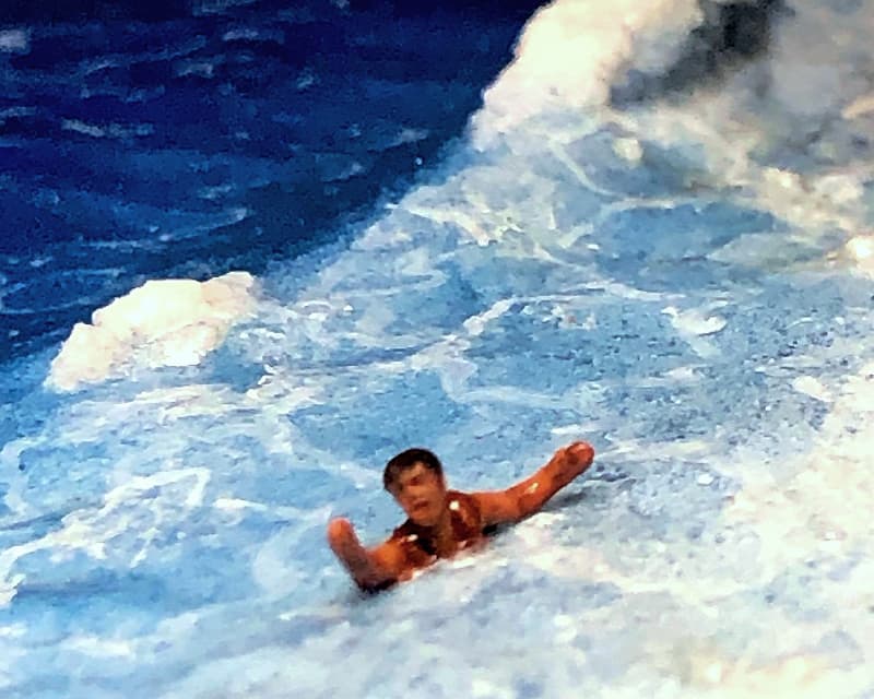
The swimming guy was next. I’m not sure where he thinks he’s going, but doing his best to get the hell out of there!
The crew were fun to do, even though when seen from normal viewing distances they almost disappear into the scene. Still, they provide little nuggets of human drama for the viewer who inspects more closely.
Brilliant! Has to be one of my Builds of 2025 and even better that it’s from the secret Gang of Tims. Suggestion – I can’t be too sure from the latest photos but maybe the lower hull could do with a sheen (or more sheen) being wet’n’all. ![]()

Brilliant! Has to be one of my Builds of 2025 and even better that it’s from the secret Gang of Tims. Suggestion – I can’t be too sure from the latest photos but maybe the lower hull could do with a sheen (or more sheen) being wet’n’all.
Thanks Tim, much appreciated! I agree, the exposed lower hull should be glossy-wet. I’d given it a coat of the Vallejo Water Texture acrylic which was quite shiny at first but, like the sea, it mysteriously dulled down after a few days. I’ll have to go back and hit it with the Behr Polyurethane Gloss.
You might want to add a layer of green algae and white barnacles too, as these grew on ships that sailed on sea for prolonged times. These gave rise to problems with speed, requiring them to be removed (burned off) on a regular basis.
I wonder if, at that scale, you could use texture medium to use its granular effect to be a quick way to simulate barnacles. Ships I’ve seen in dire need of careening have had strands of weed growing out from the hull, but for a ship in motion they’d be flat against the hull, so it’s just painting strands of green in different shades back along the hull. The coatings applied to the hull were intended to fight barnacle and algae growth, along with countering teredo worms (sometimes using toxic materials) but I don’t think anyone through history has made a truly effective anti-fouling coating.
Tim, this project is AWESOME! From your ship construction and painting to the creative way of displaying it, this is why I love this hobby so much. This build needs to be seen & appreciated by others.
This project is so full of win.
You got a valid point about the barnacles… ![]()

You might want to add a layer of green algae and white barnacles too […]
[…] barnacles… so it’s just painting strands of green in different shades […]
Erwin and Sean, thanks. Now that you mention it, the hull does look pretty clean… I’ll have to go back and give it a bit of biofouling!
Tim, this project is AWESOME! From your ship construction and painting to the creative way of displaying it, this is why I love this hobby so much. This build needs to be seen & appreciated by others.

This project is so full of win.
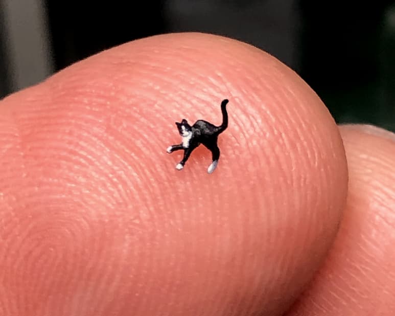
Tom and Doug, thanks! I’m having a lot of fun with this one, and my favorite part so far has been adding the crew figures. The final figure to be added is my favorite, the ship’s cat:
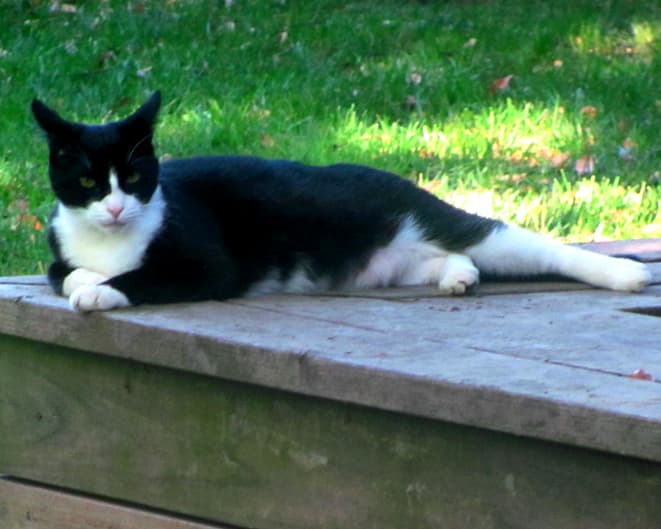
Based on my own cat Minnie, the Chief Mouser’s Mate is also a classic tuxedo cat.
I felt bad consigning her to the depths along with the rest of the ship’s company, but such were the dangers of 15th century nautical life. The arched back shows that she’s definitely not happy about it! ![]()
She’s certainly going to be a soggy moggie…
![]()
Cheers,
M
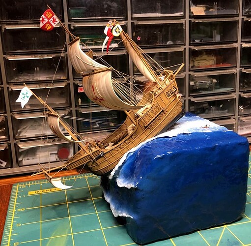
I liked the look of the diorama, but the large, featureless blue sides seemed to cry out for some kind of content to fill the space.
My first thought was to attach the wonderful Albrecht Dürer “Over the Edge” engraving which I had printed out on some parchment-style resume paper. Unfortunately, the picture was so interesting it threatened to compete with the actual model! Also, the rectangular shape of the print tended to highlight the unappealing square outline of the original foam block.
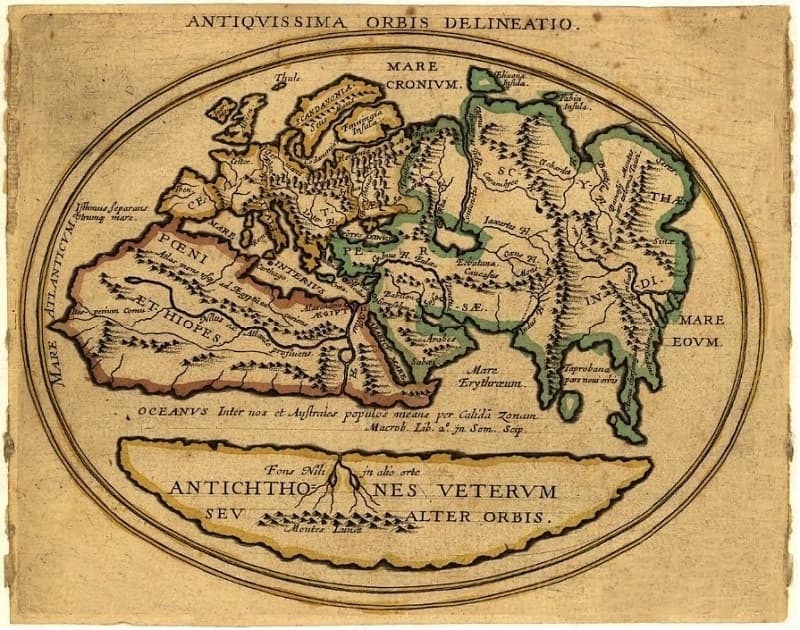
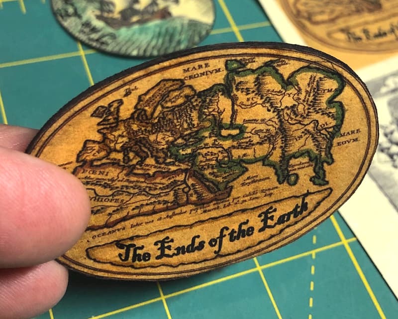
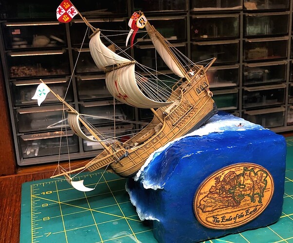
My next try was to add a map of the world as Columbus would have imagined it prior to encountering the Americas. I found one held by Stanford University called Antiquissima Orbis Delineatio (“very ancient map of the world”) which was appropriate and interesting without being too distracting.
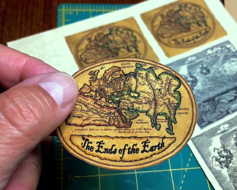
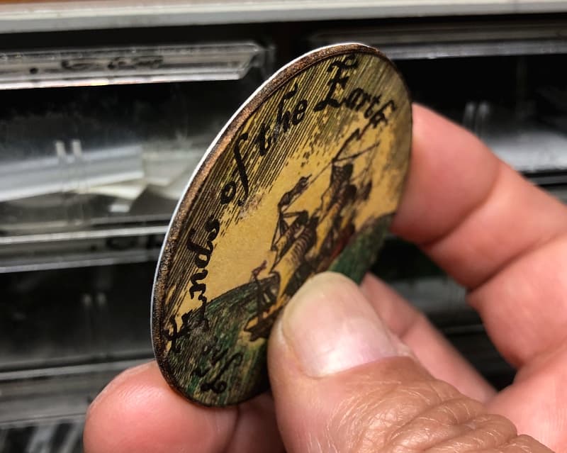
A small change I made before printing it out on resume paper was to blank out some of the text and add the words, The Ends of the Earth to make it a kind of nameplate for the diorama. I also darkened it just a bit to emphasize the antique look and to make it stand out less starkly against the deep blue of the ocean.
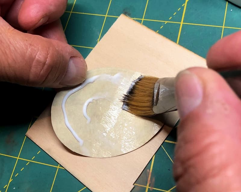
The image was glued to a thin piece of bass wood which was then trimmed to match the oval shape. The bare wood edges were darkened with Testors Flat Rubber (dark brown) enamel.
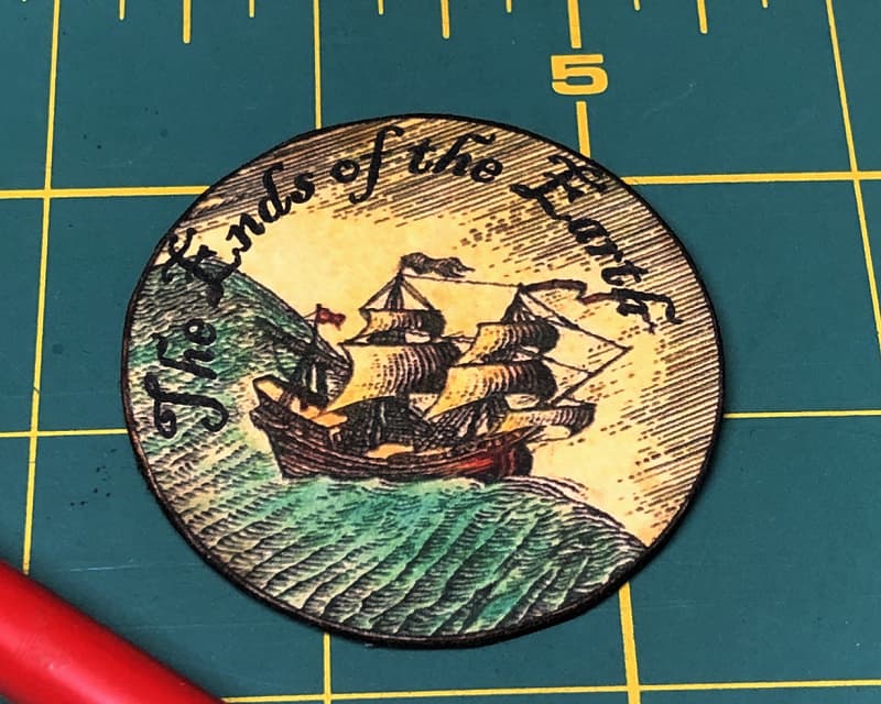
I had made one of these for each side, but to keep things interesting I also made an alternate one based on a detail from the Albrecht Dürer engraving.
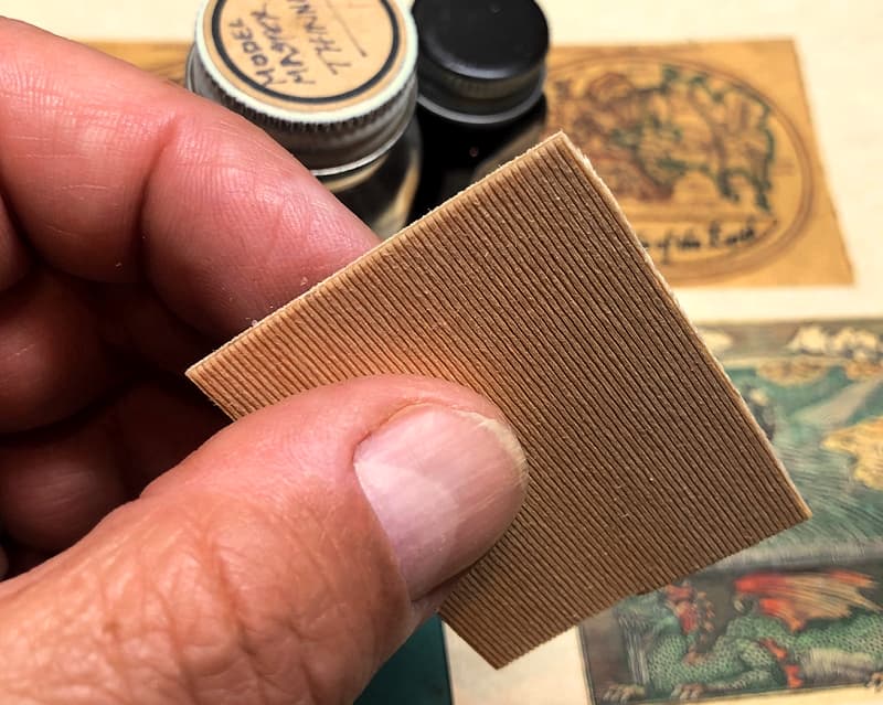
The labels were looking good, but I had a concern that the thin wood backing would warp from the wet Liquitex gel that was to attach them to the base.
To prevent this I super glued .010 inch plastic sheets to the backs to isolate the wood from the gel.
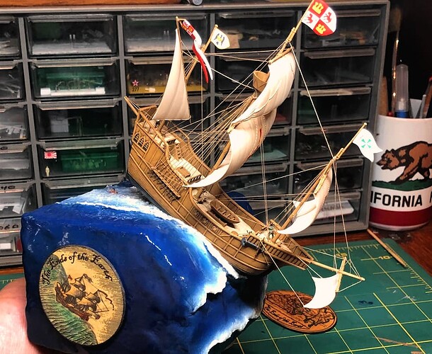
Fixed in place, the labels provide a bit of context, and their rounded shapes fill in those blank spaces nicely.
Great choices for the side-panels, perfect. And if the Flat Earth Society asks if they can use this as their logo, don’t settle for anything less than a million.
Nicely done, Tim… The creativity is just at the right level ![]()
I was first hoping you would incorporate a (head of the) dragon into the base, but this is a nice addition too ![]()

Great choices for the side-panels, perfect. And if the Flat Earth Society asks if they can use this as their logo, don’t settle for anything less than a million.
![]()

Nicely done, Tim… The creativity is just at the right level
Thanks guys, much appreciated! Sometimes I fear I’ve gone a little over the top… ![]()

I was first hoping you would incorporate a (head of the) dragon into the base, but this is a nice addition too
I had thought about including a dragon as well, but I just couldn’t find a way to gracefully incorporate one. I did, however, manage to include one other creature:
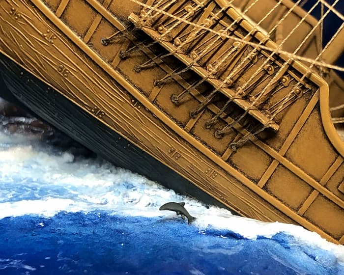
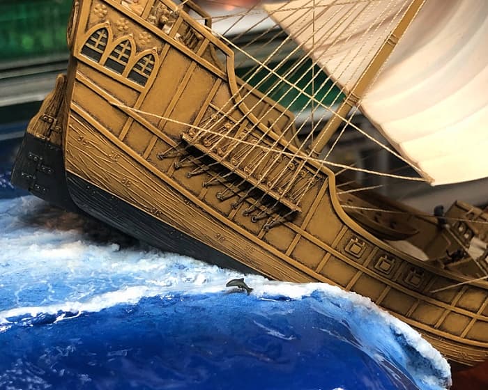
An easy to miss detail is a tiny fish jumping out of the water alongside the doomed ship.
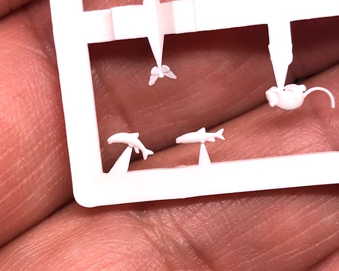
This came from a Busch set of HO scale animals.
He too seems to have ventured perilously close to the Edge…!
A lovely addition ![]()
Those side panels and those details like crew and jumping dolphin, just fantastic additions to an exceptional piece ![]()
![]()
