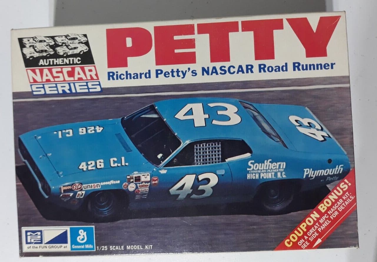
For old time sake I decided I wanted to build that kit again. So I started looking for a kit of it. I finally found one in a model shop, behind the counter. Great, I open the kit and all of the parts are there …along with a $149 price tag. ? ? ? Why would a simple MPC kit cost that? So I said Oh well until I found out JR Salvos made the upgrade of the same kit. Great!
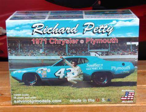
Well That kit runs $250. Have I stumbled onto the holy grail of model cars? The kit was about $40 originally. Richard Pettys 72 Road Runner is $38.
New plan. This is like going to Home Depot for a part and not finding it. Instead you have to buy 4 items to coble together a fix.
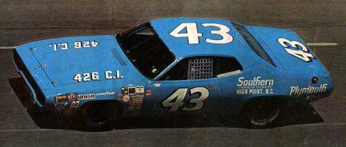
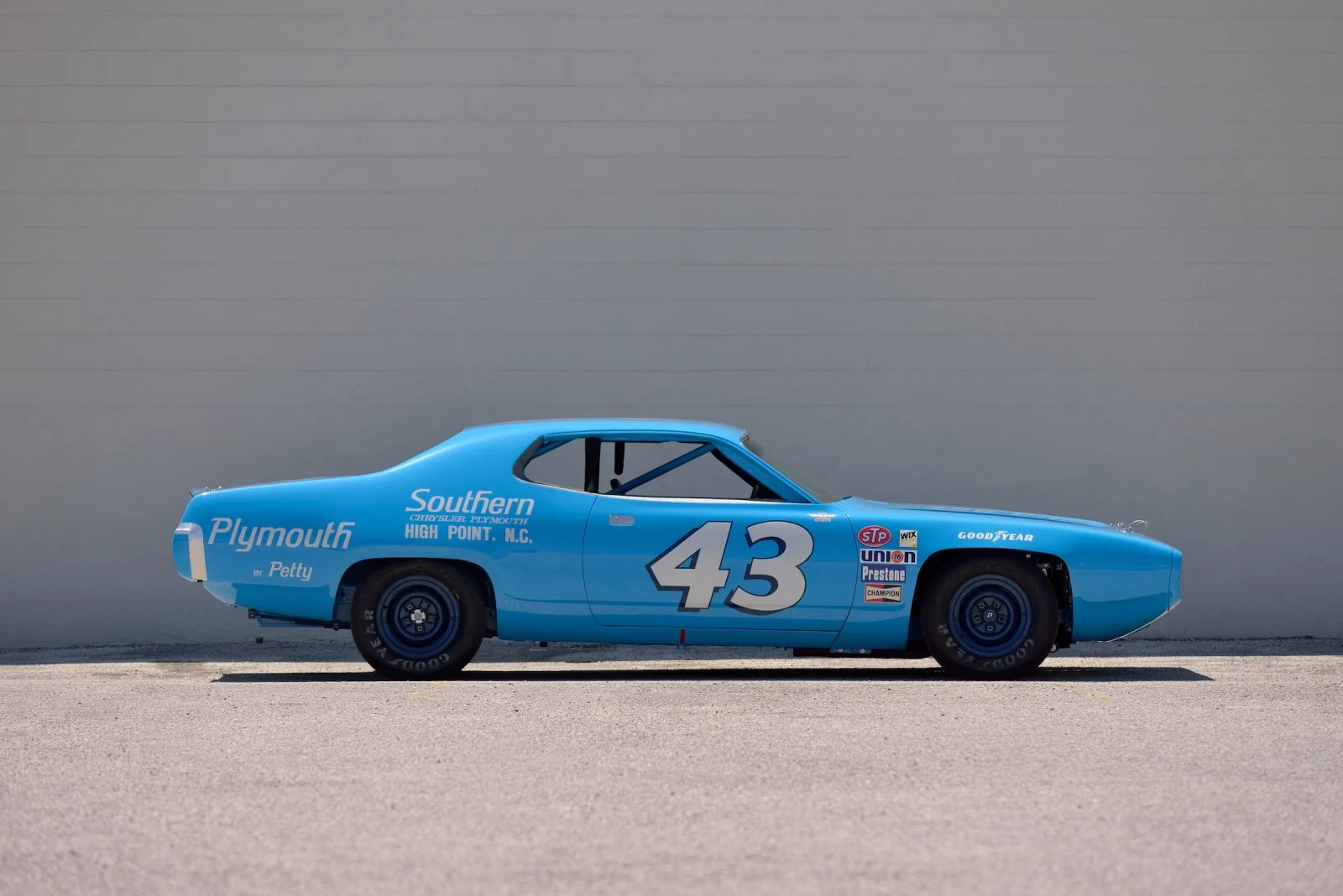
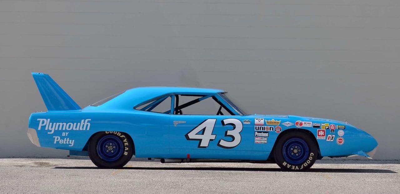
I saw Richard Petty’s 72 Roadrunner and to my eye, the bodies were the same as the 71.
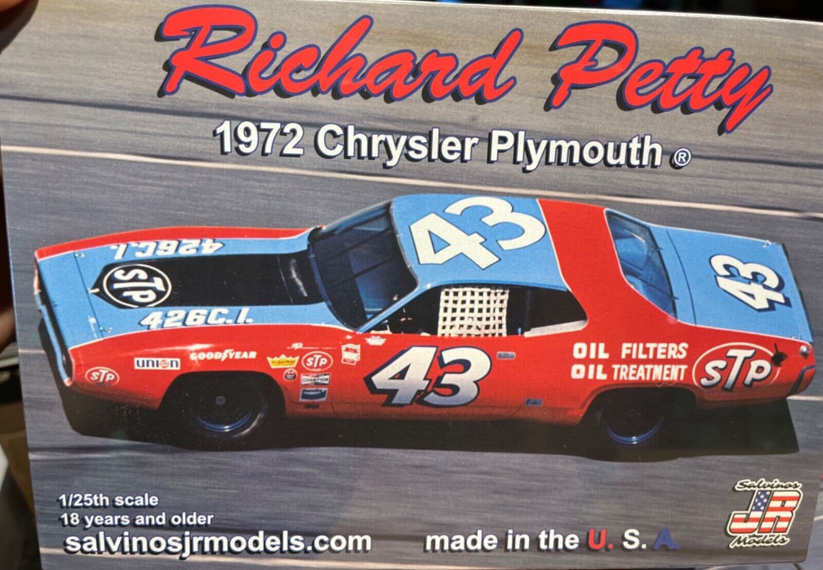
In fact the 72 kit (for $38) is molded in the same color blue.
I bought the '72 figuring I could do a work around. I just needed a decal sheet.
I called the Jr Salvinos company and asked If I could buy a decal sheet. Sorry they were out. Well, when did he think they would make another run of the kits. He said they had no plans to. They make a run of about 2500 and that is it. If they made more, it would devalue the kits the collectors have, I was thinking no brainer just change the box art and run another batch…nope. ( If you sell your kits for about $25 to distributors, why would you care what the collector’s market was doing?)
I found a company that made a decal sheet of that car and spent about $20 on ebay.
They arrived today and what a waste of $20. The registry of the decals was terrible and the white was not opaque.
What do you guys do in a situation like this? No one on this site gives up and we always come up with a solution.
So does anyone have a suggestion or solution, other than a $250 decal sheet?
I guess this sheet should fit the bill, judging by the picture included in the decal sheet web page, which is the same as the MPC box art in your first post (or maybe I’m missing something here…) :
The textual description:
" #43 STP Plymouth driven by Richard Petty in the 1970-71 season. Sheet includes graphics for several versions of the Petty cars including the 1970 Superbird, 1971 Daytona Winner Road Runner and the Riverside STP Debut car. Also has graphics for the Pete Hamilton 1970 Daytona Winner."
Make a photocopy of the decal sheet. Place the large white decal copies over a piece of white decal sheet. Cut out with X-Acto knife. Apply your cutout first, then the kit decal over that. The white portion is now opaque.
Alternately, cut out the white portion, but use the OUTSIDE of the it as template. Place on model, spary white paint. After curde, apply white decals. These work. I used to have to do it on motorcycle kits.
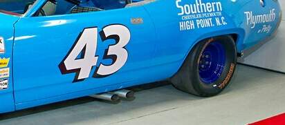
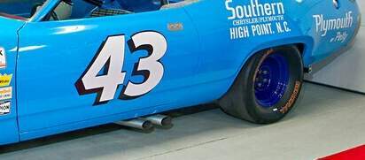
Of course the third option would be to superimpose one decalset over the other. Those “Southern” and “Plymouth” decals will be impossible to do my way. I was speaking more to the larger ones,
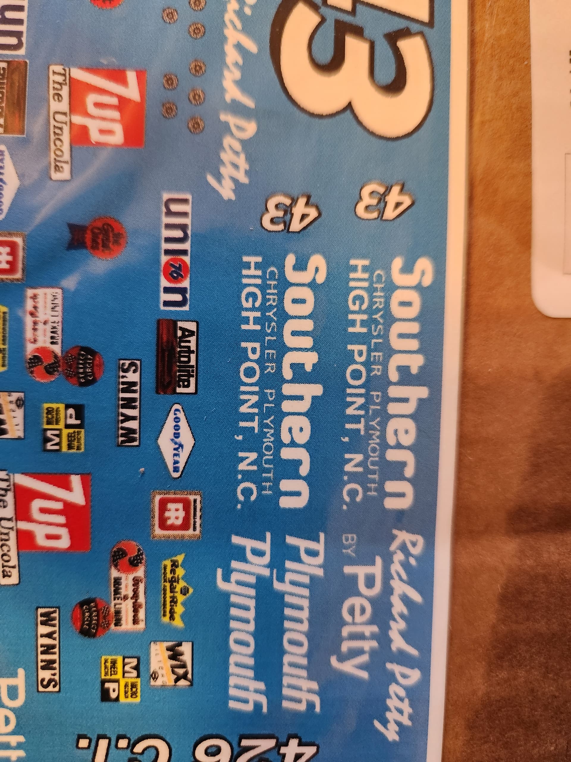
I like the ad for Southern of High Point! Used to live there, and a drive south into Archdale (Petty country!) always made me tingle with childhood excitement. Can’t wait to see your tribute to the great man’s car!
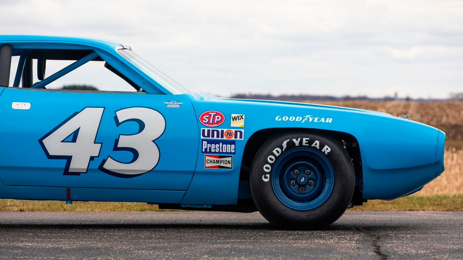
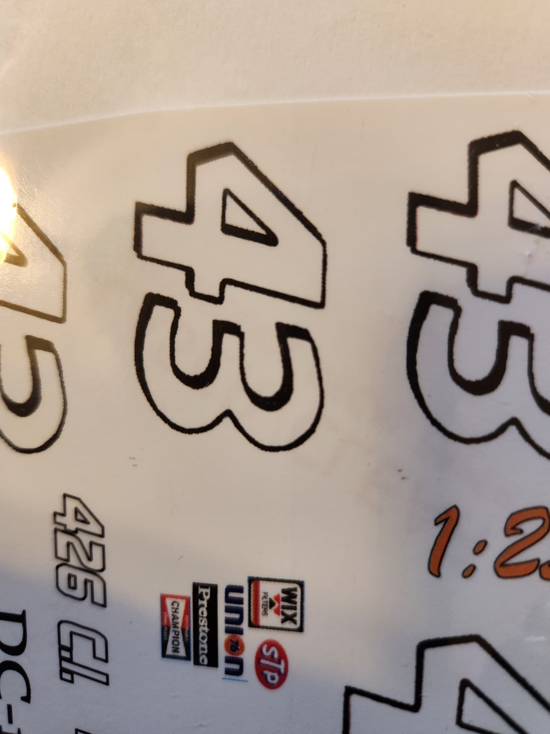
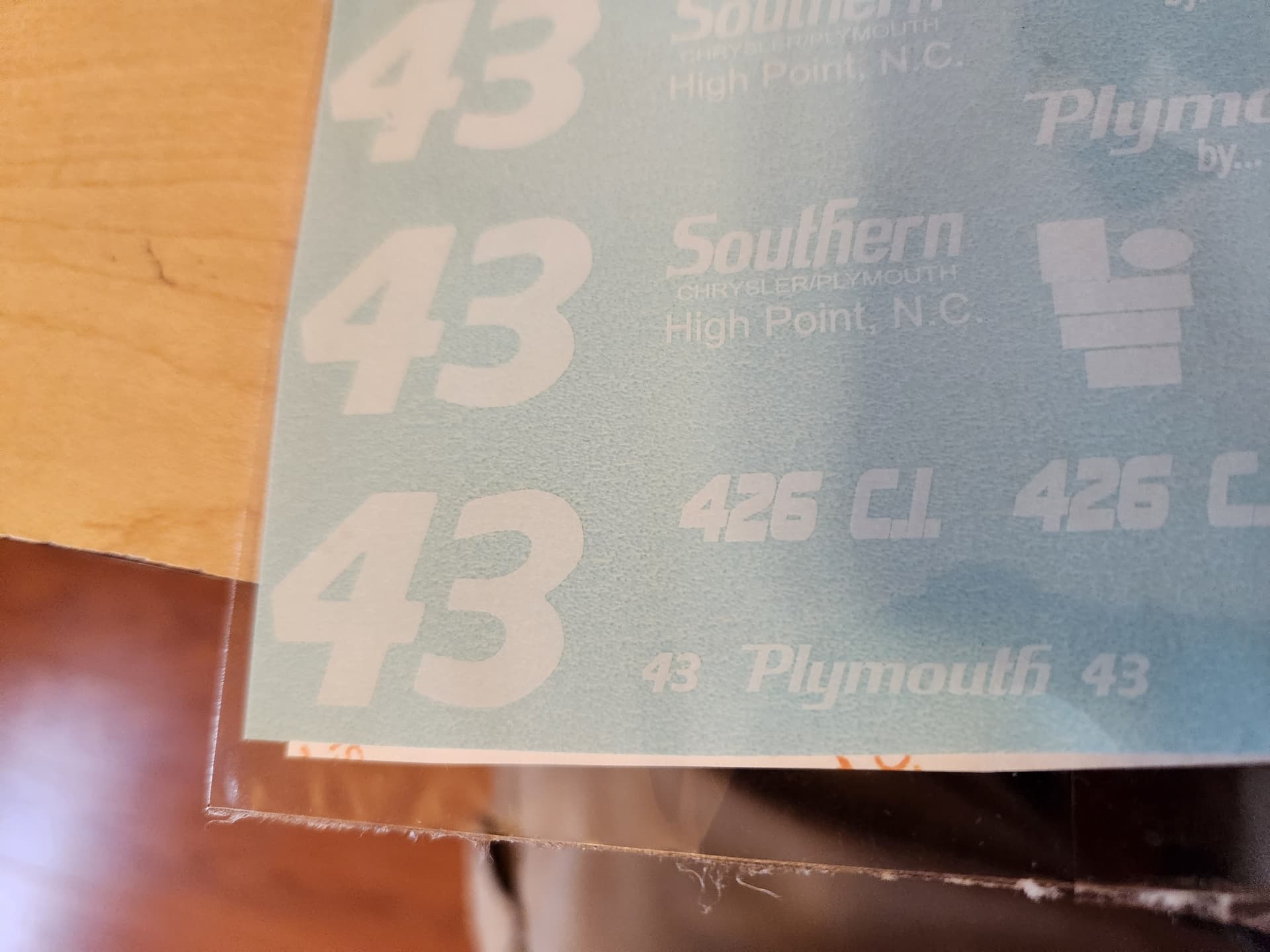
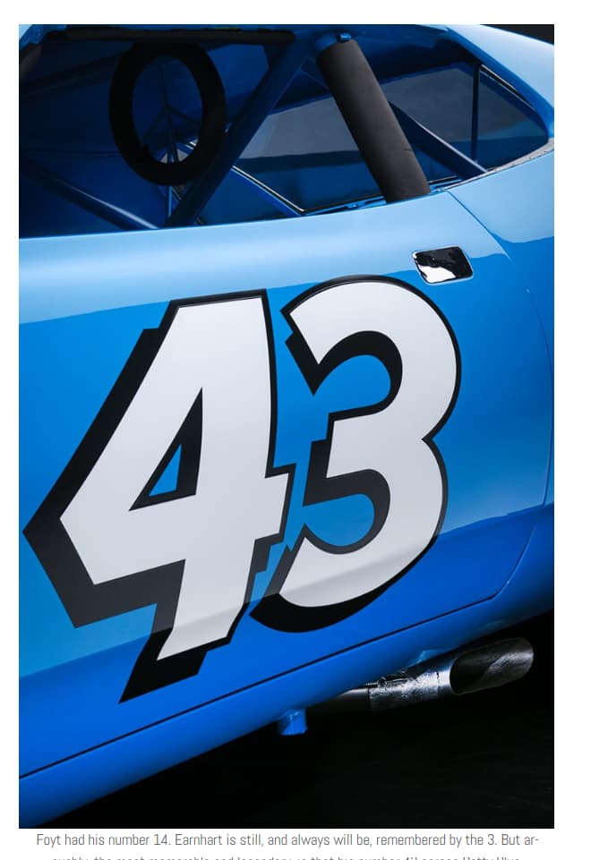
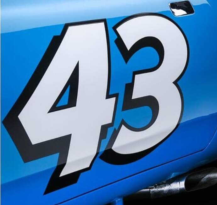
The black edges along the 43 shadow are not well done and the white on the decal, is not opaque. You can see through the decals and see the color of the paper backing.
The second set I ordered had a better 43 number, but the “Southern” decal was the wrong text type and came with a blue background that may not match the blue I use.
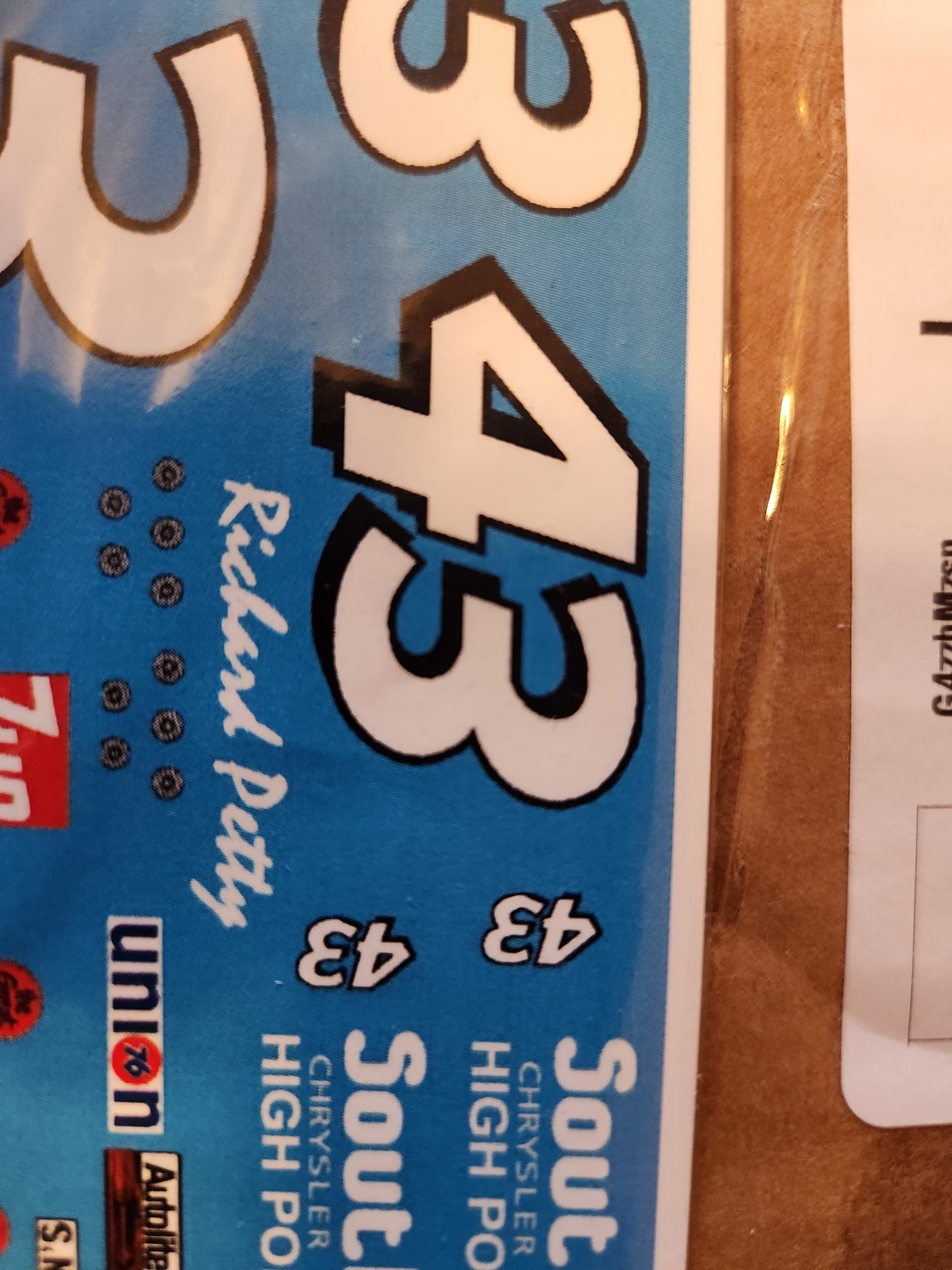
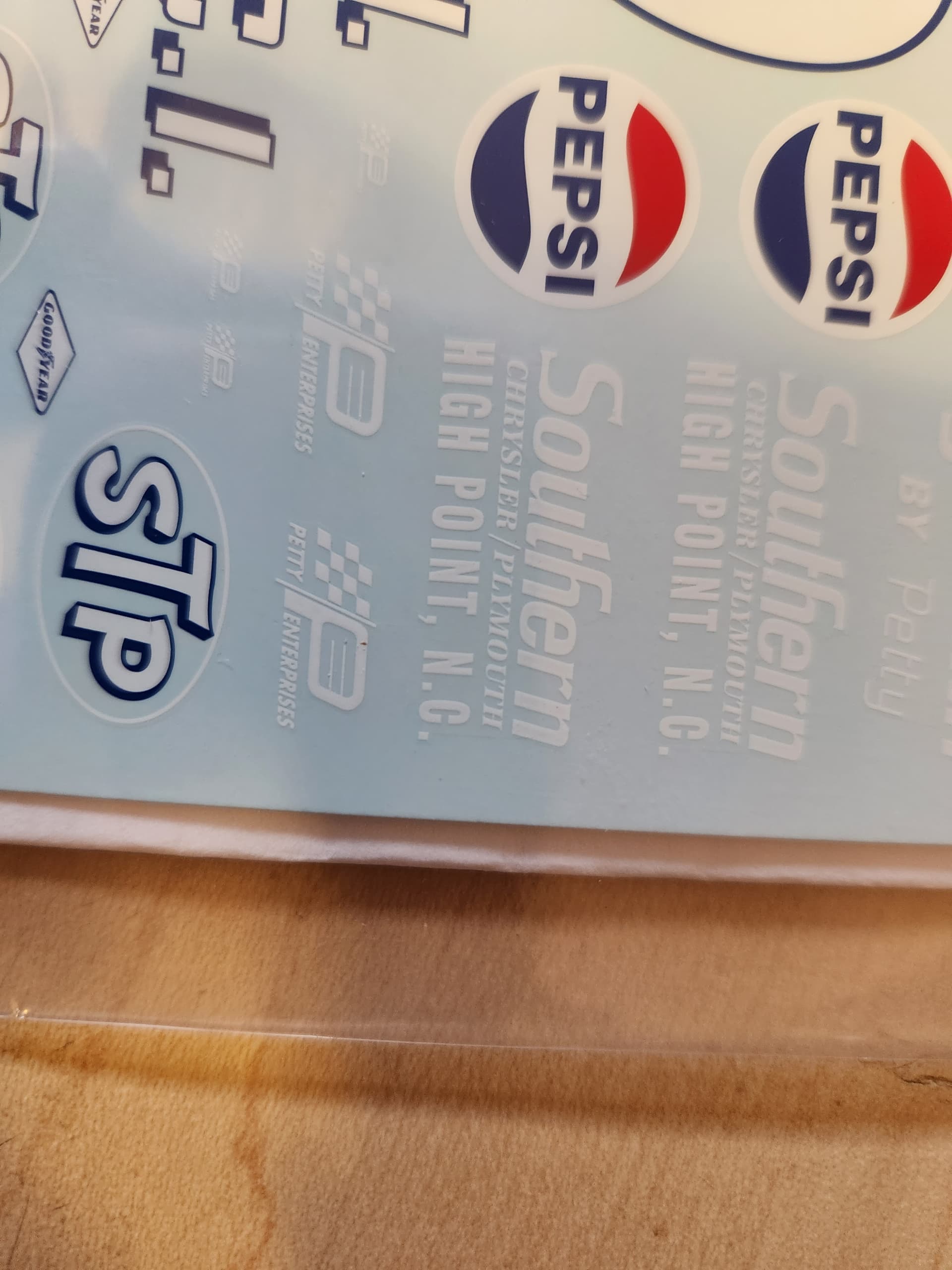
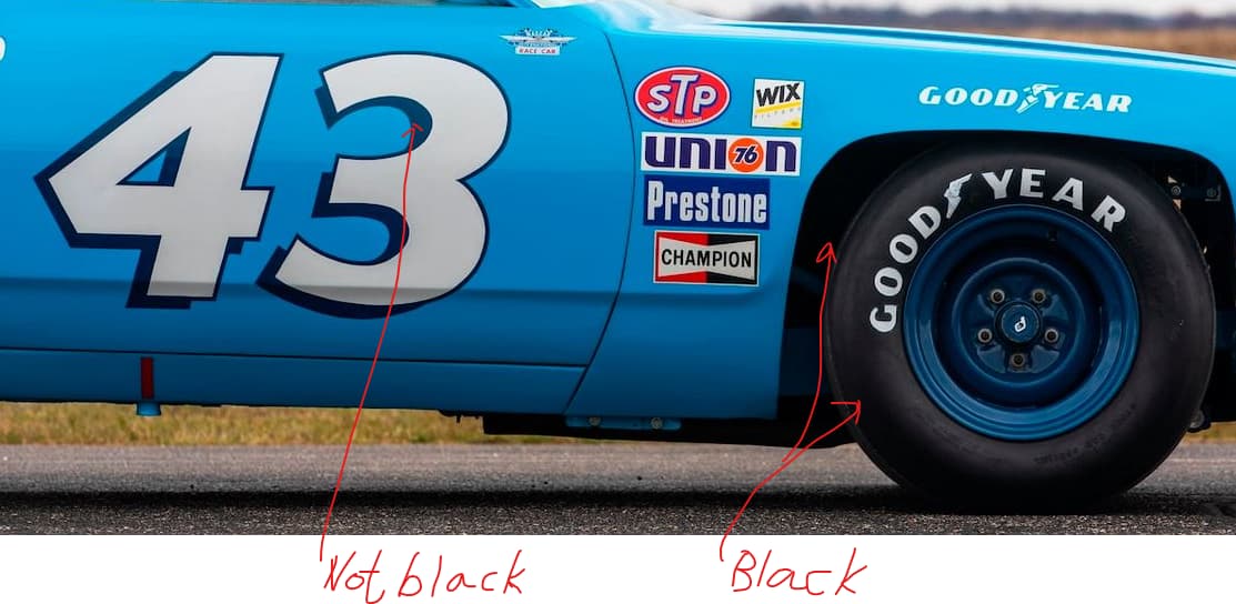
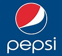
The quality of the print is great, it is a set of cartograph decals. Yea… but they printed the 43 shadow in dark blue instead of black…The same blue as on the Pepsi logo. It is not like they saved money by not using an extra color because there is black in other locations on the decal sheet.
This is where reality and perception collide. I have JR Salvinos Richard Petty’s '72 Roadrunner (same body or they ran a '71 in the '72 season) and the shadow around the 43 is the exact same shade of dark blue as on the '71 decal sheet. However, I do not think the possible blue shadow in this picture is the same shade as the blue on the Pepsi logo…but maybe it is.
In the end it comes down to what you can accept as ‘good enough’.
Another alternative is to visit the museum anfd get photos of the numbers
and the Pepsi logo with the same light conditions.
I think that Robin hit it right on the head, that you just can’t trust photos, especially digital photos as the camera’s sensor, the computer’s graphic card, and monitor all influence what you eventually will see. There’s a good chance that most of us don’t quite see what you’re seeing up close and personal.
It’s basically up to you to decide if it’s close enough to what you want, or maybe go to a custom decal printer and hope that he would be willing to use graphics on that sheet but correct the color of the shadow.
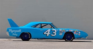
and in the sideview I posted the wheels are not too different from the shadow around 43.
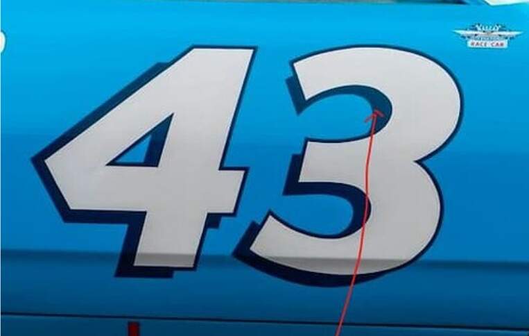
In your comparison above my eyes insist that the Pepsi logo is closer to blue and the rims have a faint tint of purple BUT it could be caused by the shadows inside the rim.
In the photo I posted the rims look like, to my eyes at least, Humbrols Midnight Blue (#15) but the shade tends to shift with the light.
Welcome to the forum!
Since this has been resurrected, I’ll just toss this out - whether or not the surrounding color is dark blue or black is moot - we’re talking two different paint jobs here, so they’re likely different colors.
The outlines on the 43 are not just different colors - they are different shapes: