The perfect hobby paint match is folly IMHO. One would need exactly the same pigments and they have to be ground to exactly the same standards as the OEM paint. Otherwise they won’t reflect light in the same way at different angles.
In the ballpark or fairly close is good enough to me. I don’t want purple in place of green etc (j/k).
Sounds familiar …
My wife picked some colours, in the beige area, she liked to have in the hallway.
I bought a handful of small “sample” tins and painted square foot patches on the old white wallpapers (I knew those colours wouldn’t work in that space) and showed it to her. She took one look and said those colours wouldn’t work (maybe I did say: Told you so). Then she asked me to cover the patches with white paint.
Then she (we) tried various blues and a soft purple which looked OK but the space
became way too dark so we settled for my original suggestion which was a soft white (slightly towards yellow).
Brother in law and wife fell for the fashion 20 - 22 years ago when everything was in the sand-beige-light brown spectrum. They didn’t try a sample patch first, they went all in and painted the living room in some dark beige-yellow. Then she started crying because it was so FUGLY and dark and he had to repaint it once it had dried enough to allow overpainting
Who is getting stressed? The people looking for some sense of accuracy seem to be happily gathering the information they can find. The discomfort appears to be from those who want to point out that the task is impossible, something they never tire of doing.
I see an exact parallel of this subject and detail accuracy: rivet-counting. Invariably when someone asks about some detail or expresses a desire to improve their model/modeling, a “It’s your model, do what you want” or “Modeling is supposed to be fun!” post appears. The Rivet Counters and Paint Chippers always seem to be having fun. It’s the Fun Builders who seem to troubled that they are being left behind.
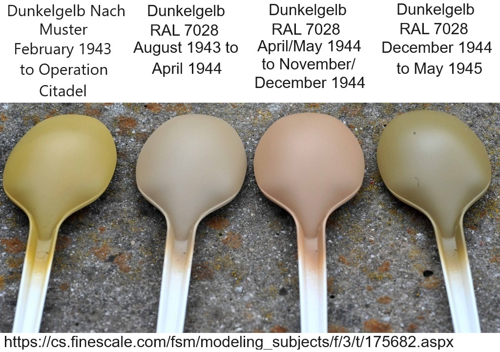
I have strived for color accuracy, and I have made peace with OD and Dunklegelb. I consider Thomas Chory’s paint chip samples the most reliable standard to go by. I am totally happy with AK Real Colors Dunklegelb 4 pack set. I will now move on with my modeling life. Thank you.
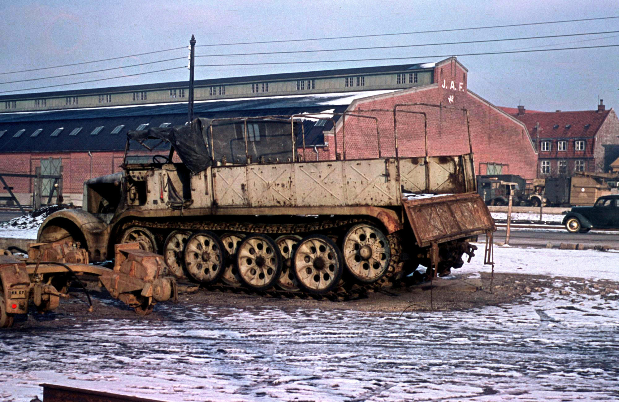
I have seen similar photos of aging Russian equipment. Their paint is notorious for fading over time. Still it is hard to believe these all left the factory as the same color/shade/hue to start.
As someone else said - the German equipment did not have the time to do much aging but the problem there (according to Charles Lemons, curator of the Paton Museum - Ret.) was that the various factories and sub-contractors all mixed their own paints. And while trying to follow the given standard the shades of paint they produced varied widely, sometimes (often) having different sub-assemblies on the same vehicle with different color shades. That is at least one reason for the final overspray of uniform color that the equipment got before leaving the factory.
Funny. Or “To each their own.” A dismissive statement if I’ve ever seen one.
Some of those same people seem to allow obvious errors to remain on their own bulds once you’ve politely pointed them out,.
“I’m calling it good” pops up frequently. And that’s cool if that’s what they want. But why ask for (begging for, sometimes) comments and suggetions if you’re not willing to listen to them? For some folks I’ve stoppped caring. In fact I don’t even follow their builds any more. And that’s a shame, because if Frenchy can’t find it online, if it’s a modern subject I’ve probably taken at least 200 photos of it.
What everyone is missing is that you also need to scale your colours. Even if you were to get the perfect match to a wartime colour, or you found an actual tin left over from WW2 and used that, it would still look “wrong” on a 1/35th tank and it would look different again on a 1/72nd one. It’s the same as using flat or matt paints. The original paints had a slight sheen on them, slightly less than “eggshell” or “satin” paints. But this may look too shiny in scale. Also, don’t forget application methods. Yes, the base colour was painted at the factory, but vehicles were sent out with tins of green and brown for camouflage overpainting, but also with Dunkelgelb. Looking at some of the schemes chosen by crews, it is clear some overpainting of the Dunkelgelb was undertaken, with all the ensuing complications of what thinner was used, petrol (preferred, but in short supply), waste oil (lovely, I’ve never seen anyone purporting to feature this on their build), water or anything else they could find. All of these will affect the final colour, as well as dust, rain and fading from the sun. I still use Humbrol paints and their Dunkelgelb appears to have a slightly brown/pink shade on the lid and in the tin, but sprays and ages as a definite yellow. Genuine WW2 colour film, especially Agfacolour, nearly always shows Dunkelgelb looking almost white. Tamiya used to provide a mix in their old instructions in the 70s, which involved mixing yellow, white and black. Anyone remember that? Lord knows how accurate that was. On the whole I just stick with the paint manufacturers colours and don’t sweat it too much. BTW, please no one take this post too seriously…!
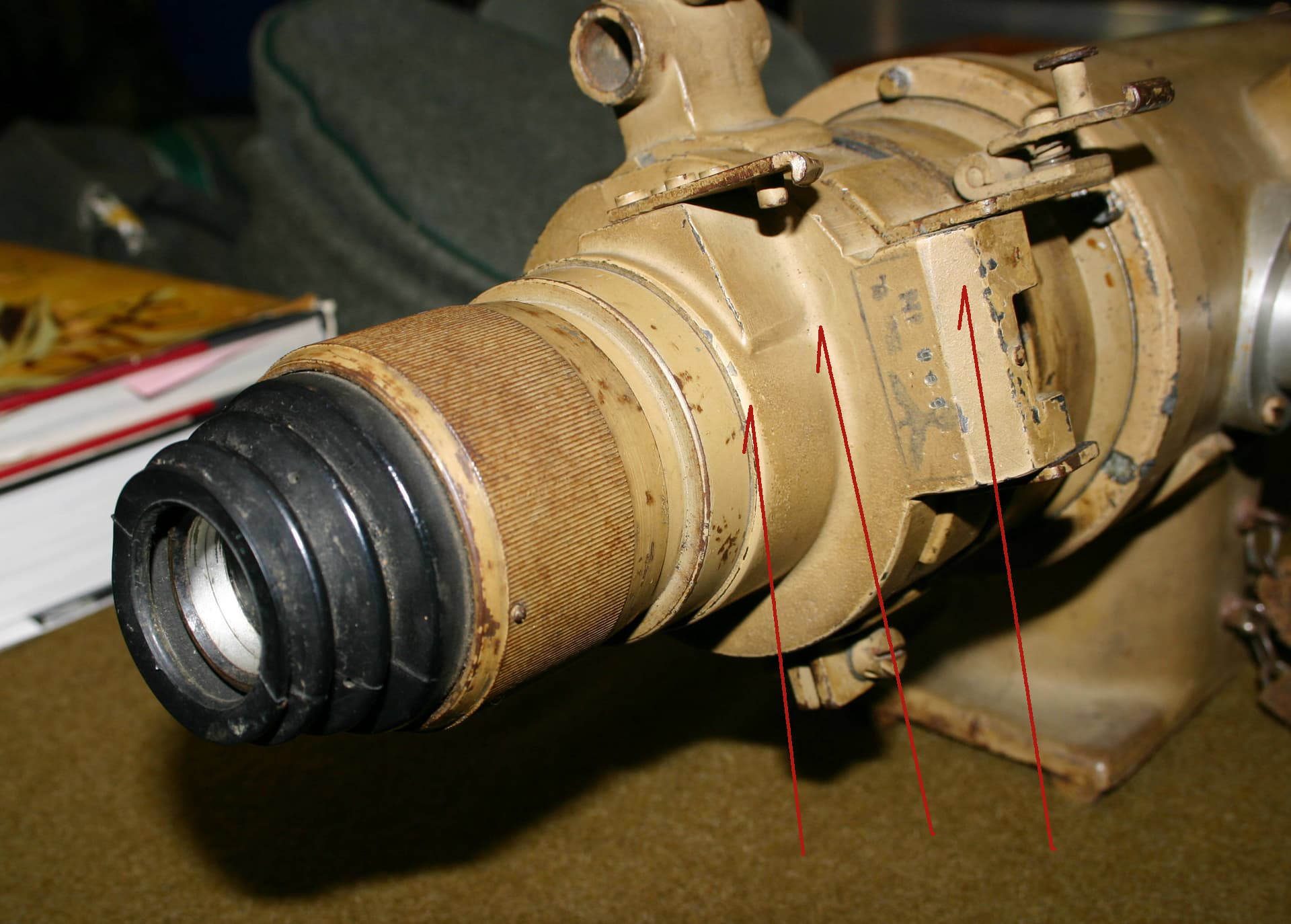
And then my own contributions: I suggest you judge the color/shade/hue based on the bright areas seen in the grooves of this telescope for that is where the color will have the lease wear and also the truest illumination: (this time lighted by electronic flash.)
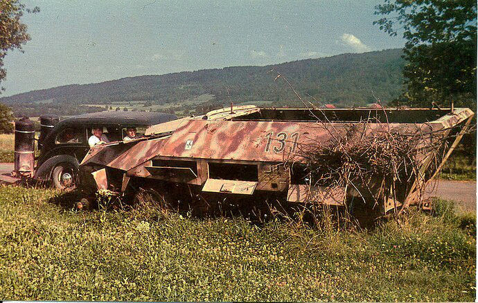
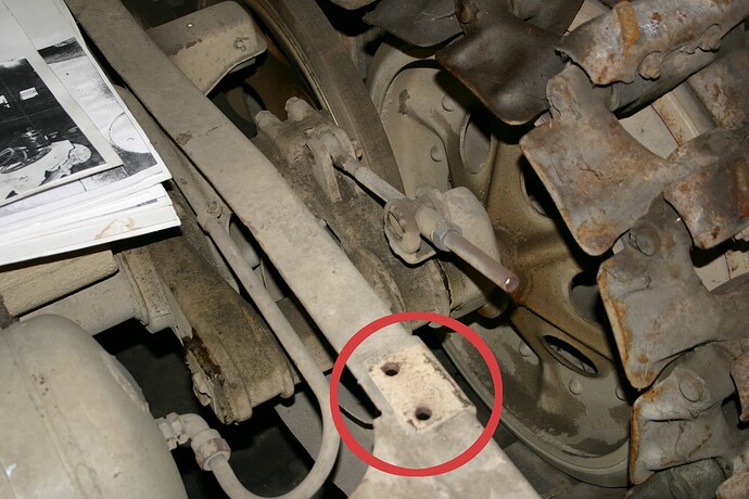
And then this photo of the Patton’s 251/9 frame upon first removing the floor plates for restoration after sitting unexposed to direct sunlight or weather for 60+ years. Again illuminated by electronic flash.
My Photo
My vote: (and it is just one man’s humble opinion) true German “Dark Yellow” is far brighter/lighter and more warm red/tan than the darker yellow/green shade that seems to be the consensus among modern model paint manufactures.
I am sure others will have their own opinions so again we are left in a “grey area” as to color/shade.
I’m still reeling from the twin revelations that 1) Robin is the Devil, and 2) Robin doesn’t exist! My head is spinning faster than a mere beige colour could make it…
What is the relevance of this photo to the question: “What current model paint best matches the standard Soviet base color?”
It says nothing about the uniformity of paint color as applied yet it does not prevent somebody from throwing this up whenever the words “paint color” appear in a post title.
The most useful lesson from this image is to show that when you consider age and environment there is a wide range of colors possible. This image is from March, 1992. The BTR-60PBs shown have paint that runs from probably 2 to 25 years old, and the vehicles served from the arctic to Afghanistan, from the North Pacific coast to south eastern Europe. Some were stored under cover, some were stored in the weather. Those things affect appearance. We knew that.
It does not prove that there is no standard color. It does not prove that different factories, at different times, had wide interpretations of what was supposedly a standard color. Those things may be true to certain extents, but this image has no weight on those arguments.
More often than not this image is posted to ridicule. That doesn’t seem to be helpful. If a modeler doesn’t want to bother with doing more than using their favorite brand’s interpretation, fine, go ahead. No one cares what you do. What I don’t get, as with the similar reactions to detailing discussions, is why so many are compelled to dismiss those who are trying. If someone wants to waste their time on what one thinks is a boring and fruitless exercise, why even comment?
No, I haven’t missed it. I simply chose as I suspect others have as well, not to throw fuel onto the fire. I even thought to quote from snapdragonxxx’s own post on his research, but I did not. Since you’ve brought it up thought, I will:
I know that if Vallejo take these on board then the colours will reman correct to the chipset and not be “scale corrected” which is a lot of tosh if you know exactly how our eyes and brain work together and bring these authentic colours to the scale modelling world.
I applaud his research efforts - he indeed expended a lot of time and expense to find his holy grail.
And I agree, if you can find the “perfect” factory color, unblemished by oxidation, weathering, varying thinners and amounts thereof, then by all means use it, tout your research findings (as he has - it seems he’s his own biggest fan) and be pleased with yourself. I also agree that if/when you’ve found that “perfect” shade, it should be in its true 1:1 saturation, not scaled. After all, the manufacturer doesn’t know which scale you’re modeling. It would be a bit unrealistic to expect them to make a scaled color for each conceivable scale - even just the main stream ones - 1/16, 1/24, 1/32, 135, 1/48, 1/72… That sould be left up to the individual modeler and his own interpretation of what each “scale” shade should look like.
But it appears that snapdragonxxx goes off the rails a bit by saying “scale corrected” is tosh. Maybe I read it wrong, but it sounds to me as if he doesn’t believe it exists. A simple test that you can conduct in the next thirty seconds verifies its validity, as does physics for those inclined to discuss wavelenths of different colors on the spectrum. I am not.
Suffice it to say, you get as close as you need to get for the vehicle, epoch, factory batch, day of the week it was painted, whatever - that you can, and you go from there.
As for the Russian/Soviet vehicles above, I’ve posted the photos before of my BRDM 2 floor panel that shows the color as it came from the factory. It’s never been exposed to UV rays. I’m not going to go to my attic and dig it out again because it’s pointless. Of all the vehicles I’ve done from Afghanistan (and also the Ukrainian conflict, I’ve never once used that exact shade.
The telescope makes a very valid point. Oil from skin, cleaning etc will burnish and darken paint.
The newly uncovered section of chassis is a different story. The mating parts, now absent, could have vibrated…abrading the paint causing it to lighten.
So… I’ll stick with the telescope since it was exposed to the possible effects of oxidation regardless of recesses or raised surfaces.
I’ve seen period photographic evidence of this burnishing on vehicles as well.
It’s a Schrodinger’s Cat kind of thing… Does “Robin the Debil” exist in the virtual world or not? Until he replies to your post, BOTH things can be true OR false AT THE SAME TIME!!! LOL!
Or maybe it’s more like “Rumpelstiltskin” or “Voldemort.” Robin is “He that shall not be named…” So, just never say his name, and he ceases to exist in your world, or… if you do say his name, he just goes “poof!” right up in smoke!
I don’t know…
But there are some really entertaining posts on this thread. At least it hasn’t been the same ol’ same ol’ discussion about that yellowish German color.
About 6 months ago, I made a Cliff Notes version of the post Wade (Armor_Buff) linked above and now offer it for your amusement, edification, or perhaps revilement.
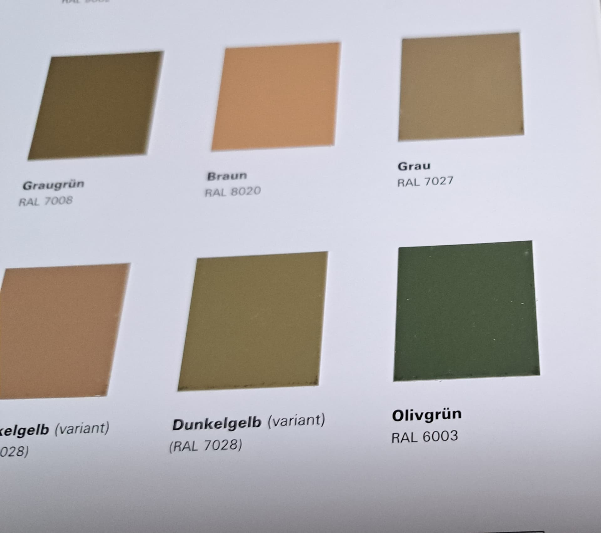
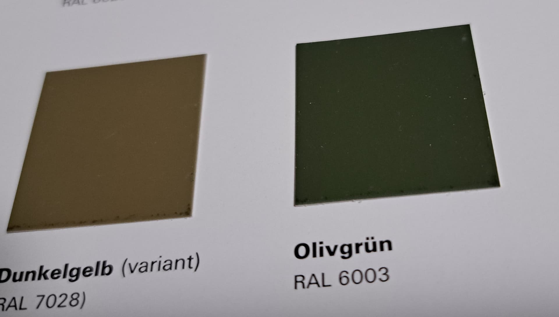
World War II paint colors are an area of active historical research. As such, no reasonable person can expect a definitive and final explanation of the subject matter. Having spent dozens of hours researching this subject via secondary sources, I came to the conclusion that the above picture must do as a starting point for for someone like me without access to authentic period artifacts, authoritative books, major research archives, or paint company records. My reasoning for this decision is complex and contradicts some assertions made in this discussion.
Please note, I use the painting methodology expressed by Kurt in his first post. I read a lot, make a best guess at the authentic color, find a model paint that matches the best guess, and tweak that color to create visual interest. I typically mix and use 4 or 5 variations of the best guess authentic color for a given model. I understand my method may not actually result in something perfectly realistic, but I am compelled by personality to strive for that goal.
He is in the details.
He is outside your door.
You can run with him.
He’s in her heart.
You puzzle over the nature of his game.
Some have sympathy for him.
He is in disguise.
You can be in league with him.
You can dance with him.
You can speak of him.
You can shout at him.
I even heard he can play a mean fiddle.
Dude’s been around for a long, long time, that’s for sure.