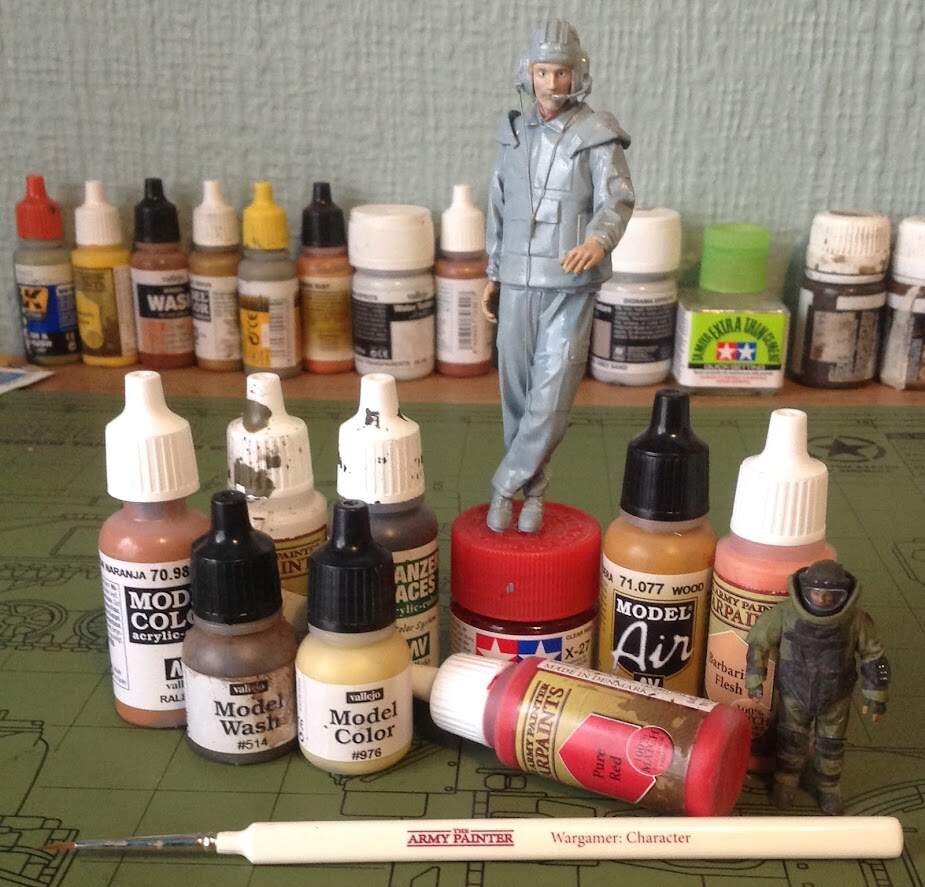
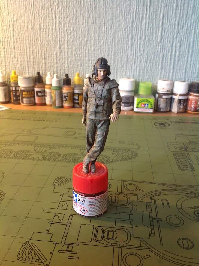
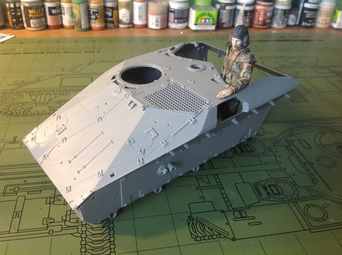
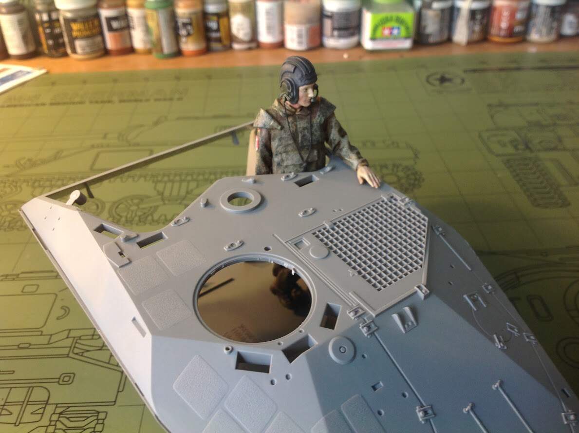
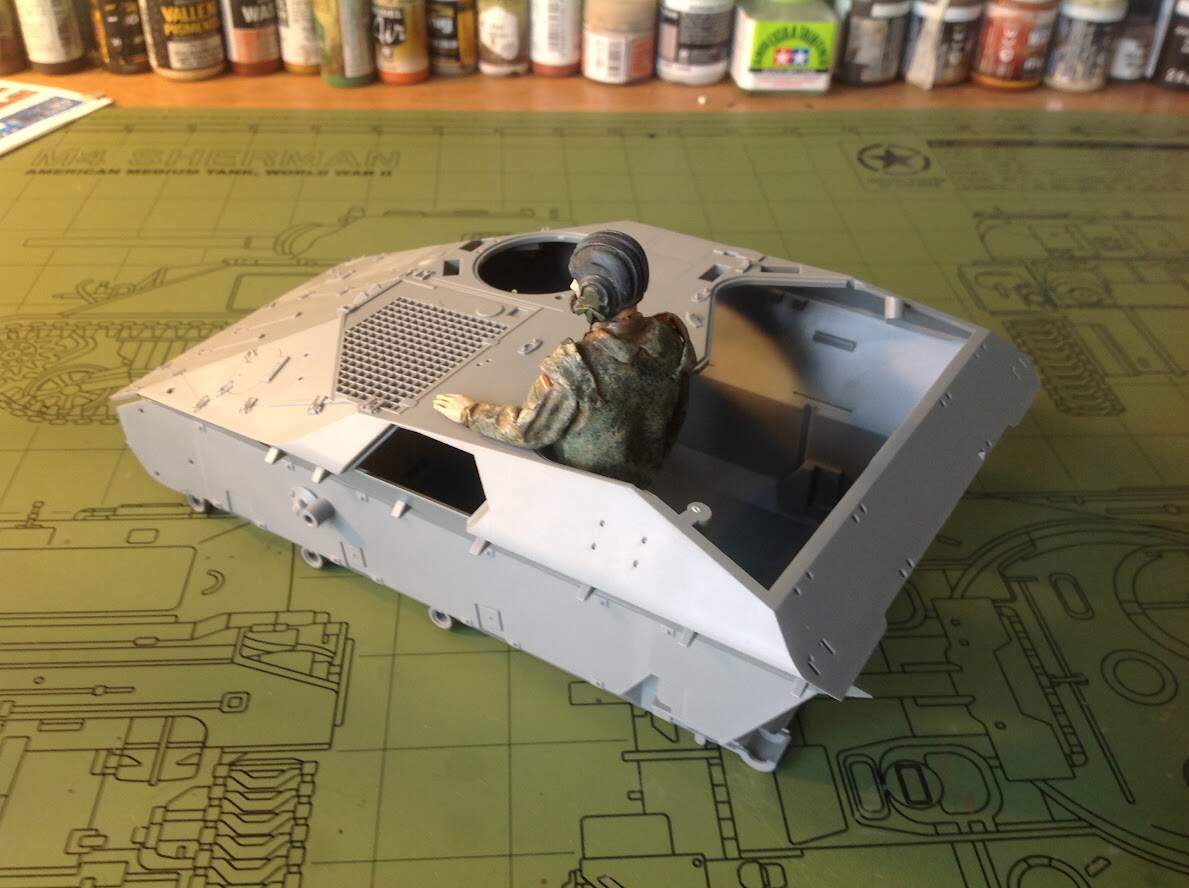
I recently got the Takom 1/16 Wiesel and once I saw the pretty nice fig included I thought it might be a fun little diversion from armor.
He has been built up and I only have sanded all the seams, (lots of them the figure was 25 parts) used green stuff to add some more detail to the helmet and used copper wire and strip styrene for the headset wires.
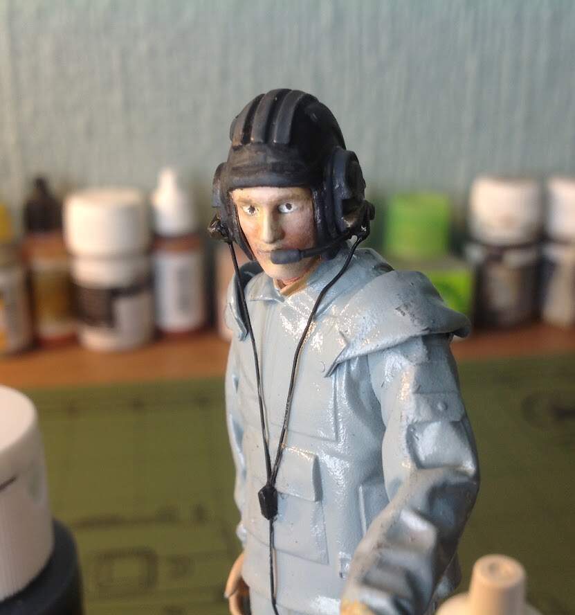
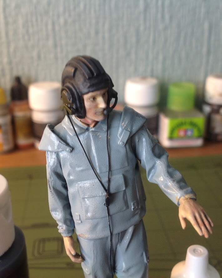
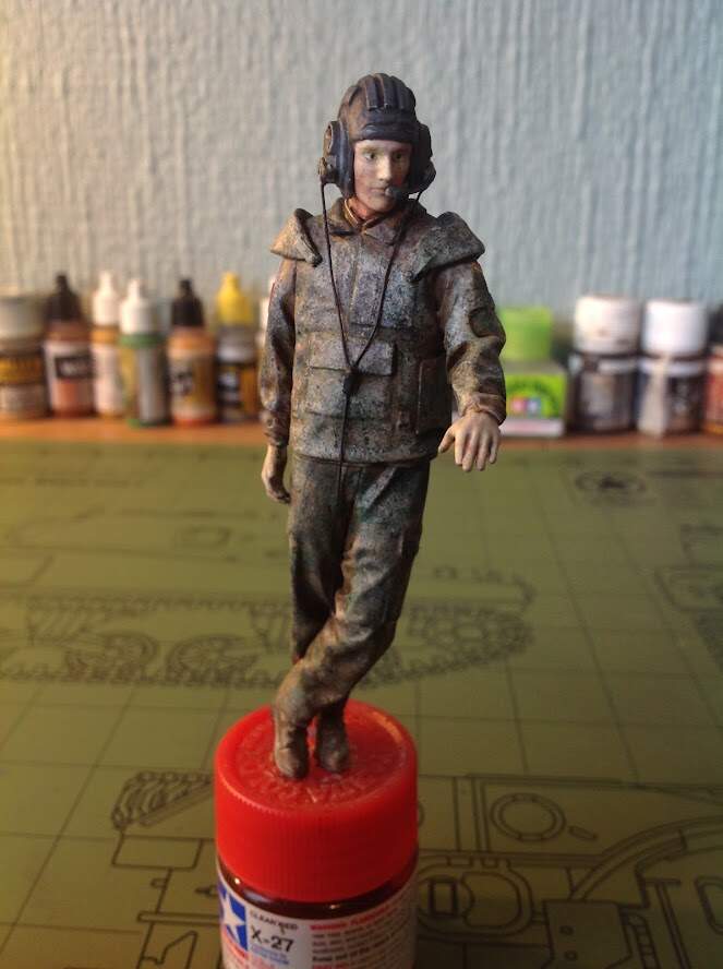
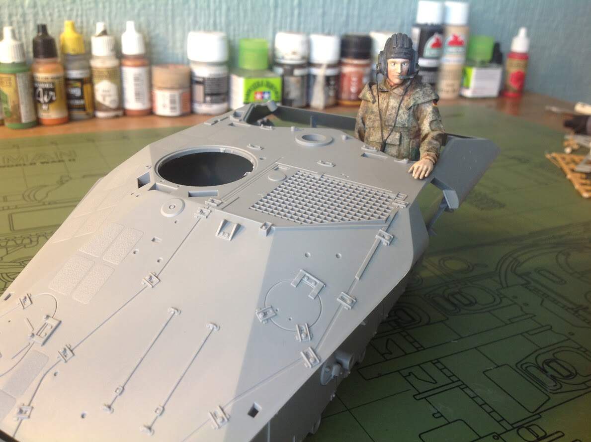
This morning I painted up his head. Im fairly pleased with the result although its far from perfect. At least he doesn’t look like he will haunt your dreams!
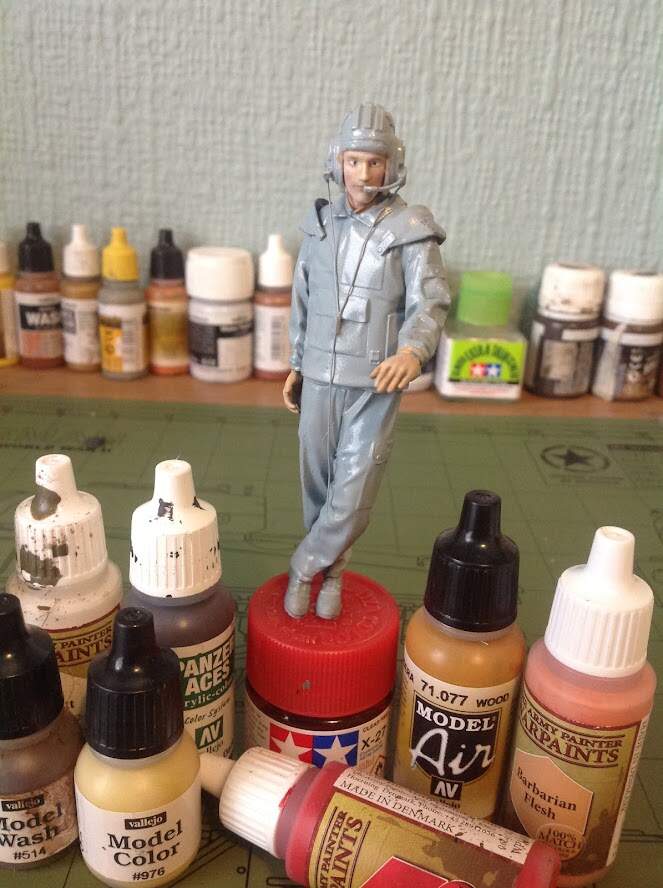
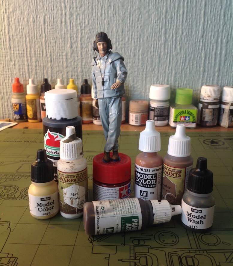
All the paints I used are piled next to him.
He is my first serious attempt at painting figures, the only other figure I have done was a 1/35 EOD specialist.
Hi Ezra
could you post a close up of the face and describe the process you did? i too am trying to learn more about figure painting. maybe we could help each other.
Looks hella better than my first figures Ezra and at that scale there’s no hiding it.
I think you nailed the flesh tones pretty well. My only suggestion would be maybe a little more colour to the lips. In the pictures at least they’re looking a little grey.
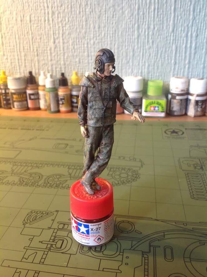
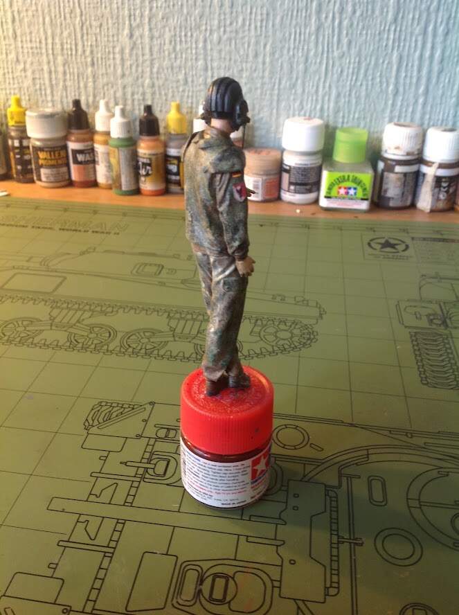
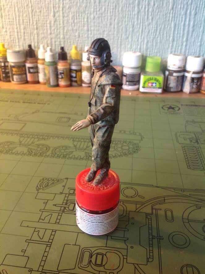
Flecktarn - I’ve never painted this, so, I have one observation, fwiw. I guess two observations. I’m not sure why you think it’s terrible? That might help us in making suggestions. Second, when I look at the photo of the real thing and then look at yours, I would say the original has more contrast. Getting high contrast in a pattern like that is going to be a challenge because you’ll probably want to blend it afterwards to unify the colors, but that usually gets rid of contrasts, so it will be a challenge.
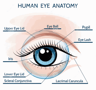
Eyes - I’ve painted tons of eyes on mostly smaller figures. I think your eyes look too big (too much white showing). When I paint faces I start with the eyes painting a big white blob where they go and then adding in the dark middle just leaving a bit of white in the corners showing. Then I paint the base layer of flesh that frames how much of the eye will be visible.
But, really, I think you’ve done a very nice job on the figure.
I just think its too much of a jumble of colors. You can see in the real pic its a big mess but it still manages to look good. Maybe I just need more contrast in my colors like you said.
Seems my German has big anime eyes…
I will try to fix it and hopefully not mess it up!
I’m glad you posted a photo of the original uniform - it saves me from having to get up and go to my closet. But from the photo, and my memory, the flecks should be slightly larger, which would also help them “pop” more, and there should be more light grass green. I think on mine there’s more connectivity of the black spots as well.
Not a figure painter by any means but it seems to me that as most of the colors are rather dark and loose their distinction when blended, what you might try is to lighten/brighten the colors somewhat knowing they will get dulled down once they are blended. It’s also difficult for me to tell from your photos of your figure, but on the real uniform although the pattern all runs together each element in the pattern is sharp and distinct i.e. you can pick out the individual blobs even though they all run together. As I said, might just be the photo that makes it hart to pick out the individual flecks. None the less a very good effort especially for an initial attempt. Good luck.
It’s been my experience you have to use somewhat brighter colors when doing most camo patterns in small scale. OCP, Multitarn, flecktarn etc. Otherwise they end up as indistinct blobs. Even with my OCP’s right in front of me it’s a bit of an uphill battle. Keep up the good work, uniforms will improve with experience.
I hear what you’re saying Duane ; I have an OCP uniform too and still had a very tough time painting it, and that was in 1/16 scale no less. Had the uniform right in front of me. It wasn’t hard picking out the right colors though, just executing it.
You are off to a great start, so don’t stop. Panzer. Painting figures is nothing more than practice, practice, and more practice. Oh, did I mention practice? Whatever you do, keep at it, it’s only a matter of time before it clicks and you will appreciate the time well spent.
Large scale figures are always going to be your best tutor for learning to paint faces, etc., IMHO. You will see your mistakes quickly and be able to adjust, fix, repaint if necessary, without much difficulty.
Tank left some great vids for you to learn from, and may I suggest checking out Planetfigure. Study how some of the guys work their oils and acrylics, it’s amazing. There are some really great step-by-steps on those pages. I often cut and paste to a word doc, print, and pin to the book shelf rails in my model bunker for immediate reference.
Most importantly, have fun. This is a hobby and if you’re not having fun “sniffin paint and gluin your fingers together” you ain’t havin fun, HA!
Standing by for more! Cheers, Ski.
Tip: You can always start over if you honestly feel you’re not getting the results you want by giving the figure an oven cleaner bath/wash, I do it “all” the time.
Don’t paint the eyes with only a dot, eyes are very important part of the figure. If they don’t look good, the whole figure will not look good
For 1/35 figure this is enough in the beginning
I was just about to suggest what Venko posted above…the circle of the iris should be larger diameter, and partially hidden under the upper eyelid. Also add some “eyeliner” to the upper eyelid. That will help define the limit and shape of the eye. I use a water-proof fine marker (black, brown, blue, etc) to make a nice round dot for the iris. In a larger scale like yours, you could make a lighter color iris, then a dark color (black) for the pupil. If possible, put a tiny white dot at the 11, or 1 o,clock position:
You can also find eyeball decals in various scales that look pretty realistic!
Almost everything is already been noticed, For a first figure not bad at all.
For the camo don’t start thinking in terms of patrons, their random and always different.
Just try to follow the order of colours the manufacturer has used, don’t mix the order of the colour dots.
For what I can recoinages, the overall basic is light green next brown dots following by dark green and as last black dots. If you change the order you get a different colour scheme.
For the eyes, think smaller a small off white line and a small dot are better than any frog eyes.
Sorry as I just found this post. Liking your work and thank you for sharing! I wonder for the Flecktarn pattern if others have mentioned the decal camo options? I tried this and still had to do a lot of painting with it, but it serves as a nice guide or map on the figure IMHO.