Olive Drab research paper covering 1918-1973

I am very intrigued by the subject and look forward to reading it in it’s entirety as soon as possible.

From the model perspective it’s likely not to be as simple. Paints on military vehicles can drastically change for all sorts of reasons. Paints can fade, be stained by mud, oil, or get covered over by mud, dust and soot, then scuffed or worn by abrasion. Though we may seek accuracy in our builds, once you factor in all the abuse paints receive on military vehicles, accuracy becomes subjective.

When I build an AFV, that’s supposed to represent a vehicle in use, I generally approximate it’s base color, I know that, the base color will change considerably after I apply weathering, staining, dusting, rusting, soot and abrasion. The only concern I would have to accurately represent a “correct” color is if my subject is supposed to look like it’s fresh off the assembly line.

Edro

2 Likes

Yes, this is reflected color.

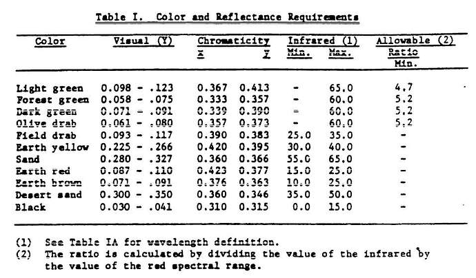
Vertical axes are usually y, horizontal are x. But neither x nor y are defined on the chart.

1 Like

Hello!
Thanks a lot for your hard work and for sharing it with us. Stuff like this could set a standard for endless discussions among modellers about colors. But this is high bar here!

I think that would be very interesting. n one hand to answer the question “what to use”, on other hand I suspect it would show some hobby paint manufacturers don’t really know what they are doing… Some of them would probably say they are off because of scale effect and so on…

Thanks again and have a nice day!

Paweł

3 Likes

I do not have a copy of the Military Specification that chart is taken from but this paragraph and table are from the specification that superseded it.

Aren’t x, y, and Y standard symbols in color science?

KL

1 Like

Yes … and no …
There are many color description systems. (See list, bottom of page at OSA-UCS - Wikipedia). I am most familiar with Munsell, which is used in a number of applications, including geology (my original field). The table appears to be using the CIE XYZ color space or an earlier version of it. See here).

1 Like

I’m sure that is covered by the specification’s references to other documents and standards. This one from the mid-70s is far more definitive than early standards that required “Colors must match the standard provided.”

When I was in the specification and standards writing/interpreting game I often had to emphasize to folks “If your requirements don’t include clear boundaries between a good item and a bad item, it’s the same as having no requirement at all.”

KL

4 Likes

Hence the old saying: “Close enough for government work,” which has been used to mean both very good and not so good. I was a member of ASTM for most of my career. The scientists and engineers wanted tight, well defined standards. The producers’ and manufacturers’ reps generally did not. Guess who always had plenty of representation at the committee meetings—it wasn’t the scientists and engineers. Talk about exercises in frustration. :confounded_face:

2 Likes

Thank you for sharing this! Funny how a subject so…dull…can be so exciting!! hahah

ba dum, tisss

for real, though. This is a wealth of information!

3 Likes

Here is an example of a hobby paint. On another forum, someone asked me about this picture. What are my thoughts? The poster thought that this picture supported OD being very dark.
Imgur

The picture obviously has issues, it is old, faded, worn, the foreground is dark and the background is lighter.

The tanks and the helmets roughly match in color. They aren’t exact, but they shouldn’t be. They were painted with the same paint, but the helmets had sawdust glued on which reduced specular glare, which made the helmet a bit more darker and saturated than the same paint on a smooth surface such as a tank. So that is good.

But to comment on what the color actually is, I presented a toy tank I had painted in Tester’s 1165 which is matched to the OD319 standard.

Then I put some of the chips next to the tank. The chip identity is written in red under the tank.

The tank is painted in Testors 1165 which is the chip above.


The slightly greener '41-'43 factory color above


OD41 aka dark camouflage OD above


and lastly the OD9 of 1942 above.

To my eyes the OD9 chip looks like it could be the color in the modelers color photo way up top. Even though it was OD9 and a field applied color, it shouldn’t be discounted from being a factory color for at least two reasons. First, it is close enough to the factory standards where it could have been made as an acceptable shade of paint. Second, we know for fact that it was made as an acceptable shade of factory paint because of the data for 3-173 in Figure 21 on page 38 of the paper.

4 Likes

the conclusion of my previous post

2 Likes

I was on the military specification side and we had a lot of scientists and engineers writing requirements who should not have been within 100 yards of the process. It went something like:

  • Our lab set-up had these parameters so the production parts must be the same.
  • You don’t provide any tolerances.
  • Right, they must meet the set up values.
  • That’s impossible. They have to have tolerances.
  • OK, plus or minus 0.001 percent.
  • Sigh. That is also impossible. The best measuring instruments made can only measure to 1%.
  • But that’s what we need.
  • Really? How did the output vary as a function of mix concentration? As a function of room temperature?
  • I don’t know, we didn’t vary the temperature.
  • How can you say it matters if you don’t know how it affects the output? If you didn’t check, how do you know that even 0.001 percent is tight enough?
  • Oh, it’ll be fine. You could be anywhere between freezing and boiling and it would work.
  • -Sigh . . .

KL

2 Likes

Well, here’s my point. This means absolutely nothing to me. These numbers have no significance and provide no information, and I would bet that holds for everyone reading this except for Littlemarten. Also, the specification does not list “OD Brown” as a color. There’s Olive Drab and Sand. One could add some qualification like “the brownish side of Olive Drab” or “a dark version of Sand” but introducing a new term does not help.

The real issue this little overlap brings up isn’t addressed in the context of the paper: What are the implications to distinguishing various color standards and color specifications when two not just perceived but demonstrably different colors - Sand and Olive Drab - can be acceptably represented by the exact same color parameters? If some ODs are exactly equal to some Sands, how do we know that some OD 9s don’t have the exact same parameters as some OD 108s or some FS 24087s?

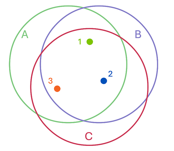
Take for example three notional color specifications and their tolerance envelopes represented by circles. How can we state something like “Specification B was clearly a departure from Specification A, as evident from the differences between samples 1 and 2” when, for all we know, those samples are just variants within the tolerances allowed by Specification C?

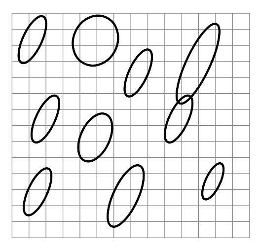
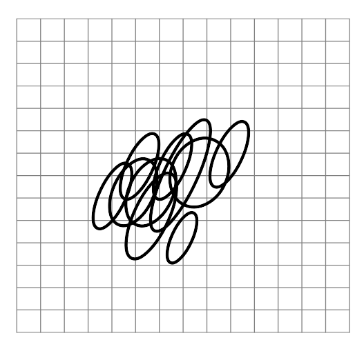
I would have a much different appreciation of what was going on and with my approach to modeling if a combined chromaticity chart of the various Olive Drab standards and specifications looked more like this:

than if it looked like this:

KL

1 Like

Kurt, the Sand and OD have a vastly different range for Y

Please go to RIT Ask A Color Scientist program like I did and scratch your itch

1 Like

I think I may know what isnt connecting for you. Your question is about the overlap of a 2 dimensional slice of a 3 dimensional space. The xyY is a 3 dimesional space. You are focusing on xy, which is a mere slice of that volume.

2 Likes

This should do it. Look at it from the top, you see some overlap. But they are two different volumes miles apart

2 Likes

I hope you know i meant NO DISRESPECT or any back-handed insult. The simple fact will always remain. Companies are profit driven, and HOLD ON TO OUR HATS, these companies cut corners. Some modelers seem to think colors are gospel. When in fact we all could spend a lifetime trying to figure out the “correct” shade of Zinc Chromate. LOLOLOLOL.
Great research. I hope to see more of your research

2 Likes

Hello!
I can remember when I got my first few acrylic paints. At one time I tried to darken my sand paint a little so I added black to it. To my surprise I didn’t get darker sand this way - I got a very nice looking OD. Since that day many years ago, the fact that sand and OD are related doesn’t surprise me. That overlap is a little like that overlap between black and white.

@ODtoday - maybe you should take advantage of today’s computer technology and provide a 3D chart to your readers? Something that could be rotated and viewed from different directions, essentially a 3D model? That could answer many questions, right?

Have a nice day!

Paweł

1 Like

No offense taken. I understand that not everyone is going to be into this research and want to go ‘free style’. That’s fine.

I wrote the conclusions of the paper based on the data. When I started the project in 2007 all I wanted to do was document the standards that were published because they had caused so much confused discussion at the time. As I traveled and gathered material, I noticed that the Army had actual data on the standards as well as applied paint out of the can.

Still, when I started assembling the material for the paper, the material was too complex and extensive to make sense. It didn’t start making sense until I was a third of the way into writing it. It was a classic case of applying the scientific method. Gather the data and follow your nose.

I can see that there were anomalies. There are a few in the report. But there are more cases in the report of where applied paint out of a can was within a reasonable tolerance of the standard it was matched to. For me, that has now become part of the hobby. I rarely use paint straight out of a bottle now. Knowing the Munsell notations of the Tamiya and Vallejo paints, I now tint my colors to get closer to the chip standard. I have done that with British SCC15, QM OD3, QM OD7, and QM Khaki. I am now working on a Vallejo mix for X24087 in semigloss.

My prediction is when modelers get comfortable with the Munsell system, many will also enjoy tinting their own paint to get closer to standard. Why? Well that’s part of history too. That is what the paint companies were trying to do. They werent’ obsessing about getting a dE = 0, no, far from it. But the data does show the companies were hitting dE < 2.5 which is yes, a different color, but a ‘reasonable’ match. That is what the hobby is now for me. Getting a ‘reasonable’ or better match, it has become quite fun.

Getting back to your point that paints in the can were dE<1, no argument here, But most of the data I have is that the paint products were pretty close, yet not exact matches.

If some people want to focus on the rare anomalies that paint in the can was dE>>1 and thus that gives them free license to paint their material dE=infinity, then go for it.

But I suspect most people want to know what was going on 98%+ of the time, which was paint was getting ‘reasonably’ matched to standard, and how that can help them in their hobby.

3 Likes

Pawel, sure I can appreciate the urge to utilize more computer technology in this subject but I have to respectfully decline. Two issues. This hobby is about pigmented paint on actual material, and early on I found out that RGB swatches were not looking right on the monitor. Something is getting lost in the translation from the Lab* I was seeing on physical material with my eyes, vs. their RGB conversion to computer. Thus I have stayed away from RGB swatches. For really accurate communication and description of the colors, I have stayed strictly with measured Munsell and CIELAB data of FS595 chips (which many people have), and the custom chips I have had made. Keep in mind, not only are they chips custom made to standard, they have 1) their actual data is reported to you, the owner and user, and 2) they have their dE values to standard given. That is big money quality control right there, it goes way beyond a RGB rendering on a monitor.

The second issue is that I am not tech savy. Excel, Acrobat, everyday apps…those are already struggle for me lol.

1 Like

Hello!
I didn’t mean displaying the colour samples on the screen - I know how inaccurate this can get. I meant more displaying the colour coordinates and their tolerances as 3D plots rather than 2D plots. I understand that this is challenging. As we are talking about scientific work here - maybe it would be good subject for some interdiscipilanry co-operation? Developing a program for displaying those 3-dimensional ranges might be a good subject for some diploma paper.

Or maybe AI could whip up something like this for us?

Have a nice day

Paweł

1 Like