Olive Drab research paper covering 1918-1973

Interesting work. Confirms some suspicious I had about Marine Green but couldn’t put my finger on. Halve to read it a few more times as the coffee isn’t strong enough this early to make sense of it all. I found the photos on page 80 very interesting. Didn’t think the Marines had hvss Sherman’s til Korea. The camo on the bottom Sherman is like nothing I have seen before. Don’t believe it’s on Iwo Jima as I recall the beaches had black sand. David Harper’s Tank Warfare on Iwo Jima has some interesting color photos.

What MOS/job did your dad have in Korea and what unit was he attached to?

As one with mk 1 eyeball color calibration issues, I for one would appreciate it. I understand and accept all the flaws as mentioned above.

1 Like

My dad was Weapons Co 1st Bn 5th Marines. Bazooka was his usual, but he spoke highly of the .5 cal lol. I will get to work on the hobby paints

2 Likes

Pawel, you are on to something and I have had similar thoughts. If someone (a mathematician Im guessing) could make a 3D space of the OD CIELAB range, and then calculate the number of various points which could be packed into the space at a dE of 2, we could get a definitive # of the quantity of various OD shades that could possibly exist. I have thought of that, but no way do I have the skills to do so

1 Like

I liked the .50 cal as well but would hate to be on a machine gun team. Everything about it is heavy. Taking it from the armory to the tank ramp was a long enough hump for me.

2 Likes

You can see the same result in graphics editing software — go to the color picker and select a bright yellow, then drag the luminance (brightness) down, and you’ll see the yellow change into an olive green shade. This is due to way the eye perceives color; there is no yellow receptor in the eye, so we perceive yellow from stimulation of both the red and green receptors. As the color darkens, the sensitivity response of the eye shifts our perception of the color to a more greenish-brown color.

1 Like

Olive Drab is made from Yellow Ochre and Black. That’s it. You can buy a tube of each at the art store and match any shade you find.

2 Likes

That would almost certainly be because colours on a computer are additive while paint samples are subtractive, possibly (likely?) coupled to your screen not being colour-calibrated. These are major concerns in the printing industry, in order to try and get things to print in the exact colours intended.

I would not trust anything “AI”-generated unless you can prove it with independent data. Have you see the kind of images and texts these things produce?

To illustrate, here is bright yellow with L=100:


And then just by changing L to 50:

2 Likes

Well, first off, the research paper is clearly the result of a labor of love, with obvious great effort and time put into it. So, on that level, I salute you, sir, for going the distance and then sharing the result with us. Very impressive! Thank you!

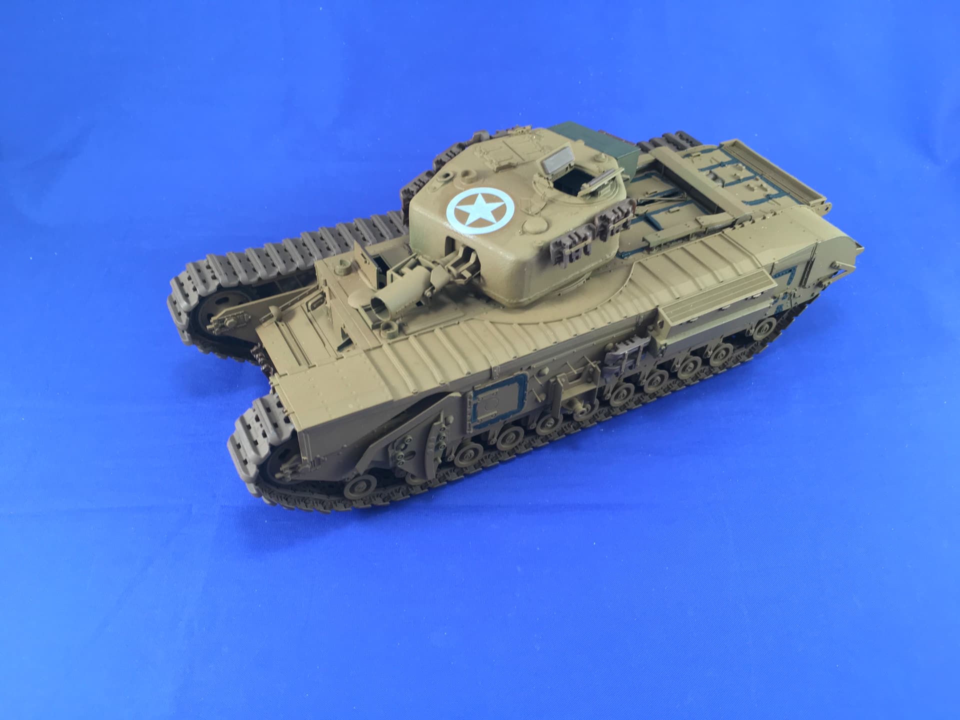
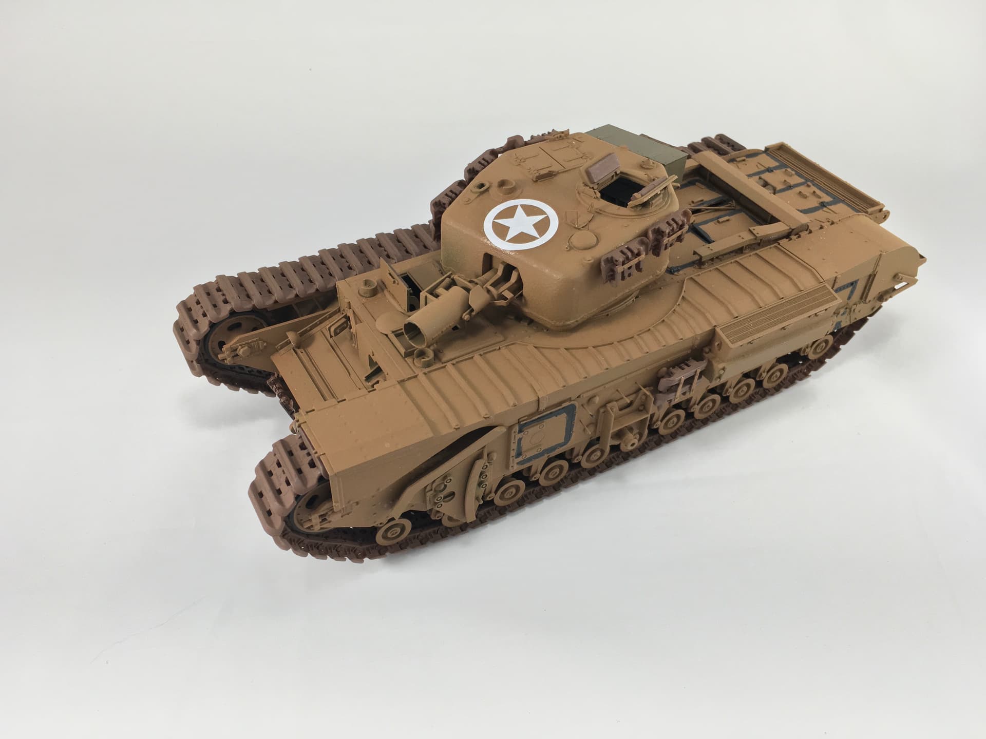
Next, I believe that you are right in your observations to some of the posters here that there is a lot of information to internalize and consider. If nothing else, you have demonstrated and proven that “THE standard” was no such thing. There was a bewildering array of evolving standards that resulted in multiple different colors of paint being used in an overlapping manner at any given moment in time (although not all of them for every purpose and some of them only for very specific purposes). One might characterize this with the old saying, “Too many cooks spoil the pot…” A lesson in bureaucratic convolutions if ever there was one.

However, if a modeler is able to determine just which specification was in effect for the modeling project’s subject at the time it’s being depicted, there was certainly a definitive standard by which the prototype paint was manufactured to satisfy. A definitive color standard was applicable and possible to provide to both the paint and end-item manufacturers.

That there were multiple different standard colors of “OD” available in the field which could be used in overlapping ways by different end users is also made very clear. A factory painted vehicle in the contract specified color only remained in that color until someone in the field or depot painted it in a different color or colors. Yet even those colors were manufactured to standard (exacting as the tolerances of that standard allowed).

I also believe that given the documented scientific exactitude (its history and employment) to which any specific color of any paint could be accurately measured and therefore manufactured to standard, this paper does a lot to mitigate the validity of the argument that "anything goes. The color measuring technology was mature, long standing and widely available. The argument that, “Enforcing the color standards was simply not possible or practical” is just not historically accurate or valid. Latitude within the standard made by the applicable governing bureaucracy may have been allowed, but variation would have been accepted only within the limits or tolerances of that standard. A standard with no tolerance for variation would have been expected to match that standard or it would not have been accepted (or even manufactured, since the paint makers would have had access to the same measuring technology).

My first read did leave me a question regarding the change of the standard factory
ES474/680 lusterless / OD319 to OD 108 semigloss:

Why? What was the reason for this change just BEFORE the end of the war? The change was made before the surrender of the Japanese. The war was still on going and the invasion of the Japanese home islands still possible, so presumably the use of OD 108 semigloss in combat was envisioned. Why was it then considered suitable for use in combat before the end of WWII while clearly the War in Korea demanded a return to a lusterless color. I understand that the main focus of your research was on the colors and standards, themselves, and not necessarily on the reasons and thinking behind them, but I wonder if you learned a reason for this this ALMOST end-of-the-war change?

Finally, I suppose the debate about the validity (or lack) of the concept of “scale color” or “scale distance” will continue even after this work. The “factory color” standard may be fairly certain and fixed (in hue, chroma and value), but the perception of value and saturation of that color as influenced by distance, atmospheric interference and other effects on the light reflected from the object to the viewer would still seem to be major considerations for the scale modeler.

2 Likes

When we corresponded previously you provided me with a ton of background information going back to the mid-60’s which ultimately led up to the implementation of MASSTER in 1973. It is a fascinating story, especially the original implementation instructions to the field which included a pattern on a sheet of 8 1/2 x 11 and instructions for everyone to draw scale drawings of their vehicles, and then transpose that pattern onto the drawings.

I have no doubt that those instructions caused a HUGE backlash from the field in the form, of “Are you KIDDING? Do you REALLY expect that “Joe” is going to be able to do THAT???”

That ultimately resulted in the annex which contained all the vehicle drawings with patterns superimposed on them. While not actually implemented at the time, that annex was dusted off in 1973 and was the one attached to the 1973 version of the USAREUR Reg which kicked off the program for real.

THAT Reg is the one which neither I nor anyone else I have been able to get in contact with, seems to be available anywhere.

2 Likes

:rofl: That sounds so familiar! My father was a master machinist, so I grew up understanding tolerances. My educational background is in geochemistry, where “a constant is a variable that changes slowly enough or regularly enough to be measured within an order of magnitude.” It’s a joke, but sometimes a rather grim one. There are some people who just can’t deal with variables.

Color models are three dimensional, but unfortunately often represented two dimensionally. They are all mathematical models trying to replicate what the human eye and brain “see.” The problem is, no two human eye-brain systems see exactly the same way.

Furthermore, with transmitted color, you can know the exact wavelength. Not at all true in any respect with either synthetic or natural pigments … Here there be tolerences! (Apparently a species closely related to dragons and sea monsters.) :roll_eyes:

1 Like

So I take it the link and the attachment are safe to open? I saw this come through my email the other day while I was out of town. I’d like to dive into the subject. No offense, but I’m wary of opening a link to a doc in a forum from a new member.

1 Like

One thing to always remember about any color photographs before the 1950’s is that they all had color shifts as they aged.
Kodachrome was especially known for a “blue” shift. Agfa color film sometimes become less saturated and can have a color shift towards a bluer tint. (Back a decade or so there was a huge discussion that the colors that had always been used for WW II German uniforms and vehicles were wrong since the color shifts in the Agfa films were never taken into account)
I believe that the paint batches were not as quality controlled as they are today, there weren’t any Federal Standards or Pantone standards.
While I have never seen a US Army vehicle that had a “purplish” fade to its olive drab, the paint used on US aircraft at the time was known to fade with a purplish tone.
Color also depends on the wavelength of the color. With a 1/35 scale model, to have a correct color it must be modified since the color won’t be the same wavelength. Most ship paints that are sold for specific colors have be adjusted so they look correct.
Good luck with your research. We’ve been disagreeing about Olive Drab for as long as I can remember.

1 Like

You keep using that word. I do not think it means what you think it means.

Simply put: wavelength is colour. That is to say, the only thing that determines the colour of light, is the wavelength of that light (or the frequency, since the two are directly related).

What you seem to be talking about, is the much-debated “scale effect”, which is the theory that a model painted in the exact same colour of the real thing will look darker because it’s smaller and so reflects less light. Some people claim this is true, others claim it isn’t, and both sides support their stance with theory and experiments.

(FWIW, I don’t care either way. I want to have a decent understanding of what the real colour was supposed to be, so I can pick a model paint colour that seems appropriate.)

3 Likes

you beat me to it. Scale effect is real, but whether is it necessary to invoke on a model the size of a shoebox is questionable. Like you, I have no opinion on that question, Id rather know the correct color to start with the project and then make a determination.

Scale effect is true though. But at what scale does it become important I don’t know. When I was deciding what size to cut the paint chips I had manufactured for this project, I drew upon my own experience during the research phase. The smallest size and most useless chips I came across were those in the original FS595 binder of 1956. They are .75" x .5" and the darker greens are indistinguishable at that size. So I know that I didn’t want that. And at the other end of the spectrum were the FS595A,B,C 3" x 5" example which seemed overkill. The size I settled on was the size first used in 3-1f of 1943, 1" x 3". That was the smallest size chip I ever came across that adequately conveyed what the color was. So if a 1" x 3" chip was deemed satisfactory, then I don’t see the necessity of invoking scale effect for a 1/35 tank. But that’s my personal opinion.

2 Likes

These discussions on paint color differences between batches seem to be a military forum discussion. I do not recall this being in the automotive forums where members were saying different batches of automotive paint changed color so that on cars in a car lot there would be different shades of the same color. Why? What was the level of precision paint companies could achieve at the time? I am thinking they were pretty precise. When you see vehicles photos of newly built vehicles parked together, their color is the same. There had to be multiple batches of paint to paint all of those vehicles and it appears that the paint companies were consistent. I am not bringing in to the discussion paint thinned in the field. Is more of an issue between the different paint companies?

2 Likes

I have seen 3 Fender Jazzmasters, all painted “Surf Green”(there never was a Seafoam Green color in pre-CBS Fenders), which was a DuPont GM car color. The serial numbers showed the guitars were shipped out in the same 30 day window. All three had subtle differences in hue even though DuPont auto paint was one of the best. All three were different than the paint chip on the 1960 Custom Colors folder. The auto paint batches could definitely have variations even with the exacting standards of GM and Ford. Even today, Fender’s Custom shop has information as to how its original Custom Colors cannot be 100% replicated with modern paints.
who knows how different each Olive Drab paint batch was from one to another. Were the paints sourced from multiple vendors.
The “scale effect”is not so much with all items being the same scale, but it can be an issue when comparing photos and full size vehicles to the various model paint offerings.

3 Likes

From the photographic aspect, a direct comparison isn’t really definitive as it could contribute to an incorrect interpretation.

The early image of Shermans was taken on film. (Later digitized) Not all film stocks were the same. Some films could produce over saturated colors, while some produced desaturated colors. Age will also factor in to photos printed on paper. So we know that the colors, as rendered aren’t going to be accurate

The photo samples of the model tank doesn’t appear accurate either. Although digital images are technological marvels, they don’t always produce accurate colors. With digital images, white balance plays a role in how accurate colors appear (along with vibrance, saturation, exposure, lighting or light quality)

To me it appears that the digital photos of the model tank is a little over saturated and slightly more vibrant. Add to that, a bit on the “warm” side, meaning the white balance was above 5400k (taken in high sun, no clouds)

So on one hand you have slightly desaturated and muted colors (uneven lighting) on printed paper (later digitized) being compared to modern digital slightly over saturated, and higher vibrance, slightly “warm”

Although your chips and model are “technically correct” the image renders it more “frog green” to my eyes. Digitally correcting the white balance and reducing saturation and vibrance will make the model look more like the real thing.

Edro

3 Likes

Hello Mark.
Thank you for sharing this huge work of yours. It is very generous of you.
Cheers Christian

1 Like

Which reminds me:

This would matter for a photo taken with a digital camera, but not for one taken on film. The film simply records the colour of the light falling on it in any given spot, but digital images are subject to a lot of processing (and the newer the device or camera software, the more of that it does) to try and make the image more pleasing to the eye, and these take into account the whole image in order to tweak the colours in any given spot.

Which, incidentally, is usually tuned for typical photographs of landscapes, people, etc. and can really screw with the colours of things like models:


These photos were taken some 2:30 minutes apart, which is about the time it took me to swap the background from blue to white, reposition the model and line up the shot to match the previous; nothing else changed about the photo booth, lighting, etc. Both were taken with the same iPad using the standard camera app and HDR mode switched on.

With a blue background the model looks green and the tracks are dark brown, while with a white background, the model looks brown and the tracks are not as dark as in the other photo. The white one is a more accurate representation of the model’s actual colours, because the algorithms in the camera app try to balance the image in all kinds of ways, which isn’t influenced anywhere near as much by the large areas of white as by the blue.

4 Likes

This would matter for a photo taken with a digital camera, but not for one taken on film. The film simply records the colour of the light falling on it in any given spot, but digital images are subject to a lot of processing (and the newer the device or camera software, the more of that it does) to try and make the image more pleasing to the eye, and these take into account the whole image in order to tweak the colours in any given spot.

Just so that you know. Both film and digital records light and color. One onto a light sensitive frame of chemicals, while the other onto a digital sensor. Both receive processing. With digital, the processing occurs as the sensor captures the light. Processing of film, happens after the film is removed from the camera, in a dark room. The time the film is processed is dependent on how a photographer chooses to “develop” the images.

With a blue background the model looks green and the tracks are dark brown, while with a white background, the model looks brown and the tracks are not as dark as in the other photo. The white one is a more accurate representation of the model’s actual colours, because the algorithms in the camera app try to balance the image in all kinds of ways, which isn’t influenced anywhere near as much by the large areas of white as by the blue.

This is a perfect example of why white balance affects images. As you mentioned, digital cameras do a ton of processing. Most consumer grade digital cameras, such as your ipad, are set up to automate everything. Things like exposure and white balance are automatic. This means that when you took the photo agains the blue back ground, the camera automatically set white balance to best match the overall scene. The give away is the star on the tank. If you isolate the star on both images, they will not match in color. Keep in mind that white balance control is just a standard, it is not intended to make all white objects in the photo appear perfectly white, it is there so you can control color casts caused by the type of light you photograph in.

If you were to use a DSLR camera, in your comparison, you can manually set the white balance control and the end result would be that the color of the tanks would not be different, but the blue in the blue background would not appear as “blue”

Edro

2 Likes