And this is why I don’t do German armor any more.
I’d call those IJA Yellow, Desert Sand, Desert Pink, and DunkelGelb.
2 Likes
That’s a pretty accurate description in my book Robert!
1 Like
From left to right:
Swedish pea soup (made from yellow peas)
Hot chocolate the way my kids like it (far too little cocoa and way too much sugar)
The way my wife drinks her coffee, 50-50 with milk and lots of sugar
German pea soup (made from green peas)
2 Likes
Used to get into endless discussion (arguments to outsiders) that Dunkelgelb sometimes looked Desert Sand back in the day with my German AFV modeling friends. This was long ago before any of us knew about the four variations Dunkelgelb.
It’s quite funny in hindsight.
Good times!
1 Like
The Four Dunkelgelbs of the Apocalypse
![]()
![]()
4 Likes
The Four Dunkelgelbs of the Apocalypse ![]()
Yes indeed. Usually a can of worms such as this would have already devolved into a swirling vortex of vitriol by now. ![]()
Heading for the bunker now…
2 Likes
Time Machine Hobbies in Manchester, CT also carries this line.
Bill
1 Like
Allow me to kick over the can.
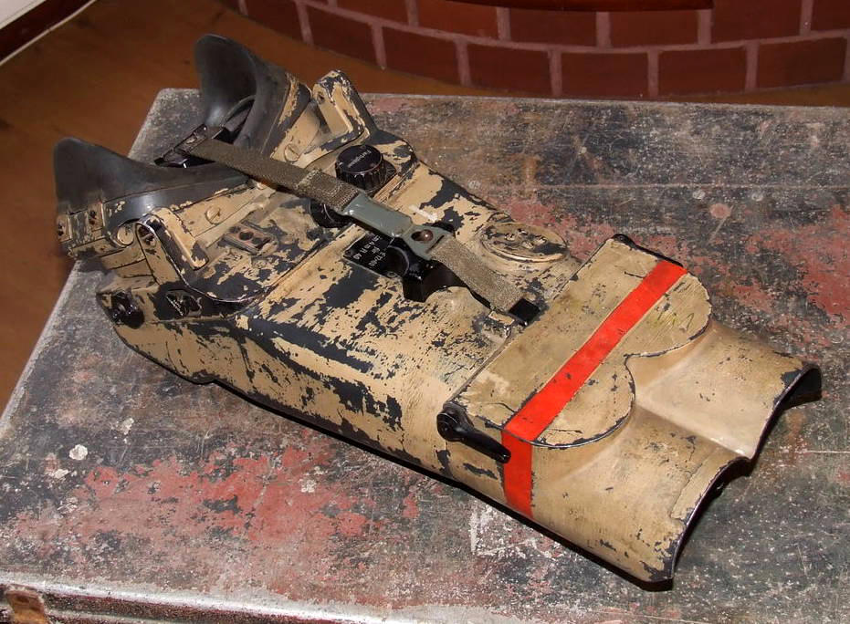
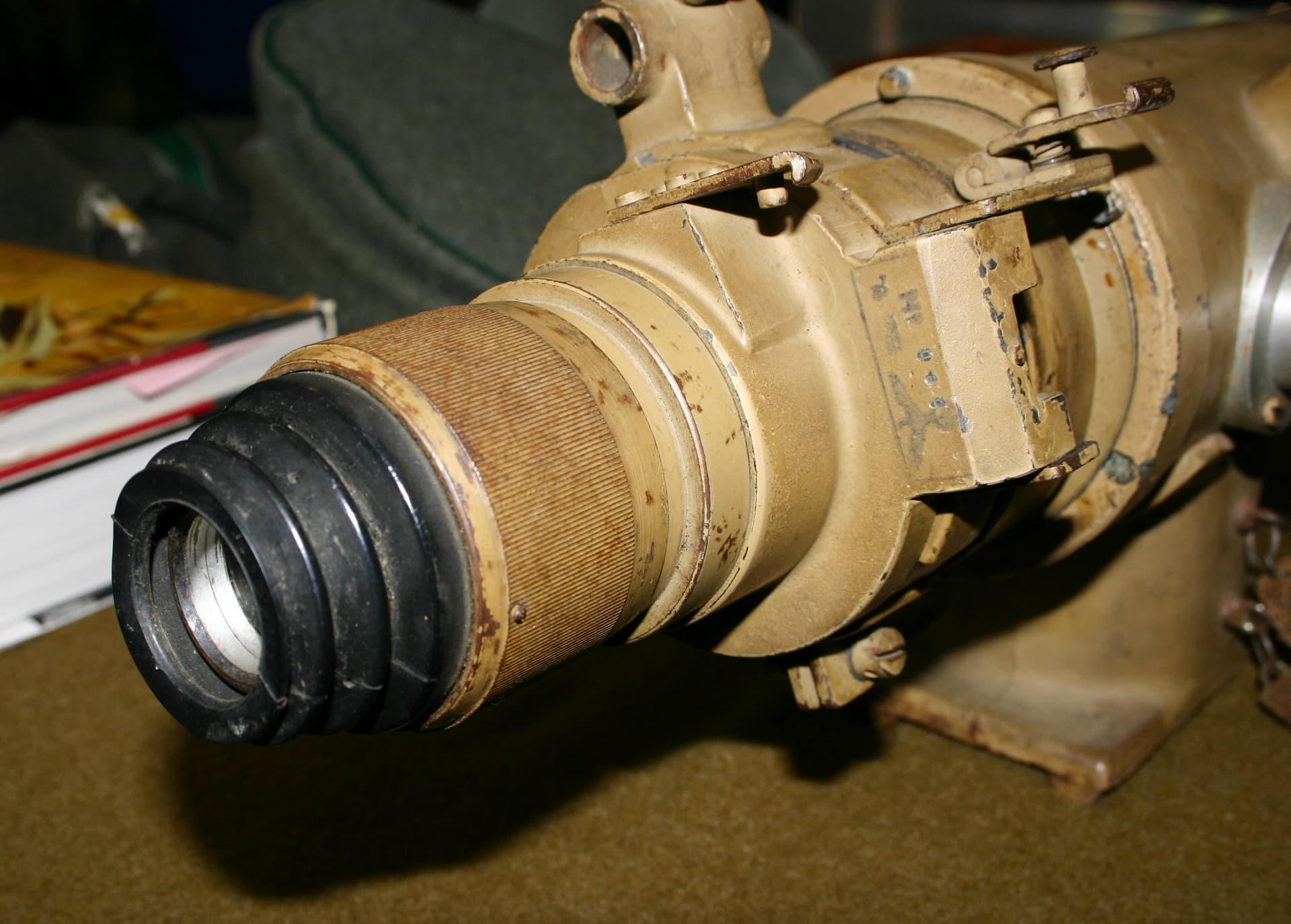
Pop quiz! What flavor is this;
I thought there was a Dunkelgelb Lite? ![]() (“Hell”), see above post by Headhunter506.
(“Hell”), see above post by Headhunter506.
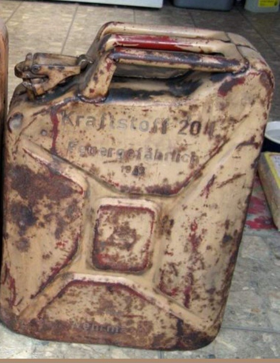
Not seeing it amongst the spoons. Or is this spoon number 2 plus 75 years in a swamp? The rest of these colors have held up pretty well, all things considered.
The grenade case on the far right seems in fairly good shape and looks pretty close to the roof panel’s color. And probably hasn’t spent most of its post-war life in a swamp. The grenade case in the middle looks mighty close to spoon 3.
I thought there was some tale about a 251 in Bovie with 7 different shades? Looking like at least 5 here so far. Or not. Maybe it’s just faded. Don’t shoot the messenger. I’m just posting photos, not laying down dogma.
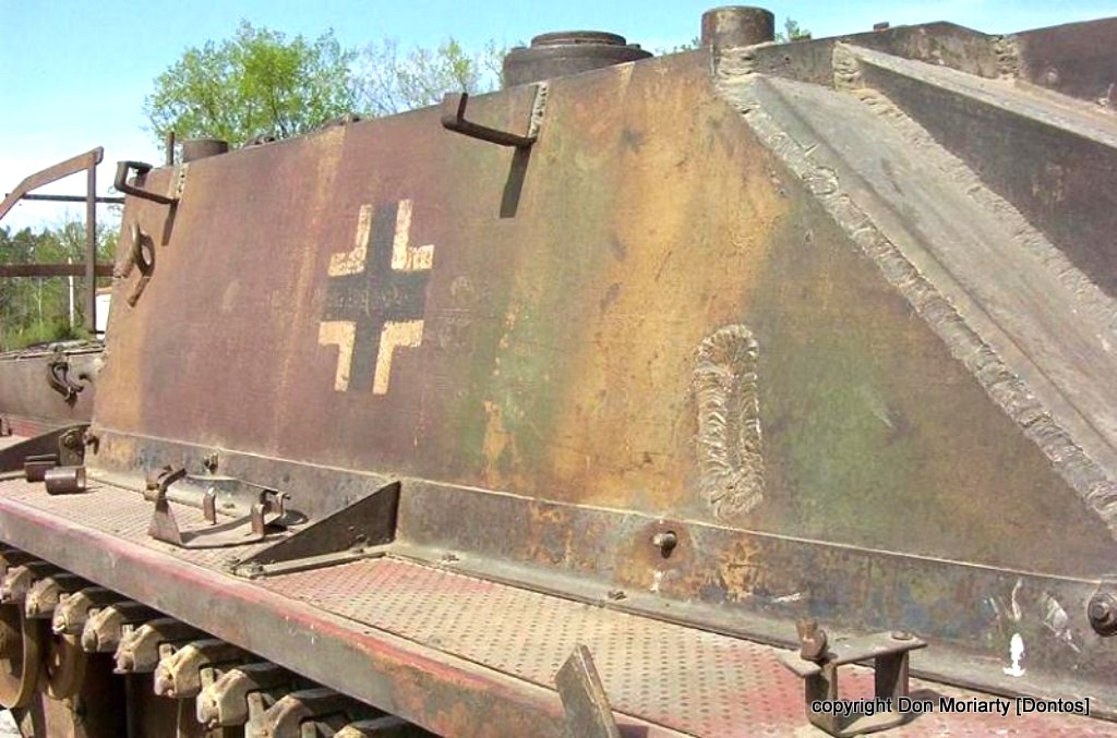
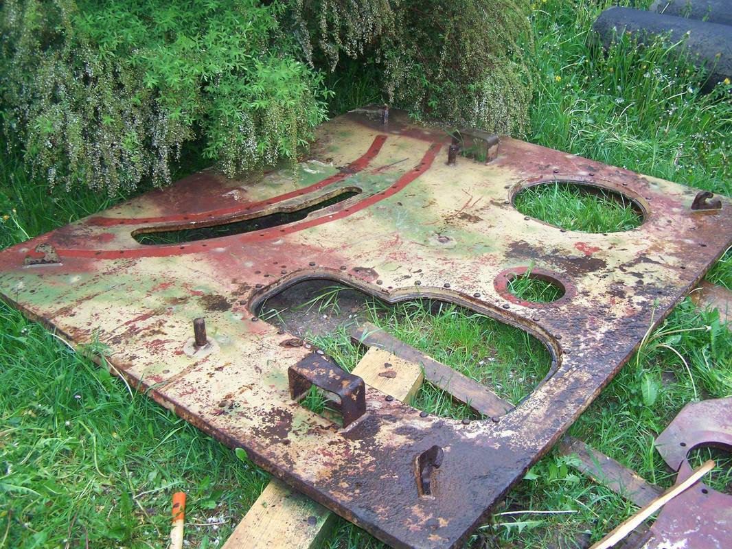
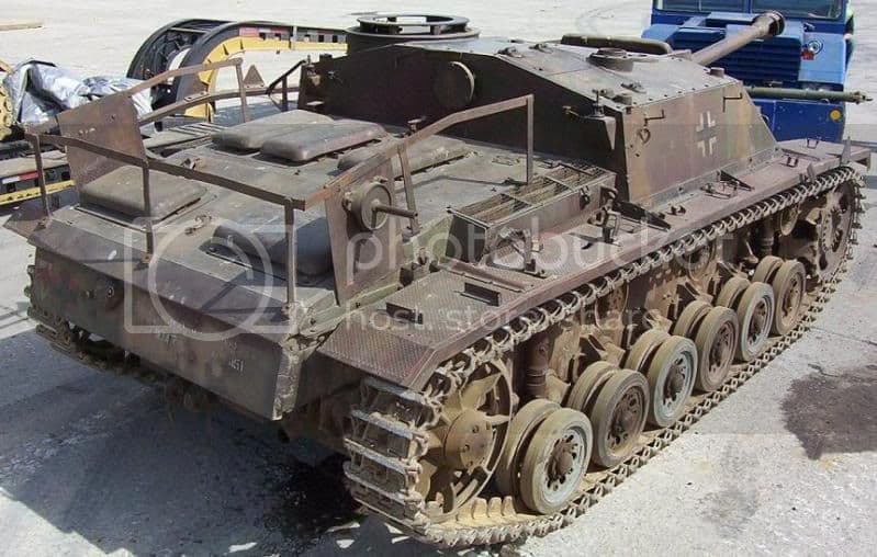
This is the Ft. Benning late Stug III G, (former Ft. Knox), in original paint. Looks mighty yellow to me, along with the Red Oxide peeking through on the mudguards. Guess we reverted back to earlier Dunkelgelb nach Munster.
And while I’m at it, why did the Germans outline the Balkenkreutz on the rear in red, yet the ones on the sides are in white? Shouldn’t the low visibility markings (aka. “Aiming Points”) be on the sides? Who’s looking at the rear? Your own troops!
And yes, I understand how differences in light temperature, film color shift, digital camera color bias, monitor color balance, as well as a plethora of other optical / film / digital color photography variables can affect an image, so we can skip that discussion. ![]()
I like my worms with some hot sauce, Carolina Reaper anyone? ![]()
6 Likes
As all German vehicles were initially base-coated in the factories, I would think that the paint was pretty well applied consistently. But, yes, the small cans of pigment paste supplied could be thinned with water, oil, gasoline…just about anything wet.
![]()
![]()
2 Likes
Not trying to stir up controversy, and I am not an expert, but weren’t US vehicles base coated in the factory as well? Or was that done by the units?
The only reason I ask is that many on this forum can attest to the many shades of OD. If it was applied in the factory, common logic would (at least in my mind) say that the Germans could easily make this mistake. However, I am no expert and my statement is only food for thought. The Germans may have been more thorough, ![]()
EDIT: Are you talking about the consistency of the paint, i.e. thick or thin, how many layers, etc., or are you talking about the consistency of the colors (I.e. pigmentation, etc.) themselves? Probably should’ve asked that first before throwing my hat in the ring ![]()
FWIW - Speaking Olive Drab, there was an outstanding pair of pictures floating around on this forum I think showing an AFV in OD ar Saumar Armor museum in France. Same tank in one shot it was OD in the other it ws Khaki. Same day, same camera, same film & same photographer but different times of day & lighting.
3 Likes
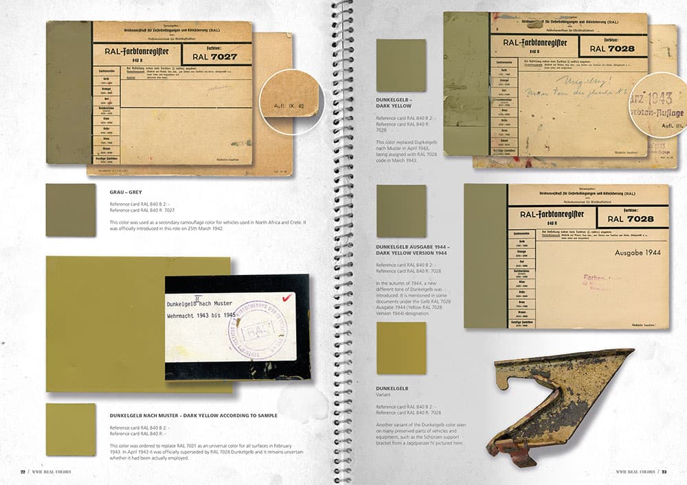
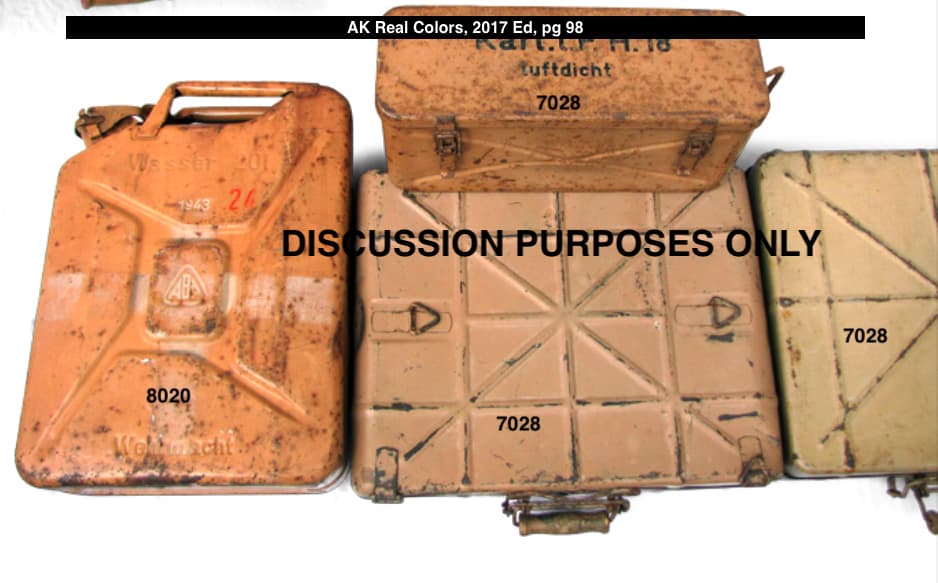
Here are the actual RAL Farbtonregister cards for Dunkelgelb, except for Dunkelgelb nach Munster, which has no RAL number. Note, disregard the first entry, RAL 7027. This research was conducted by this team of authors and modelers;
A video review of their product;
https://www.youtube.com/watch?v=HT0GwFn02HE
Review of book posted on Missing Lynx;
http://www.missing-lynx.com/reviews/other/realcolorsofwwiiarmorbookreviewbg_1.html
Can anyone recommend a more up to date, concise and well-researched guide on the subject?
If it passes through Missing Lynx’s review without demerits, It’s good enough for me. And no, I don’t believe this book is merely a sales pitch for AK paint products, look at the RAL cards for yourself.
Make of it what you will.
2 Likes
Here an older thread from this forum about Archive Armorama: AK Real Colors of WW2 that also may be of interest.
Ordered it, look forward to checking it out.
2 Likes
Note that the review I posted is the revised and enlarged second edition.
3 Likes
Adding another opinion here (worth every penny you paid for it) but with some photo reference for support as well.
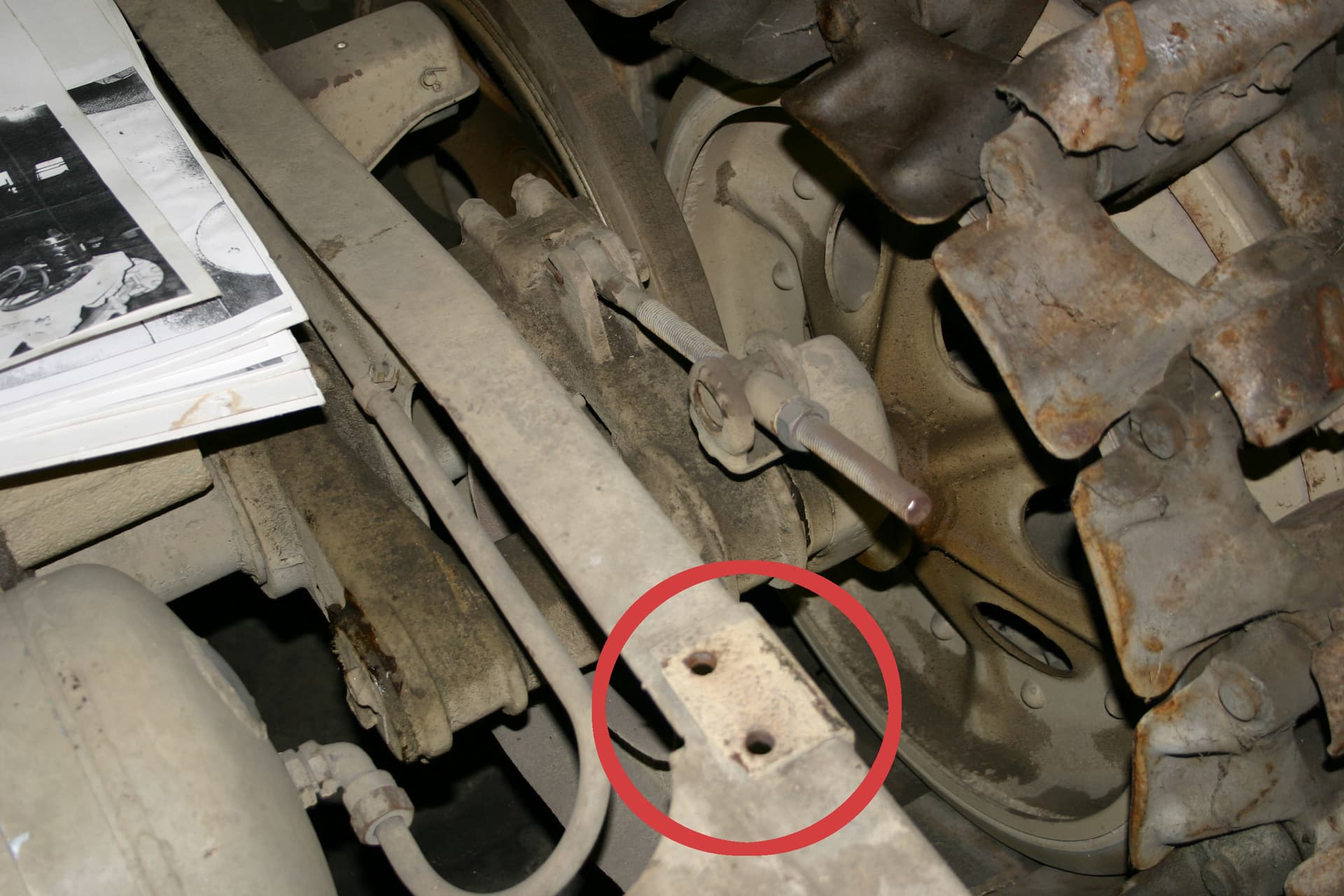
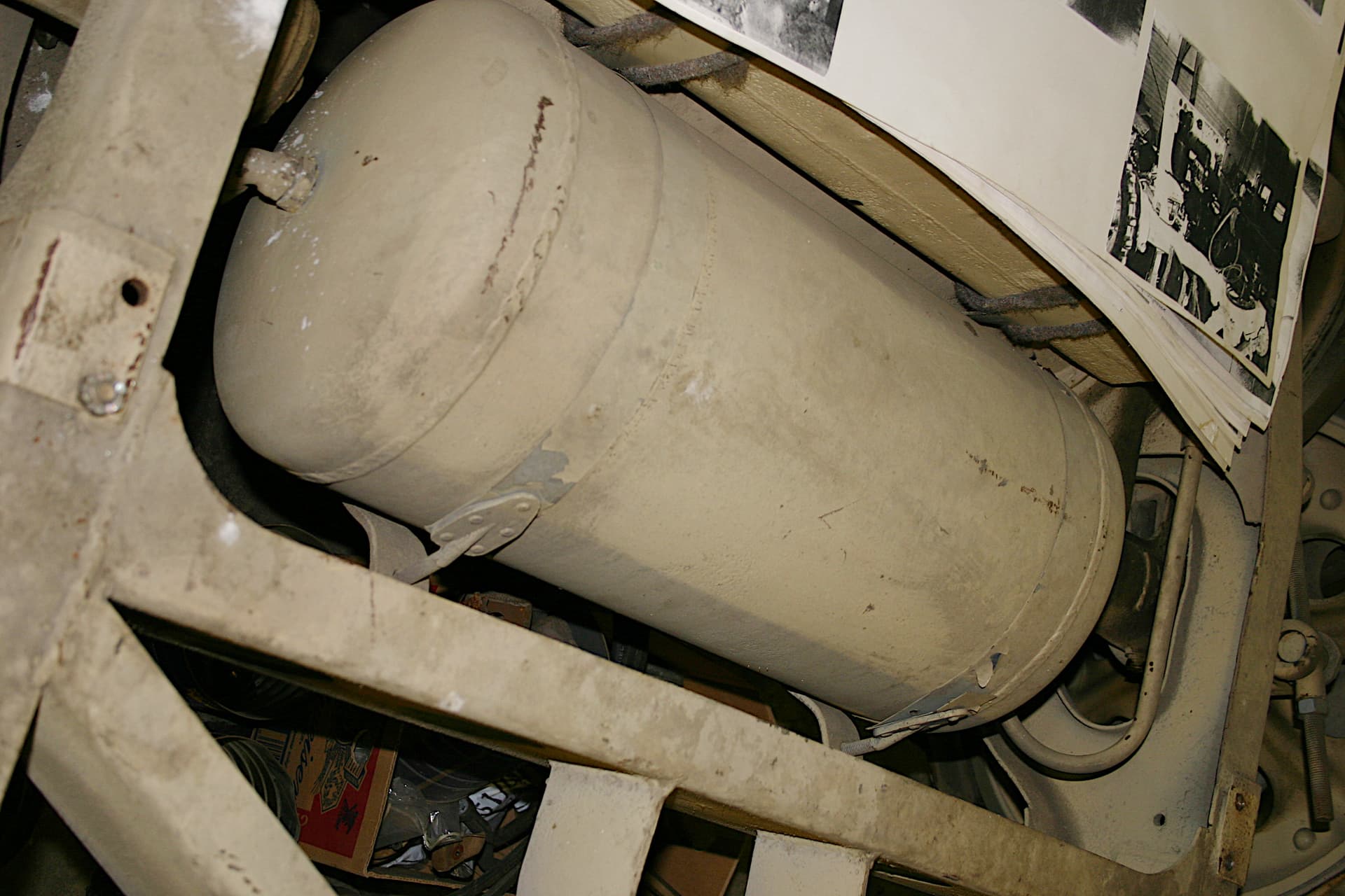
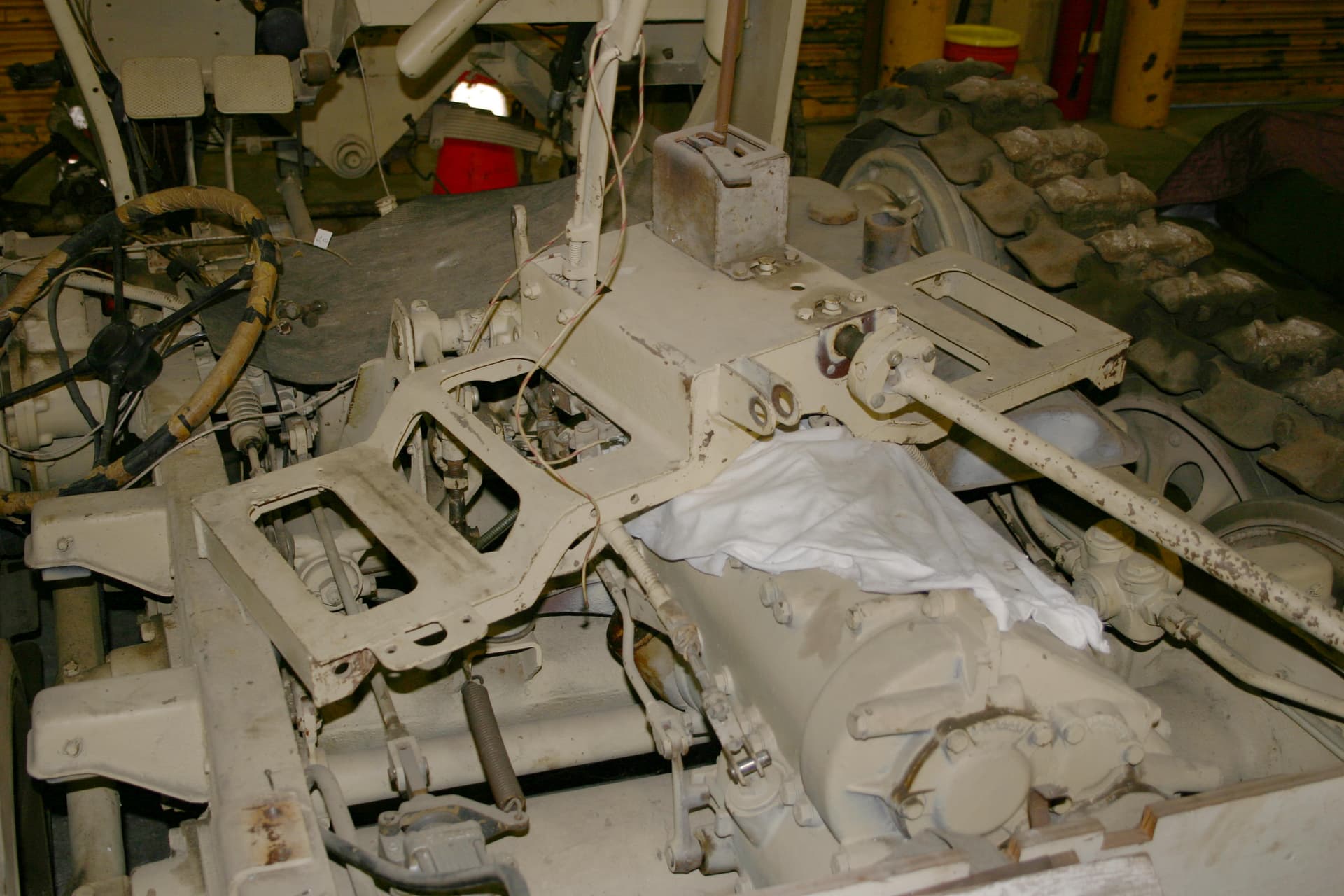
When the Patton Volunteers dissembled the Museum’s 251 for restoration it was agreed that while the colors may have aged 60+ years, the paint under the floorboards was almost totally protected from the effects of sun fading as well as most of the dirt.
So notice here the protected area circled in red that had not only been under the floor plates but also under a now removed body mount. I was totally surprised at just now much lighter the shade was than so many of the premixed dark yellow model paints on the market.
Unfortunately I have to ask you to trust in the fact that this photo properly represents what was seen that day.
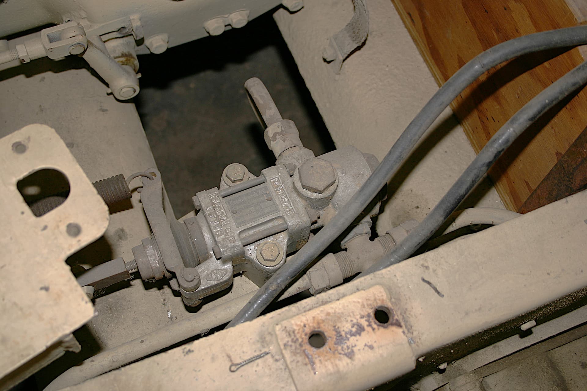
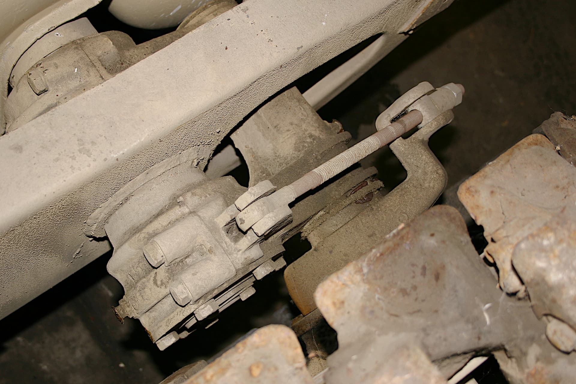
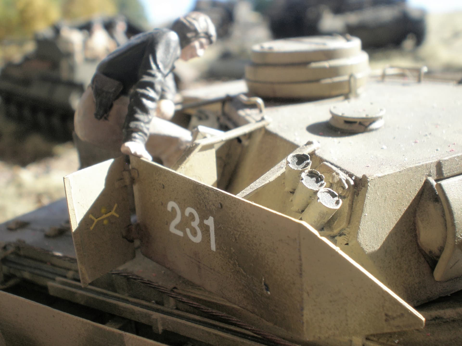
So as regards the AK real life samples, I too would recommend the grenade case on the far right. But also know that when the floor plates where raised on the Patton 251 it was noticed that many pre-painted sub-contractor supplied items; air tanks, brake valves. etc. were seen to vary in shade. So I am not at all surprised in the variations of these many AK “real” samples.
More possible reference:
Other references:
On thes two original perion piece we shoul look at the highlights (bright spots) to see the truest color shade.
3 Likes
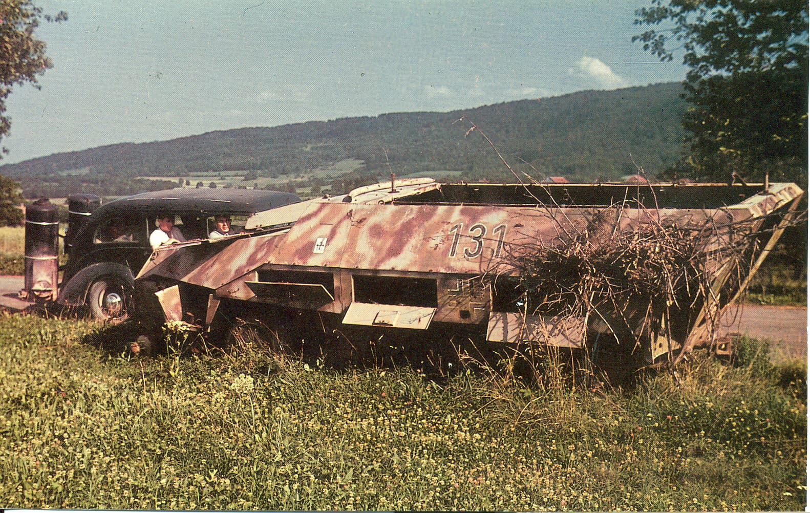
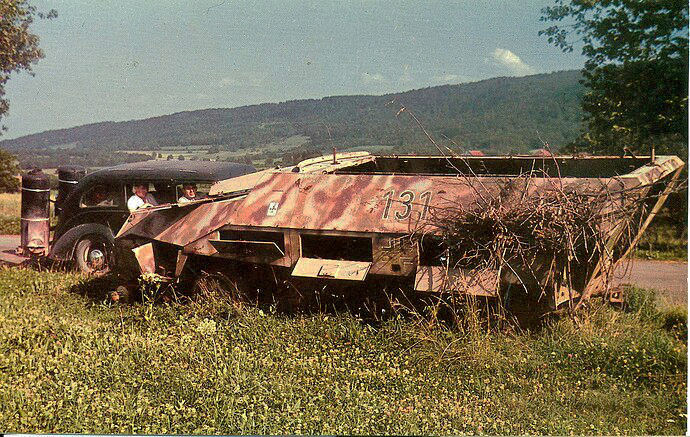
An Agfa color slide of a 251D, postwar. Looks like they mixed Dunkelgelb with Rotbraun to get the 3rd color.
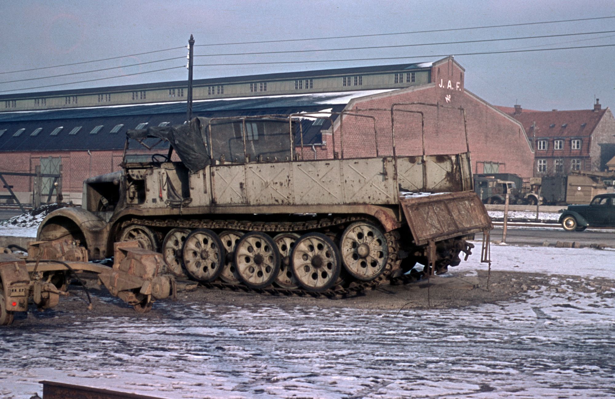
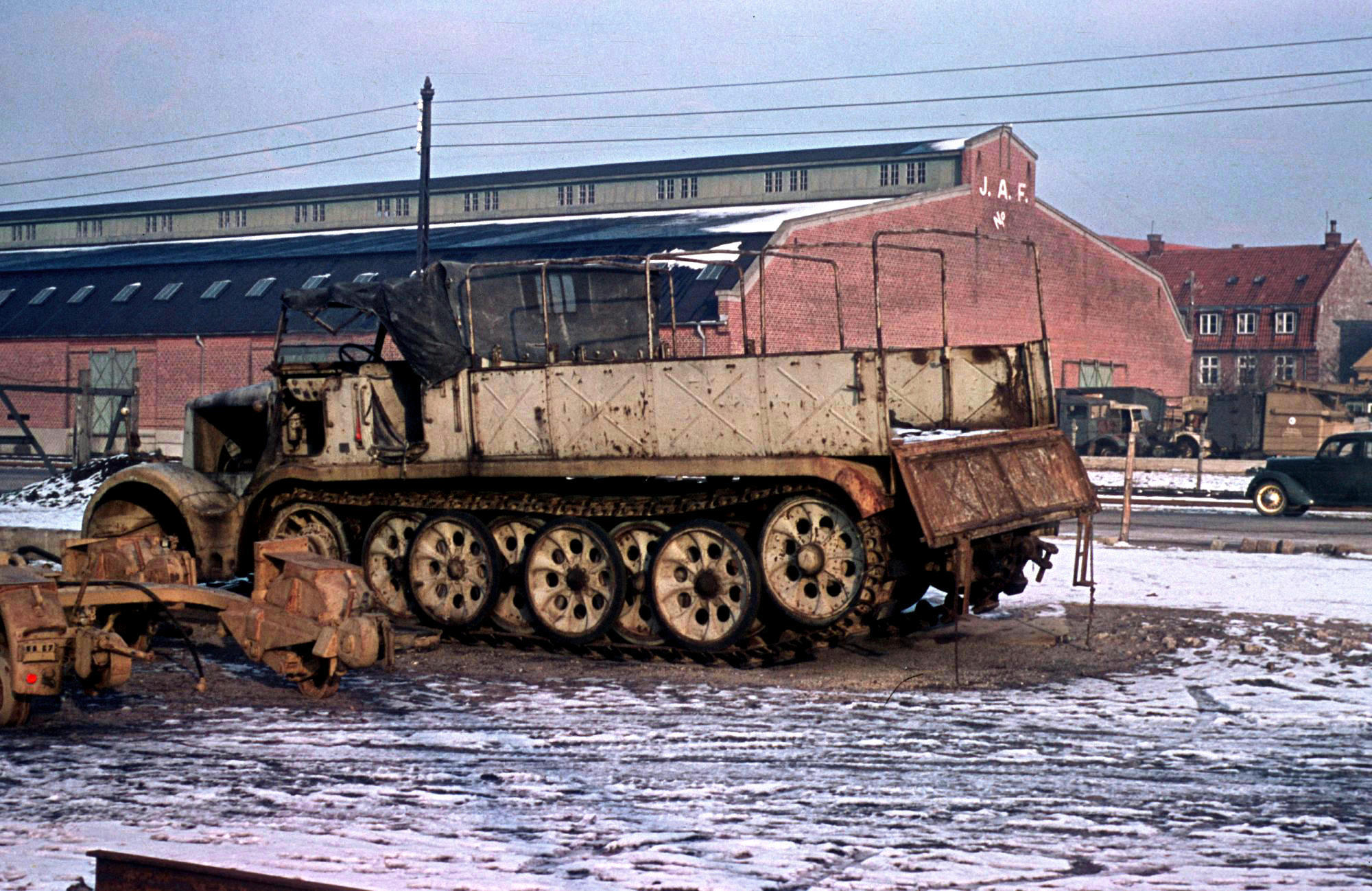
SdKfz. 9 in Denmark, postwar. Note the color difference with the trailer to the left.
3 Likes
The Dio cops have laid off this one because contributors have been so tolerant/intelligent/knowledgeable - it’s just way too disappointing. What happened to the good old days of verbal mud-wrestling & handbags at dawn?
But seriously, another variable to consider is scale-colour. Any shade lightens and lessens in intensity (to varying degrees) the further away it is. Take jet black, up close it certainly is but 20 or 30 feet away it looks very dark grey particularly in strong light. Building typically at 1:35 scale the viewer is around that far away from the real thing, so to speak. Which is why, whatever colour I use (on AFVs anyway), it gets an approx. 20% very light grey additive. Even up close, in shadow or not, I think it looks more plausible than a lot of manufacturer’s examples straight out of the bottle…
4 Likes
Paska - having more than a few years in the photographic business I tried my best to give your two photos somewhat more accurate contrast and color saturation values. I feel these changes only strengthen your examples.
2 Likes
The handbag broke during the last duel, haven’t gotten around to fixing it.
I am thinking about reinforcing the handle on my old attache case.
It looks friendly with the soft leather covering but there is a half inch wooden frame inside.
Adding a plywood board inside and some cross braces would turn it into a gret ‘skull-buster’
![]()
![]()
![]()
2 Likes