My interest in British WW2 AFV’s has increased but my knowledge still is limited. In middle age there seems to be an upper limit to number of consecutive worn Wehrmacht and soiled Soviet AFV’s builds I want to do.
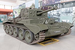
Is the Bovington Cromwell in World War 2 SCC #15 Olive Drab or a post war color?
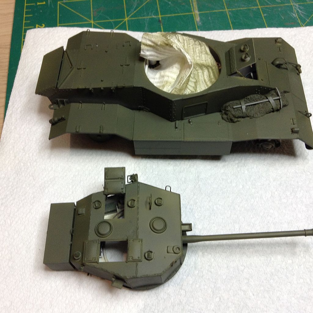
British SCC #15 Olive Drab in 1944 - any suggestions for good color reference & information?
I’ve read British SCC #15 Olive Drab was close to but not a match for US Olive Drab. Can anyone point me toward a reference to see the difference?
How does British SCC #15 Olive Drab weather and fade over time more green or more brown?
Don’t trust anything Bovington has on display; most exhibits were repainted over several decades long before any accurate colour intention became fashionable. In fairness this was probably to get the exhibits inside and painted as soon as they could but you won’t find many really accurate schemes. It must be remembered that a lot of the exhibits were painted in whatever colour was to hand and those that languished outside were often given a coat of Deep Bronze Green just to protect them from the elements. I myself remember as a child the Panther and Tiger in a gloss medium grey, the Jagdpanther in DBG and the Lynx in a gloss pale green. All a bit strange!
The Cromwell appears to have been painted in a more modern British Army NATO Green – which I suppose is at least hereditary-wise going in the right direction.
Mike Starmer’s formulae are the way to go – in my opinion of course.
I have found that mixing your own color is effective . I start with a od and add a brown or golden brown to get the desired color .
By the time you add weathering the tone changes . It is also good to remember that prior to 1941 their vehicles were painted gloss . That will also affect the color choice . As a idea this is a sample of what thw base color looks like .
middle bronze green with either dark or light bronze green disruptive was the scheme at the start of the war until 1941/2 when they were gradually replaced by olive green. however i am not sure if that was because shermans became the main tank and is a generalisation or because the british did actually change their own tanks colour schemes
Sorry Stewart. Deep Bronze Green No.24 was a pre-war colour replaced in 1939 by Khaki Green G3 and where camouflaged with Dark Green no.4 patches. The base colour of British and Commonwealth colours was changed to Standard Camouflage Colour (SCC) 2 Brown in 1941 which continued until SCC15 Olive Drab was ordered to be introduced from April 1944. The only variations were vehicles repainted for North Africa, and the Mediterranean Theatre and of course the Centaurs used on D-Day which remained SCC2.
Wade. Hard to trust any colour reference unless you go for an original paint chip sample. The colour on your monitor will show colours different to other colours and restored vehicles are painted whatever the owners get that they feel is close - museums too. Then years of dust and just age fading changes what you see know to what it was 70 years ago.
If you have no joy on the AK paints suggested, try Mike Starmer’s latest mixes (he updates them when the manufacturers change their paint mix):
Tamiya Acrylics: 5 parts x XF81 + 1 part x XF58 + 1 part x XF71. (Get a 10ml jar of XF 81 and add 2ml each of the other two colours. I add about 20% gloss and use Tamiya Lacquer Thinners too to make sure the paint is smooth)
Humbrol enamels 5 x #150 + 5 x # 159 + 2 x # 33
These are straight matches to original chips, 1:1 scale, so people allow for ‘scale effect’ which kind of defeats the purpose of wanting an accurate match and weathering will change the base colour anyway, as the other guys have said. I use the Tamiya mix and I am happy with it.
megamodels.com carries the AK real colors, and, are the cheapest available at $3.99 a bottle. Plus they have “kits” of 3/4 colors of different vehicles/theaters. Hope this helps, Joel
megamodels.com carries the AK real colors, and, are the cheapest available at $3.99 a bottle. Plus they have “kits” of 3/4 colors of different vehicles/theaters
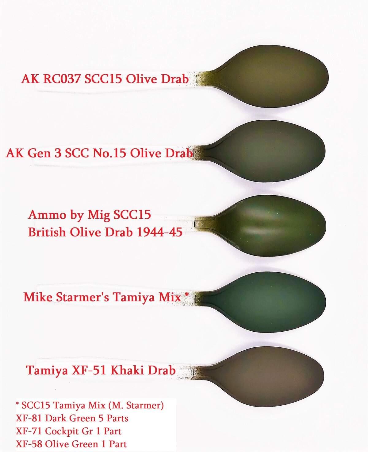
To give you an idea of what the different colors of SCC15 being sold by companies right now compared to the color chip provided by Mike Starmer, David Nickels did a test:
Whoa that Tamiya mix looks way too green in that spoon picture.
I have just sprayed my AEC for the Miniart build with the mix and holding it up to the screen they are light years apart in colour.
This is the result of my using the mix. NOTE there is a little buff added to the mix which I oversprayed in some parts and this shows up in the slight colour variance - look at the darker colour in both pics to see Mike’s mix. One in natural light:
So a perfect example of why you do not accept what you see in pictures, there is just too much that can change the colour as presented. This is the same problem when trying to interpret colours from photos. The exposure in the picture, natural light, shade, cloud cover all play their part in making sure you never really see what is there… and why there is so much confusion about what British OD really is… more brown in low light and more green in bright light…