Thanks! I’m trying to make sense of your suggestions (I’m not a native English speaker, so some words are not obvious to me). The brass on the corners is a good idea.
1 Like
I see some are not exactly ninety degrees - you can cut the inside of the angle with a grinder or a Dremel cutting disk, then clamp it and bend it to the desired angle.

3 Likes

Very nice!
3 Likes
Thanks Robin
2 Likes
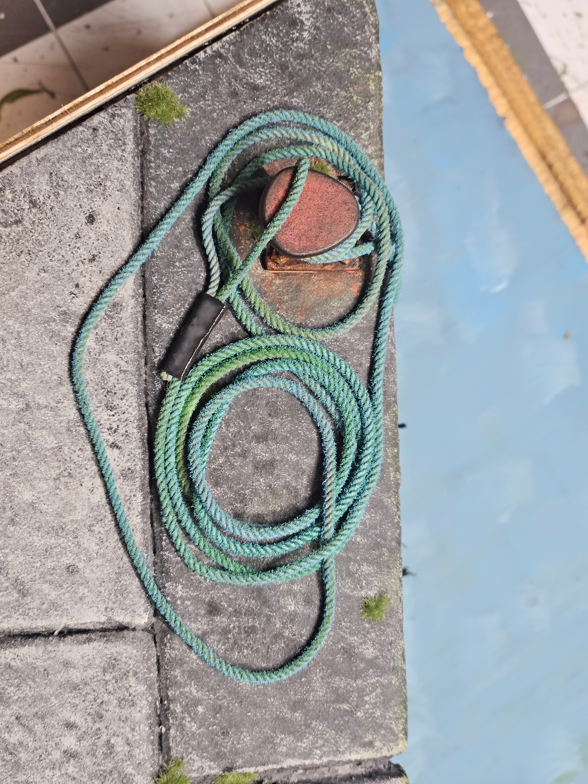
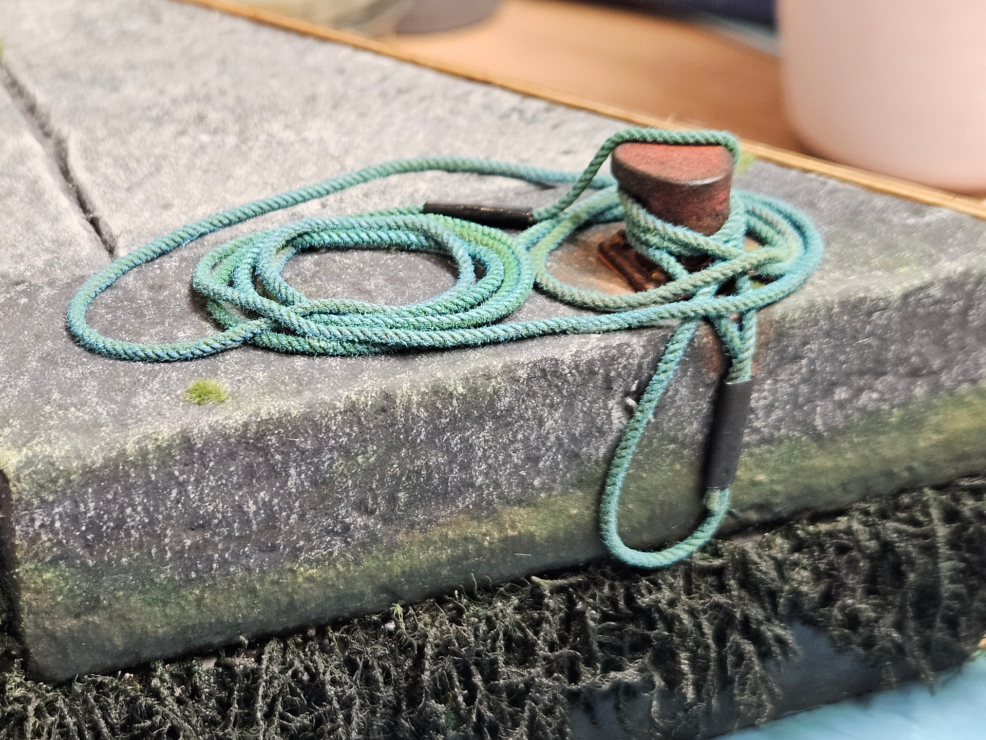
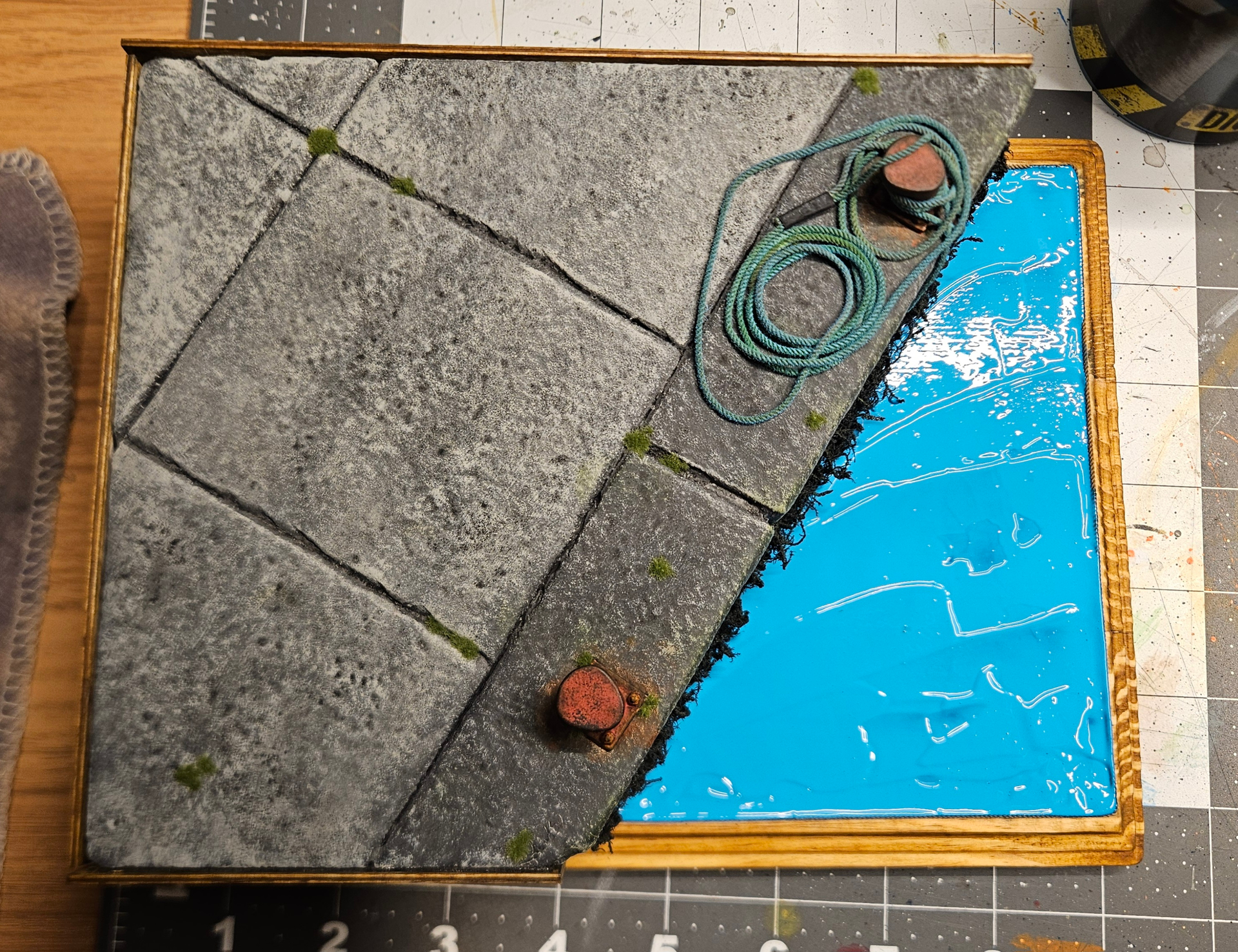
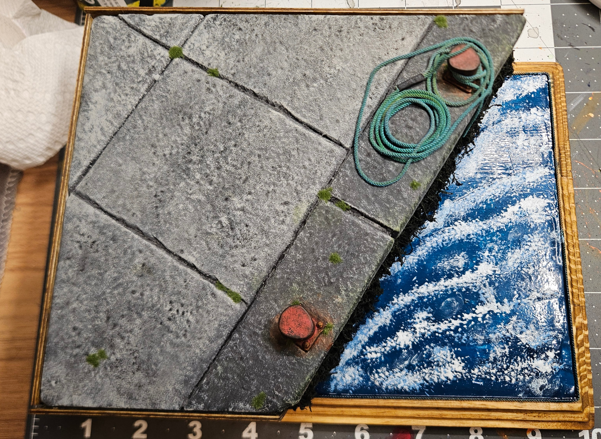
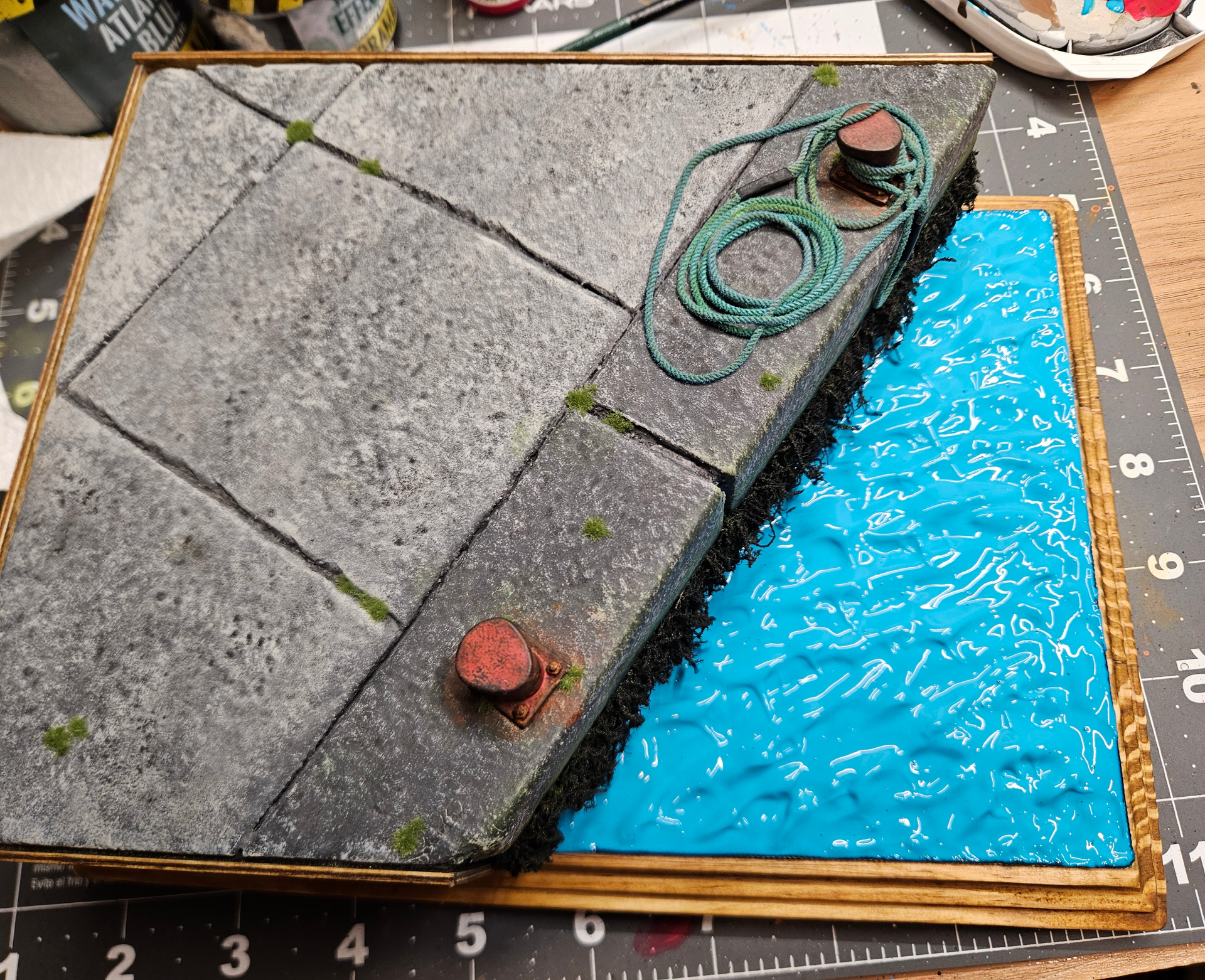
You have a great eye for the little effects and details that make bits like this authentic. The chipped and worn smooth metal effect on the bollard really works beautifully- as do the small weeds and mossy tufts. The green coloured deposits on the rope and that lovely fading is exactly what you would see down on a quayside like this.
3 Likes
Oh Karl, you’re making me blush! Lol. That’s really nice of you.
2 Likes
I think it’s highly inappropriate to try and pass off photos of real items as your own work.
6 Likes
Wow, what a great compliment! Thanks
2 Likes
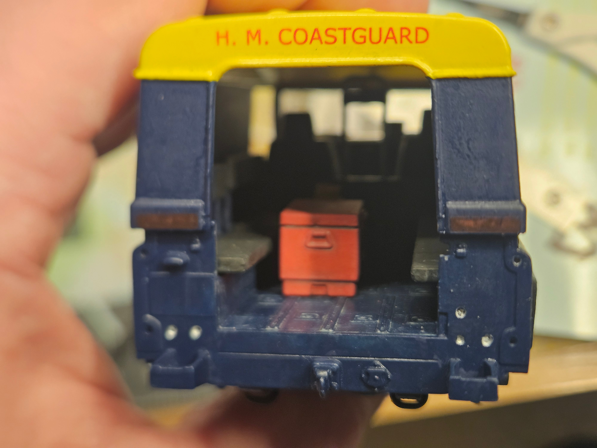
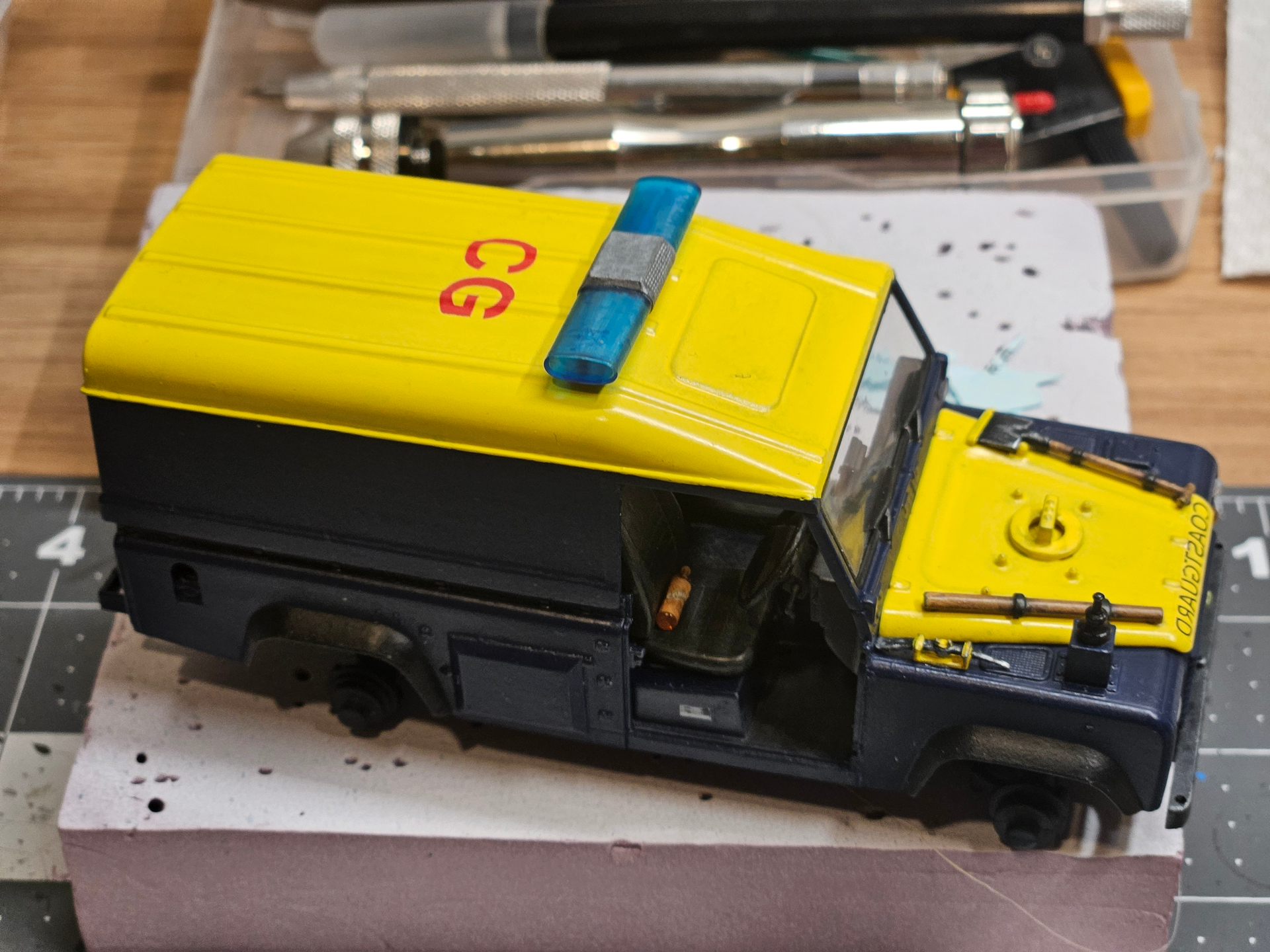
Things are not going as planned with the decals I printed. Colors are too transparent and almost disappear on the dark background. See below: red decal on yellow works great, but red on Prussian blue is hardly visible. I tried a yellow decal on Prussian blue, and that’s the same.
Any idea how I can remedy this problem? Printing on white paper could work for simple shapes, but for letters i don’t know.
2 Likes
You may want to look at AM individual letter decals. Unfortunately, anything you print w/a home printer on clear decal film is too transparent to work w/dark backgrounds. Printing on white film with a dark blue surround may work, but it is hard to match the blue color.
3 Likes
Thank you for the suggestions. I look into AM letters.
1 Like
Looking great so far.
2 Likes
Thanks ![]()
1 Like
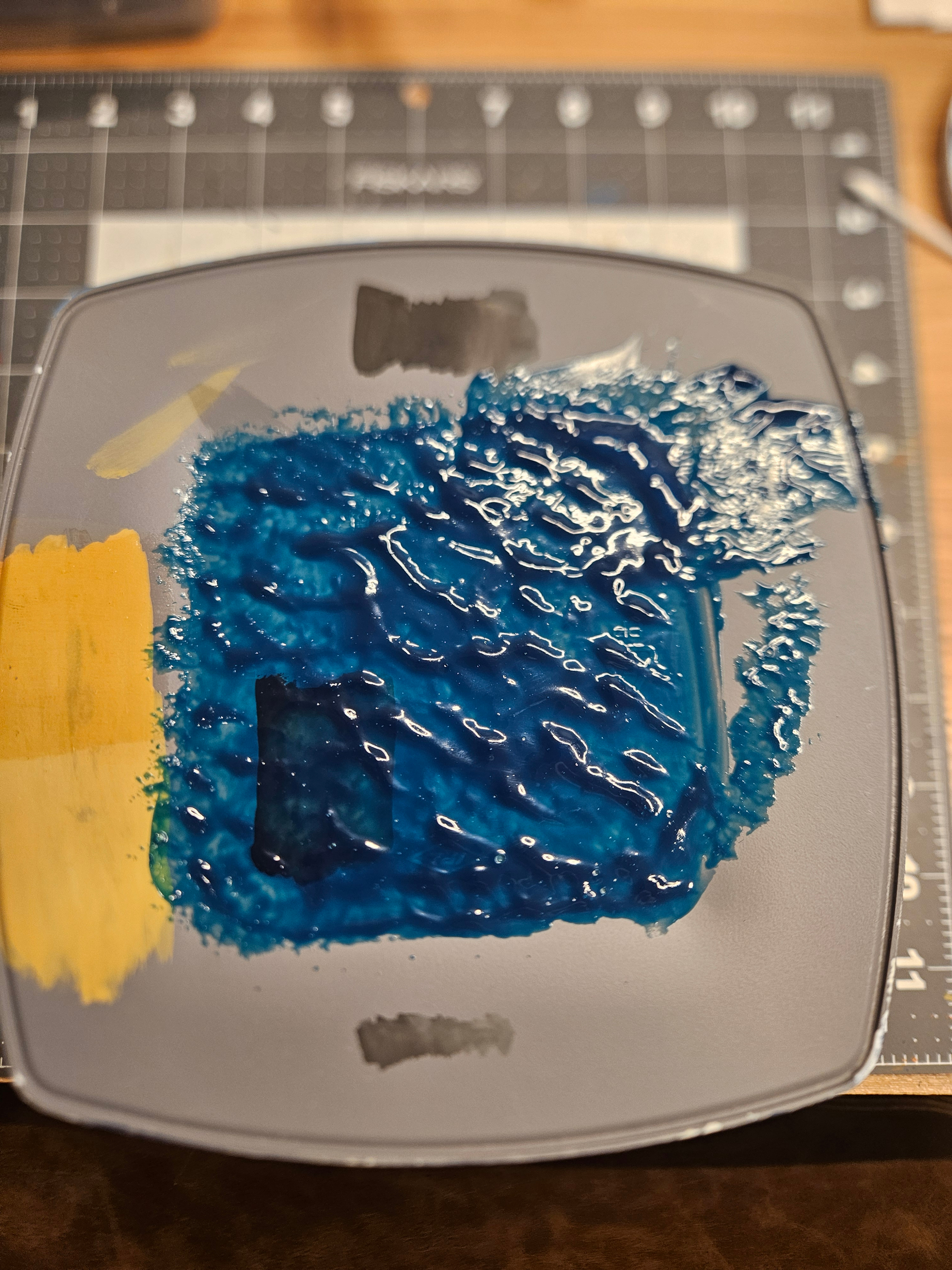
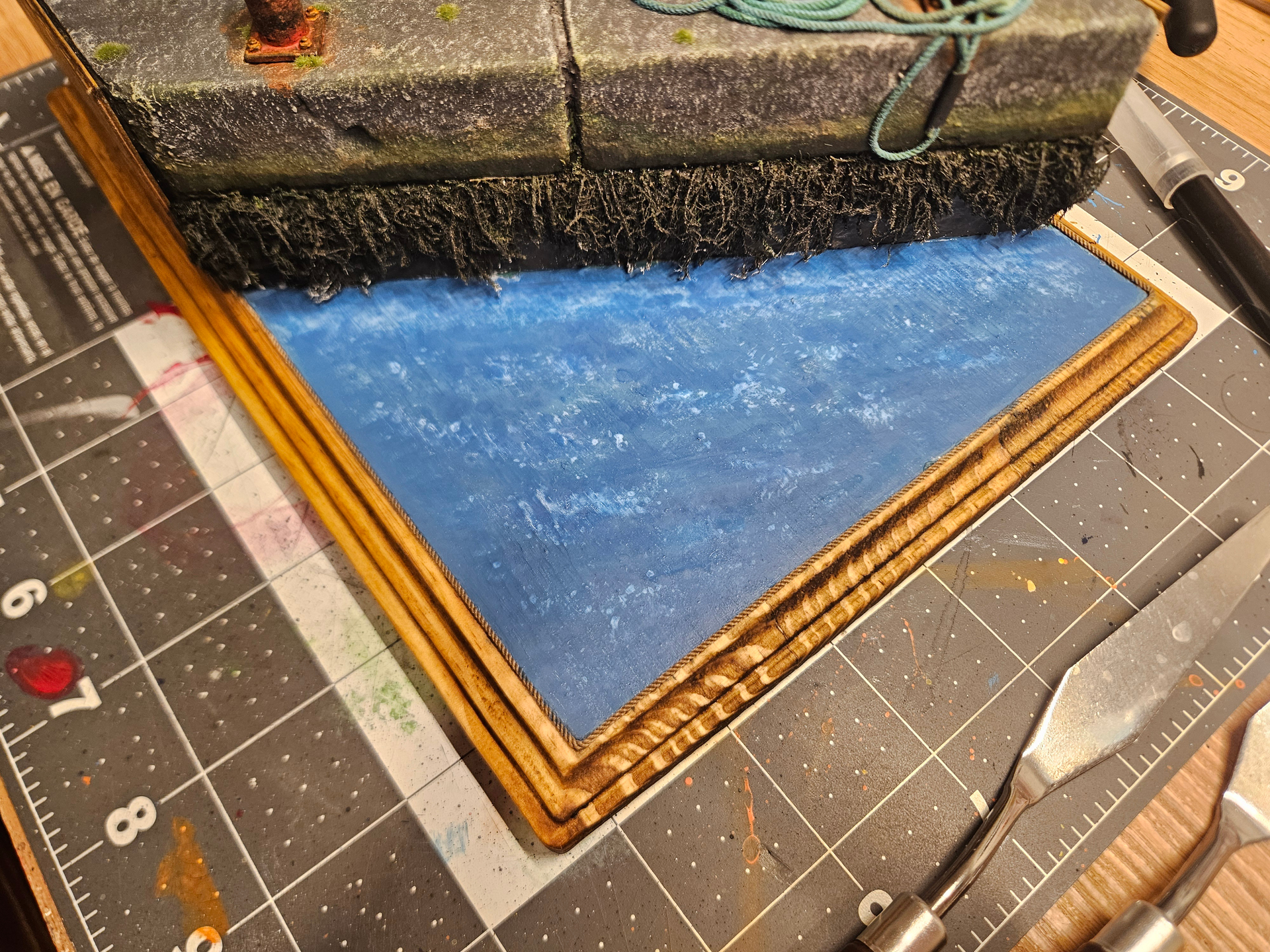
Started to test the waters (pun intended), and the result of the Atlantic Blue water gel from AKI is quite impressive! It’s very easy to work with.
3 Likes
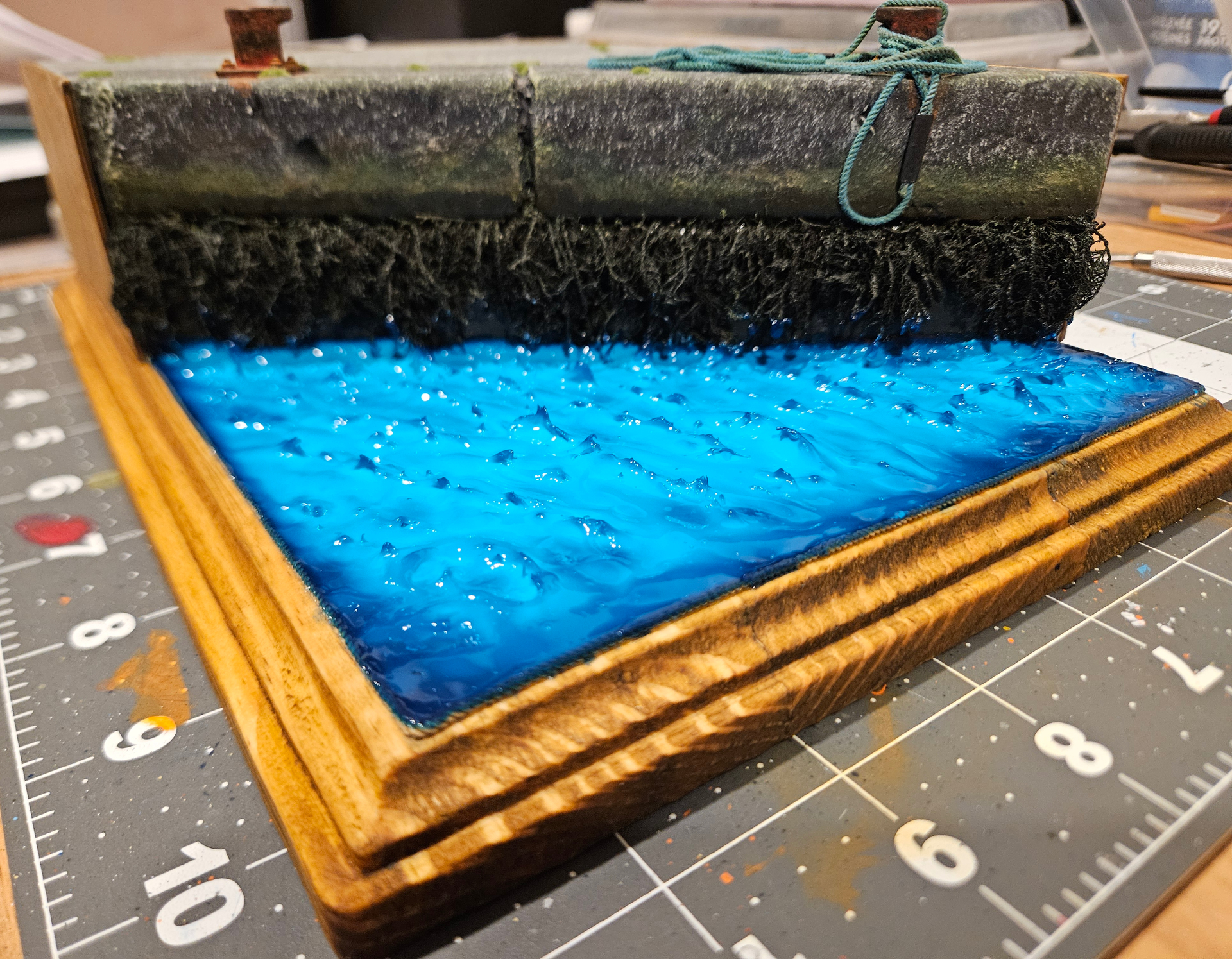
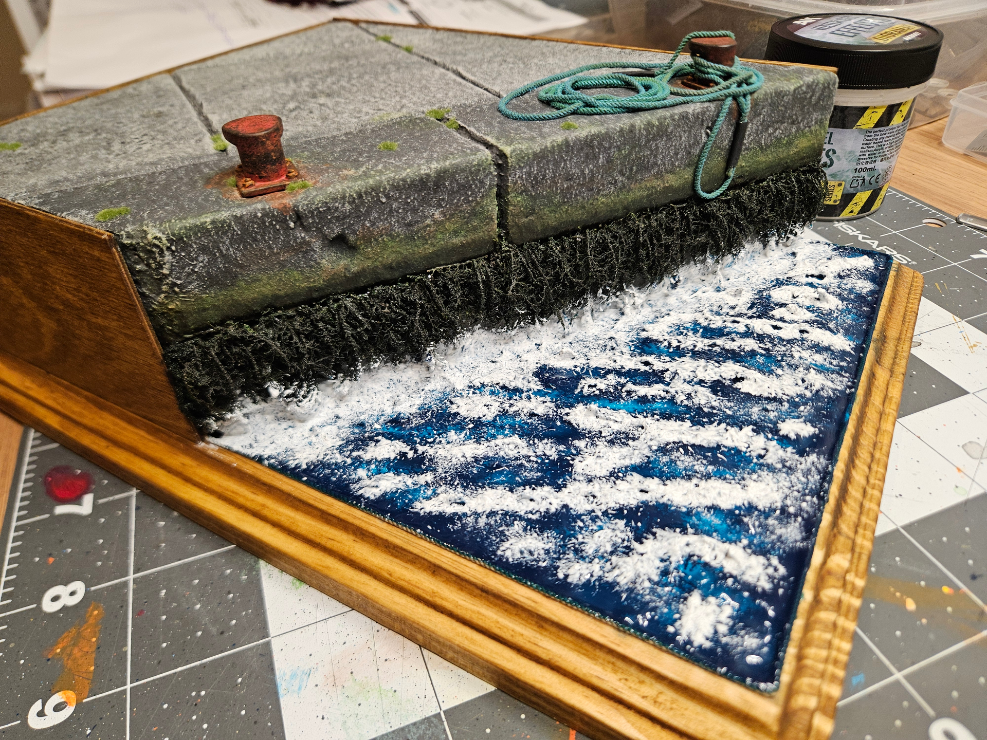
All right, I’m done with the sea. The result is not the most realistic, but this has more to do with my inexperience than the products. I think these two products indeed have wonderful potential, but there’s a lot more testing to be done! This result is okay for a first!
Here are the steps (photos following):
1- wet painting with blue acrylics to give some depth
2- first thin layer of Atlantic blue resin, trying to keep it smooth
3- some water effect paste tainted with blue and white (tumultuous water often has bubbles/foam further deep)
4- second thick layer of Atlantic blue, with ripples and waves. As it was drying out, I played with it some more to get some sharper effect at the tip of the waves
5- water effect with Vallejo white to finish making the foam.
6 Likes
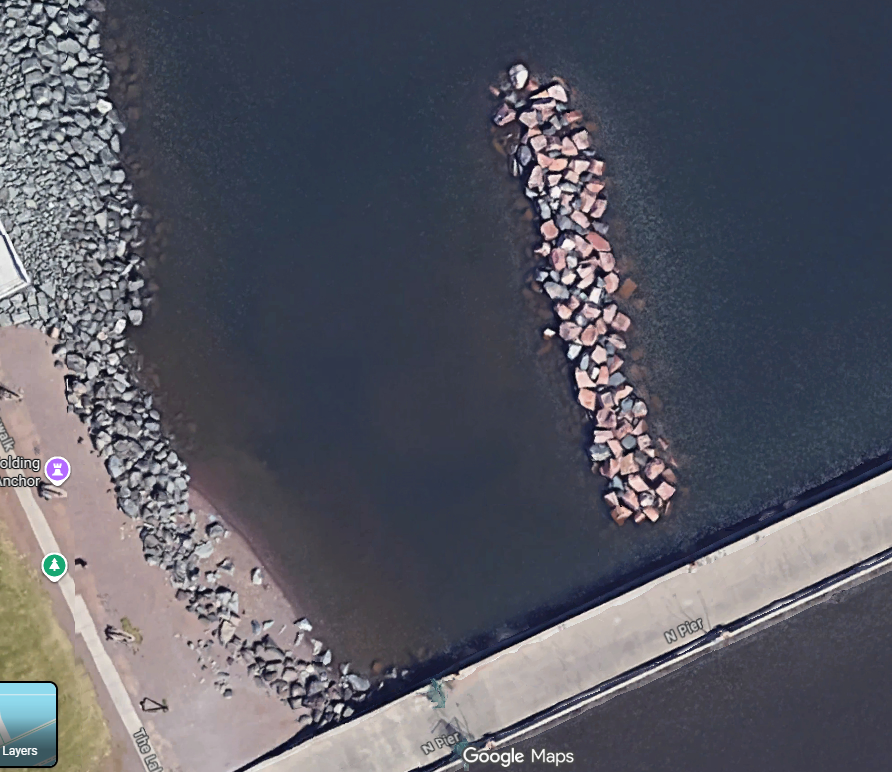
Duluth harbor on a cloudy and windy day

Duluth harbor on a beautiful day

When seen at a shallow angle the water reflects the sky.
When seen straight down the water has the colour of the depth below
(sand tan, rock gray, seaweed/slime greenish, brown from stuff in the water).
3 Likes