Beautiful work Tim, great story-telling and immaculate finishing as always. My inner architectural critic feels it necessary to point out the lack of transverse timber battens to fix and support the corrugated metal roofing at those lapped joints.

4 Likes
Thanks for all the kind comments guys.
John, thanks for the tip. I did give some thought to that, but I take the view that if you cannot see it then it’s not something worth doing!
3 Likes
Completely agree that unseen details are mostly superfluous, but usually these battens would protrude past the wall to the sheeting edge and would therefore be visible. But it’s your shed and it looks fantastic as it is, and it’s just my pedantic architectural mind that prompted the suggestion. ![]()
2 Likes
every time i look at that wood shed i keep thinking of the lyrics from the song “Something for the weekend” by Devine Comedy.

4 Likes
That’s a fantastic song! Yes, I know what you mean… a bit creepy isn’t it?
3 Likes
This is an incredible build. I look forward to seeing this progress.
3 Likes

Well I have made quite a lot of progress over the last 3 weeks… the image shows the farmhouse in its current state.
Painting the stones and brickwork
For a template I used two main sources.
First, a google street view image that I found of a rustic building in one of the villages along the route of the German advance.
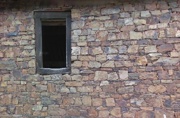
Then when I was in Prague a few weeks ago I noticed that many of the cobbled streets have a similar mix of stone hues.

The painting process is rather repetative, but once I started I actually found it quite therapeutic. Because of the gaps scribed into the foam between each block, it’s also very easy to work quickly over the surface without over-painting.
I started off by choosing a selection greys, blue and brown tones for the stones, all brush painted in quite thin washes.

In the end I reduced these further and made further variations by mixing as I went along.

As you will see I did not colour in every stone with this selection of colours and tried to keep the distribution random.
After just the grey tones the effect is already rather pleasing.


Next I moved on to the more yellowish and reddish hues.


But was not until I painted the bricks that I felt everything started to come together.
Like stones, there is tendency to think that bricks are all a similar colour, but look at any old wall and you will see that th colours can vary from shades of blue, through reds to yellows and pinks.

So I assembled an appropriate selection of paints and got cracking:


Now I agree that it all looks rather extreme and toy-like at this point, especially because of the gaps between the blocks and bricks, but everything changes with the next step…

26 Likes
Absolutely nothing toy like about this. Its a stunning display of patience and skill to get it as detailed as it is. Easily up there with the best house builds I have seen in here.
4 Likes
Looks like a real farmhouse to me!
3 Likes
Realmente un trabajo bellisimo el que estás haciendo, espero verlo terminado para felicitarte!
3 Likes
Outstanding work Tim, stones look so real it’s freaky. Always great to get these inspiring updates ![]()
2 Likes
Very nice work! I’m bookmarking this as a tutorial.
-Zon
2 Likes
Just to be obtuse, I find the “pre-mortaring” stage curiously appealing, although obviously it looks much more realistic finished. Excellent work all over.
2 Likes
Wow, thanks Johnny. More to come…
1 Like
Thanks Barney. That’s good enough for me!
1 Like
Thanks Juanjo.
There is still a long way to go but I will finish it one day…
[Rough translation “It’s really a beautiful job you’re doing, I hope to see it finished so I can congratulate you!”]
1 Like
Thanks John. I’m certainly pleased with the way it’s turning out so far…
1 Like
Thanks so much Zon.
1 Like
Thanks Hohenstaufen. I know what you mean. It’s more cartoon-like, but appealing all the same.
1 Like
Windows and Doors


As with the shed, I decided to use plastic card rather than wood for most of my actual woodwork. The plastic was scored with a razor saw to create the effect of wood grain and hinges, handles, etc added from some photoetch sets (including an old Verlinden offering). To ensure that the nail holes all lined up, I drew the outline of the internal wooden supports before adding these with the twist of the tip of a sharp hobby knife.
The card templates that I had used to cut out my foam walls also came in handy here because I could also use them as a guide to draw and then cut out the window and door frames.
Because I am not planning any visible interior (and to make life easier) I created an oversize backing piece for each with an internal lip so that the windows and doors could simply be dropped into each aperture.
The exception was the large pair of barn doors. To avoid warping I added two reinforcing struts to the rear face made from thick rectangular tubing. The smaller inner door was bent slightly inwards to give some depth. Bolts were then added from a Meng set and a ring handle from the spares box.

Because I had kept them separate frrom the building they were much easier to paint. I started with an over-spray of black.

When I created my first dioramas as a teenager back in the 80s I decided to paint all my doors and windows in a simple wood shade. Looking back, I think I was tricked by all the black and white photos I had seen of the Second World War into believing that there was no colour in those days…
Now I know that the past was often more colourful than the present, woodwork (at least on houses) is almost always painted and people tend to choose what ever colour they like (or at least what is available). This farmhouse was someone’s home, after all.
Because it is a colour that almost never occurs in nature - or on military vehicles - for most of the woodwork I chose a fairly vivid blue colour to add contrast to what will eventually surround the building: blacks and browns (for the terrain), some green (for the vegetation) and, of course, yellows, browns and greens for the vehicles. However, to create another contrast with the more work-orientated parts of the structure, I did go for a wood shade for the lower front door and window.
All of this was brush painted with Vallejo acrylics, including highlights and weathering, then treated with various washes to add depth. There will be more weathering once the
house is in place and surrounded by terrain…
For the barn doors, I initially went for a wood effect, using an opaque application of various acrylics. Here you can also see how effective the wood grain effect can be when scored into plastic card using a razor saw.

However, when I temporarily put the barn doors in place I decided that they looked more ‘artistic’ than realistic. I was also reminded me of my teenage dioramas. So I decided to go for the classic hairspray technique, spraying the doors with a layer of the stuff before over-spraying with various shades of red brown and then rubbing away with cotton buds and toothpicks to create a ‘distressed’ look. This was then followed with washes to add depth.


I then added the glazing from clear plastic sheet. This was cut roughly to size and attached using little dabs of super glue to the reverse of the frames.
The final touch (at least for now) was to add part of a Belgian advertising sign (from Reality in Scale) to give the effect of a boarded-up window. Because this is red, it adds a a nice companion to the barn doors.
So with all this done, I could, at last, fix the farm house in place (the roof is still detachable) and move on to the actual diorama. Happy days!
24 Likes