Fantastic farmhouse Tim ![]() . The colours really add some life as you intended, and compliment the stone wall and brick reveals. And of course practical farmers would always have painted their external timber windows and doors for weather protection in the days before synthetic clear finishes. Are you adding any downpipes etc.? Can’t wait to see it all come together.
. The colours really add some life as you intended, and compliment the stone wall and brick reveals. And of course practical farmers would always have painted their external timber windows and doors for weather protection in the days before synthetic clear finishes. Are you adding any downpipes etc.? Can’t wait to see it all come together. ![]()
4 Likes
This looks phenomenal!!
4 Likes
Beautiful work Tim- and thank you for taking the time to explain both your technique and your thinking behind it. I quite agree with you regards painting things like the doors vivid, non-natural colors. I will do this the odd time I do a scene or dio simply because it contrasts well against the usually drab military and nature colors, as you so well explained.
6 Likes
Everyone’s said it, but again: beautiful, absolutely fantastic work. I also love that you used plastic instead of wood. It works great, obviously (plastic + great skill = wonderful).
2 Likes
great work so far , where do you get your or XPS foam?
2 Likes
It’s the blue or pink insulation foam sheets that you can get at Home Depot or Lowes.
2 Likes
Thanks John. Yes, I know we are all used to black and white photos of WW2, but colour is everywhere… but I still have to push myself to make things a little bit brighter and get over that monochrome image I have in my head.
And downpipes are coming!
1 Like
Thanks mate. More coming…
1 Like
Thanks Karl. Like I say, we all see monochrome images of the Second World War so its hard to get away from the drab look - but we have to try!
2 Likes
Thanks Ron, Matthew has answered below. Mine came from ebay but it’s pretty easy to find. Just go for the high density stuff - it’s mire expensive but worth it.
1 Like
Thanks Matthew…
1 Like
Adding colour (and other stuff) to the roof
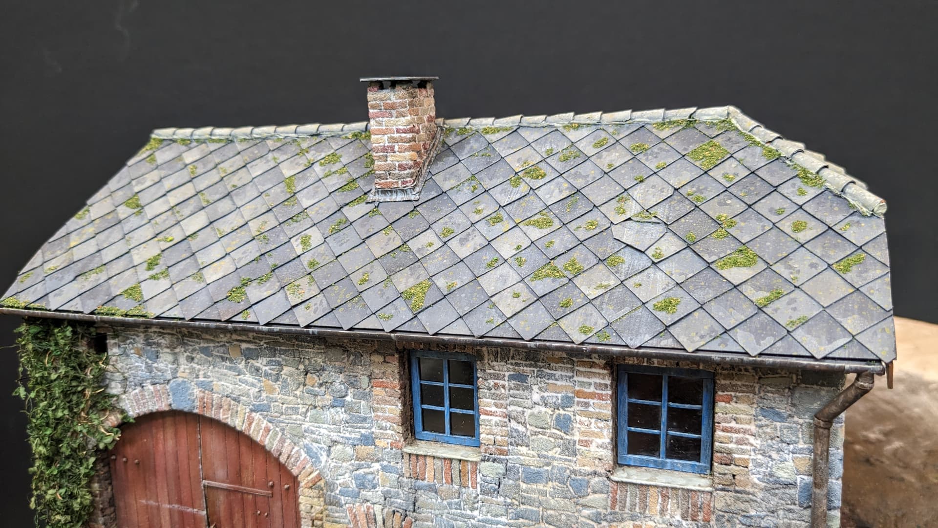
After spending so much time painting the stone and brickwork, I was a little wary of tackling the roof, but it was actually pretty quick, easy and a lot of fun.
I had already added some very basic pre-shading with an airbrush when I was giving the walls their first coat, but what the roof really needed was some variation to the individual tiles.
So I started with a grey black (these are all Vallejo paints) and mixed in various browns and blues to give me a palette of around five basic colours. These were then applied with a brush using the wet-blending technique to give some graduation within each tile with the darkest shade generally at the top of each (where the one above hangs over it).
This was done in a random manner and I didn’t even bother to paint every tile - so some remained in the original (pre-shaded) tone. Incidentally, the thick black card stock I had used to make the roof takes the paint very well and there was no sign of any warping (which was a relief).
Next I lightened these colours a little and went back over the tiles adding random spots, focussing generally on the lower edge of the tiles (but not all). None of this was scientific - I was just going for the right ‘look’.
To complete the illusion I then applied slightly lightened and diluted versions of the colours at the top of the roof planes and used a broad brush to drag them down vertically to give to look of rain stains.
The next step was to add speckling. I have always been slightly nervous of this technique because it seems a bit crazy and uncontrolled - and usually looks awful when first applied - but having tried it with rust colours on mufflers it really does add depth to most surfaces.
So, in essence, what you are doing is wetting a brush in paint, holding it a few centimetres from the surface and using something like a cocktail stick to bend the bristles back and spatter the paint. The trick is to keep the paint fairly diluted and use colours that are close to what to what you have already used to paint the surface on which you are speckling.
The great thing with Vallejo paints is that they dry pretty fast, so even if the effect looks to strong at first, they soon start to fade into the background and leave you with a subtle variation of the base colours. Anyway, it worked!
The final part of the painting process was to add speckles of Japanese Yellow to represent the typical blotches that you see on roof tiles (at least here in Europe). I believe this is lichen.


And then the final touch: moss! This is the green, fuzzy stuff that you also tend to see on rooves in rural areas and especially in damp climates.
Some years ago I bought this lovely tower of mossy stuff from Landscapes in Detail at IPMS Scale Model World in Telford.

I’m not sure if they are still going (I hope so!), but they are a great Spanish father and son team who have also published some superb diorama books. Anyway, I had never used it - until now.
Of course, this could not be simpler: simply apply some PVA glue with a fine brush (slightly diluted with a drop of washing up liquid added to break the surface tension), sprinkle the stuff over and then tip off the excess. And voila!


There are still washes to be applied to add more depth, but I’m pretty happy with the way this has turned out so far…
20 Likes
Outstanding Tim ![]() That creeper on the corner really creates an interesting asymmetry, and the green splashes of moss etc., once again, gives everything a lift.
That creeper on the corner really creates an interesting asymmetry, and the green splashes of moss etc., once again, gives everything a lift.
4 Likes
That is some of the best building work Ive seen in the scale. The realism is off the charts. Stunning. Thank you for sharing!
5 Likes
Just amazing! I’m more and more impressed every time you give us an update. Thanks for sharing your tips and tricks! ![]()
4 Likes
Great technique for the roof tiles … worth the time and effort. Looks superb ![]()
5 Likes
Simply a stunning job. Thanks for the tips too.
4 Likes
Once again a very good update… I love how this develops…
5 Likes
Not noticed this one before, but have spent time scrolling through your build Tim…well worth the time.
Your barn is amazing, the stonework and roof tiling is a joy to behold, and the detail within the outbuilding is fantastic…another outstanding build, ![]()
![]() .
.
G, ![]() .
.
8 Likes
Very realistic and great attention to detail. Impressive!
4 Likes