How’s this?
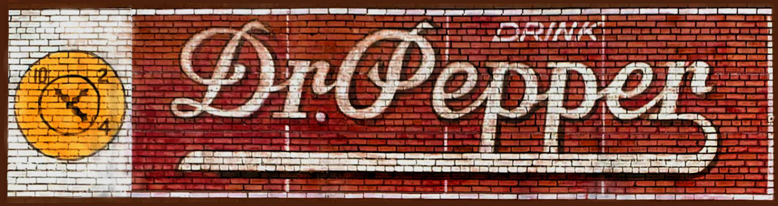
That’s perfect. Fortunately there’s a place called Extreme Tactics and Training Solutions nearby. This is the landmark for making the turn, so I was able to get out there fairly quickly.
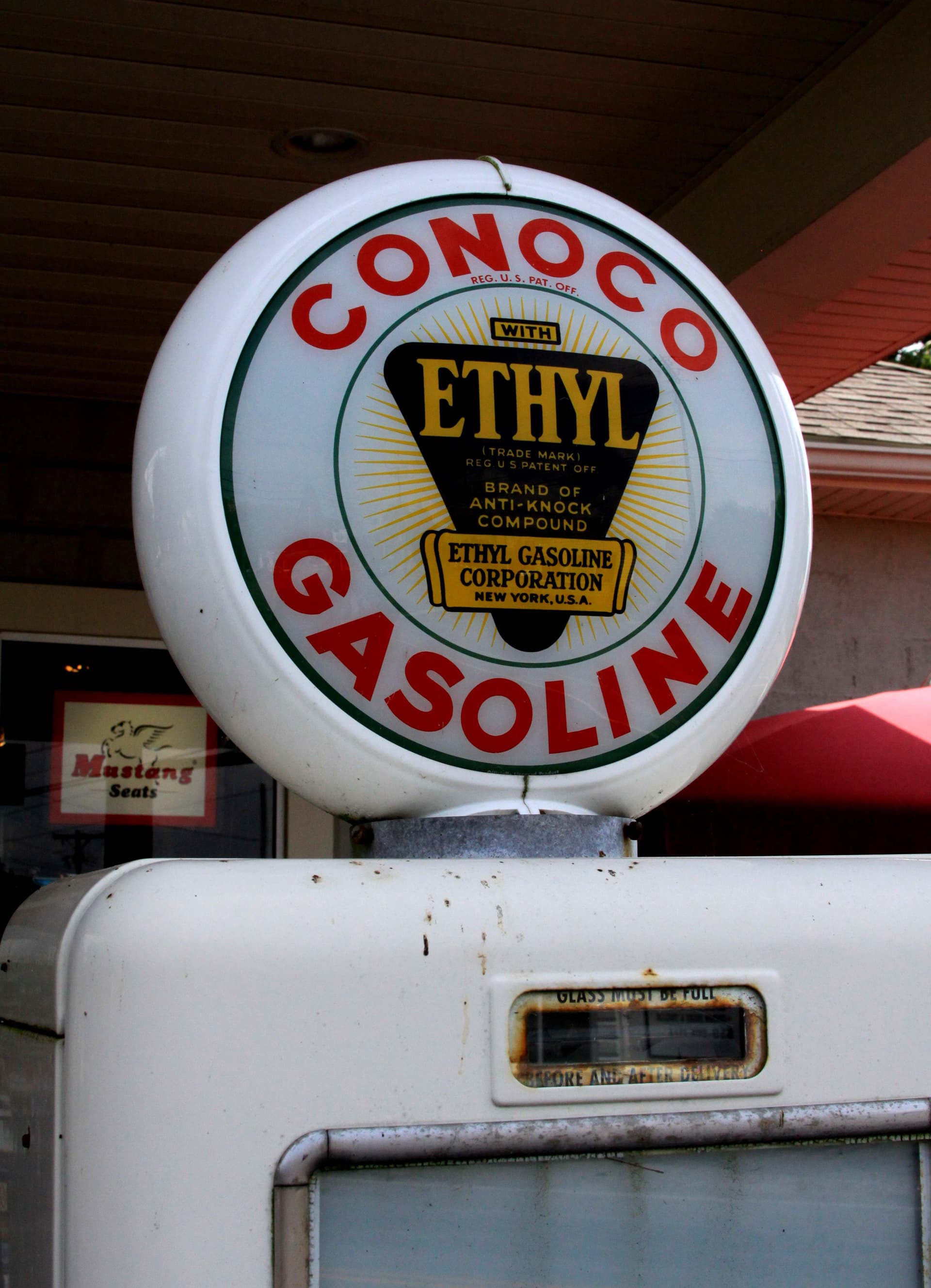
This one is in Hico, Texas.
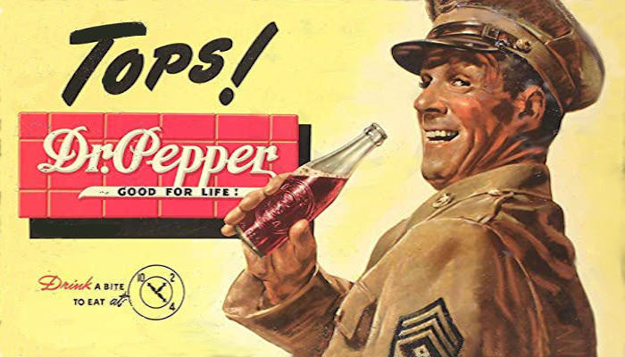
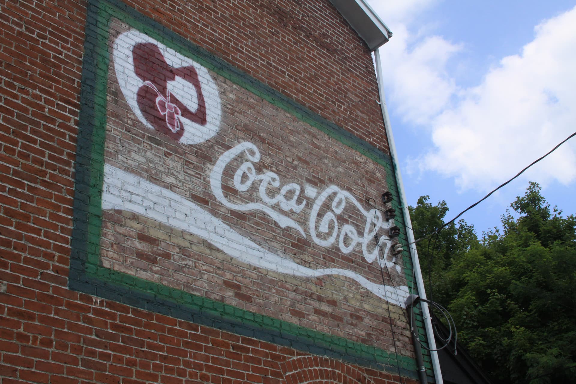
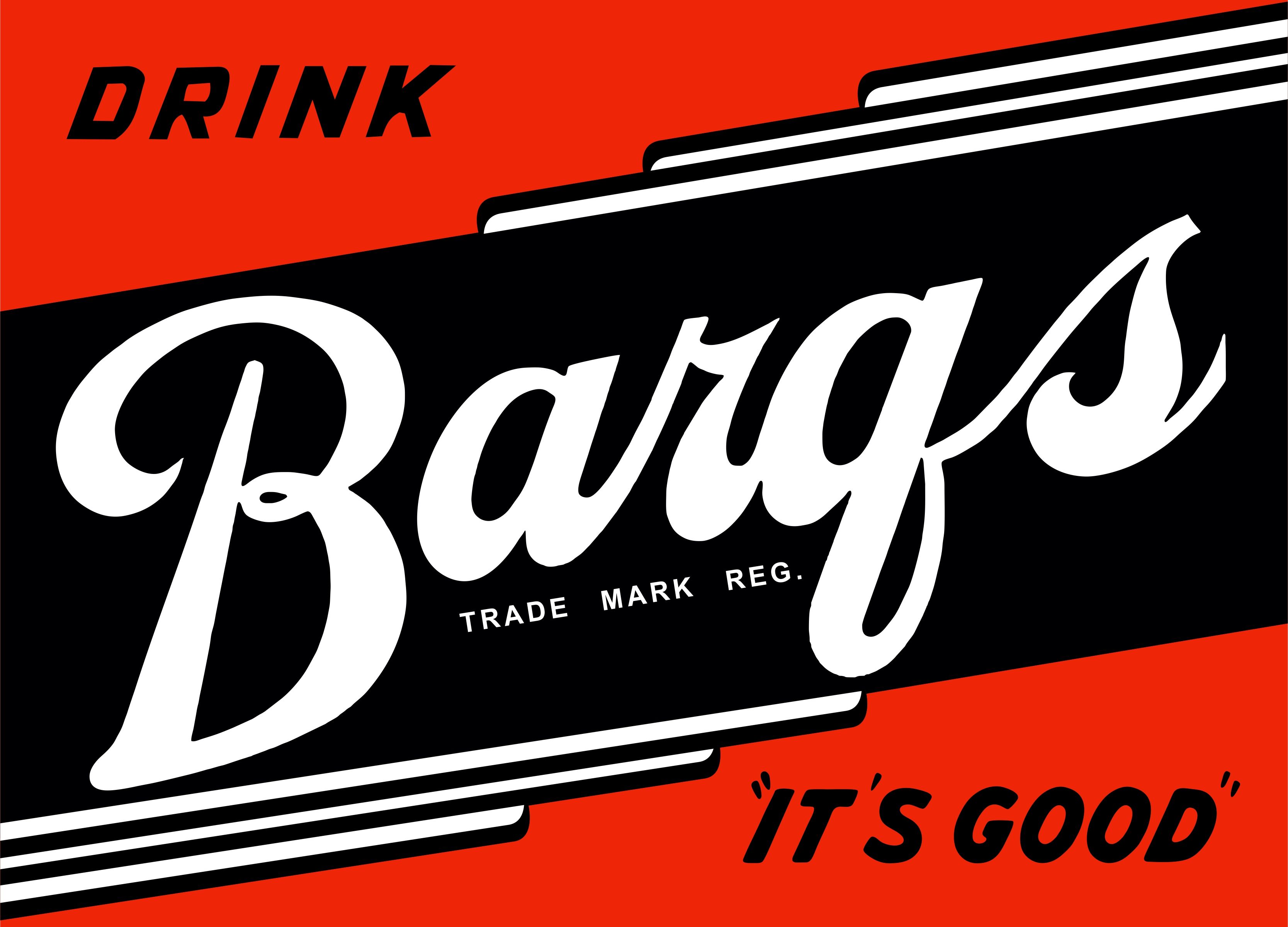
I almost feel like the one above is incomplete. Most have some sort of slogan in the “tail” of the “r.”
1 Like
There’s a whole lot of cleanup required in the white around those slogan letters. Please don’t expect to see results anytime soon unless there is someone else out there that wants to contribute art work to this site.
All are welcome to contribute their artworks here. I have no desire to be a one man band with this!
1 Like
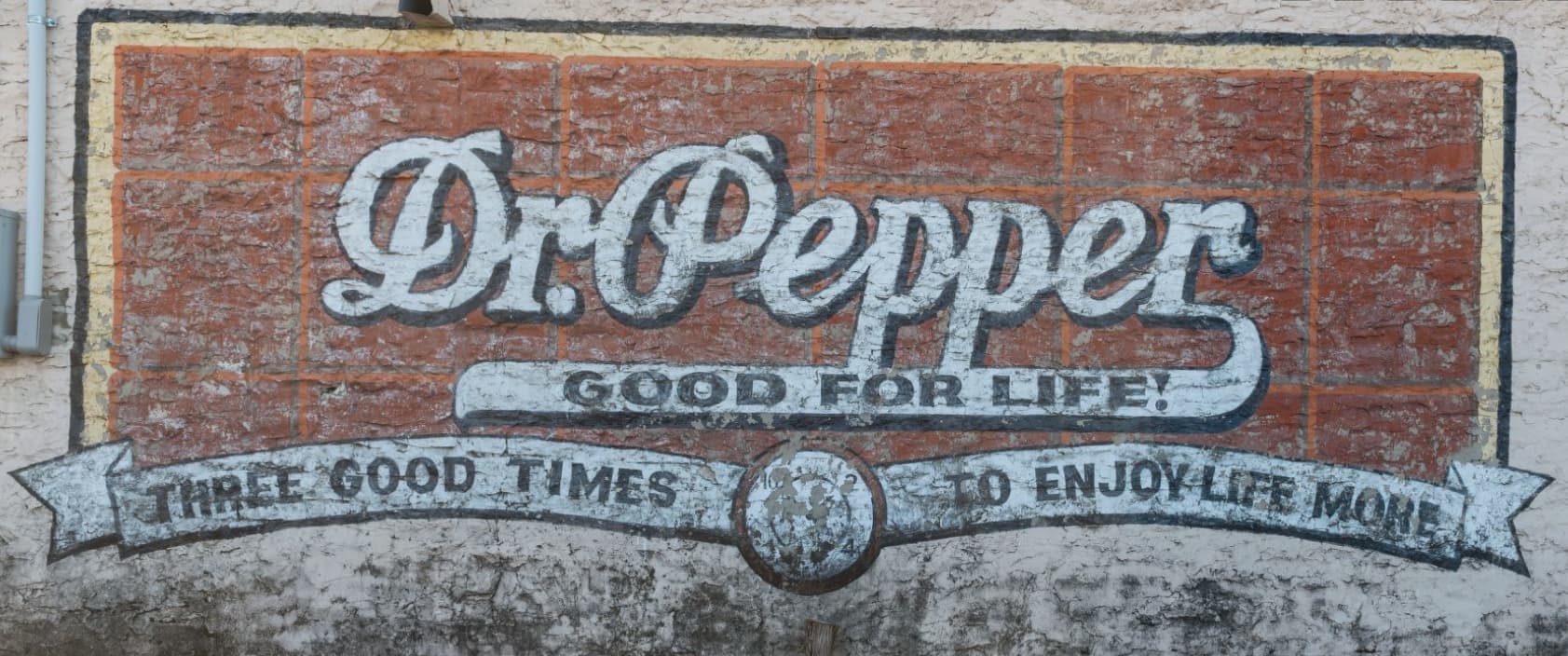
OK, I squared up the sign, brightened the colors just slightly and did a little bit of quick background knockout.
I meant the dude who originally painted (or repainted) the sign left it out. Good For Life! is obviously one used a lot, and then there’s King of Beverages and a few others. Maybe he ran out of black paint.
Given the vertical thinness of the swash on the “r” I don’t think that sign ever had the slogan. Perhaps a change in the marketing plan or a desire to save money on the hours paid to the sign painter?
The sign near the tactical shop seems much newer than this one so maybe it was towards the end of business for the company.
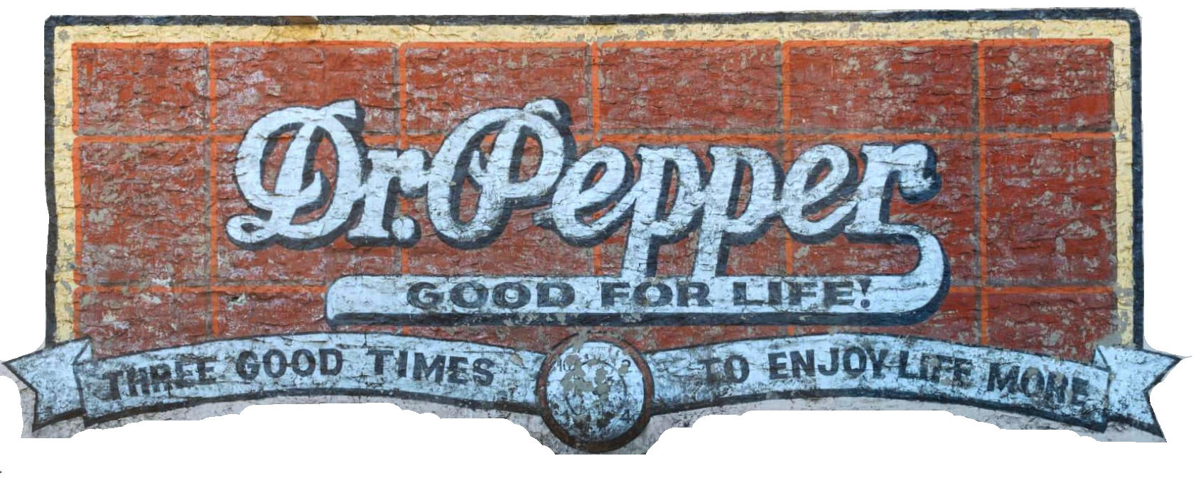
Finally finished:
Found just a couple of small flaws in my work above and have now corrected the artwork seen here.
1 Like
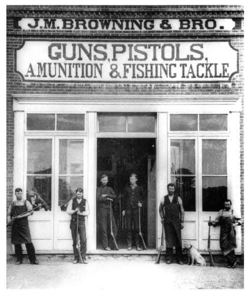
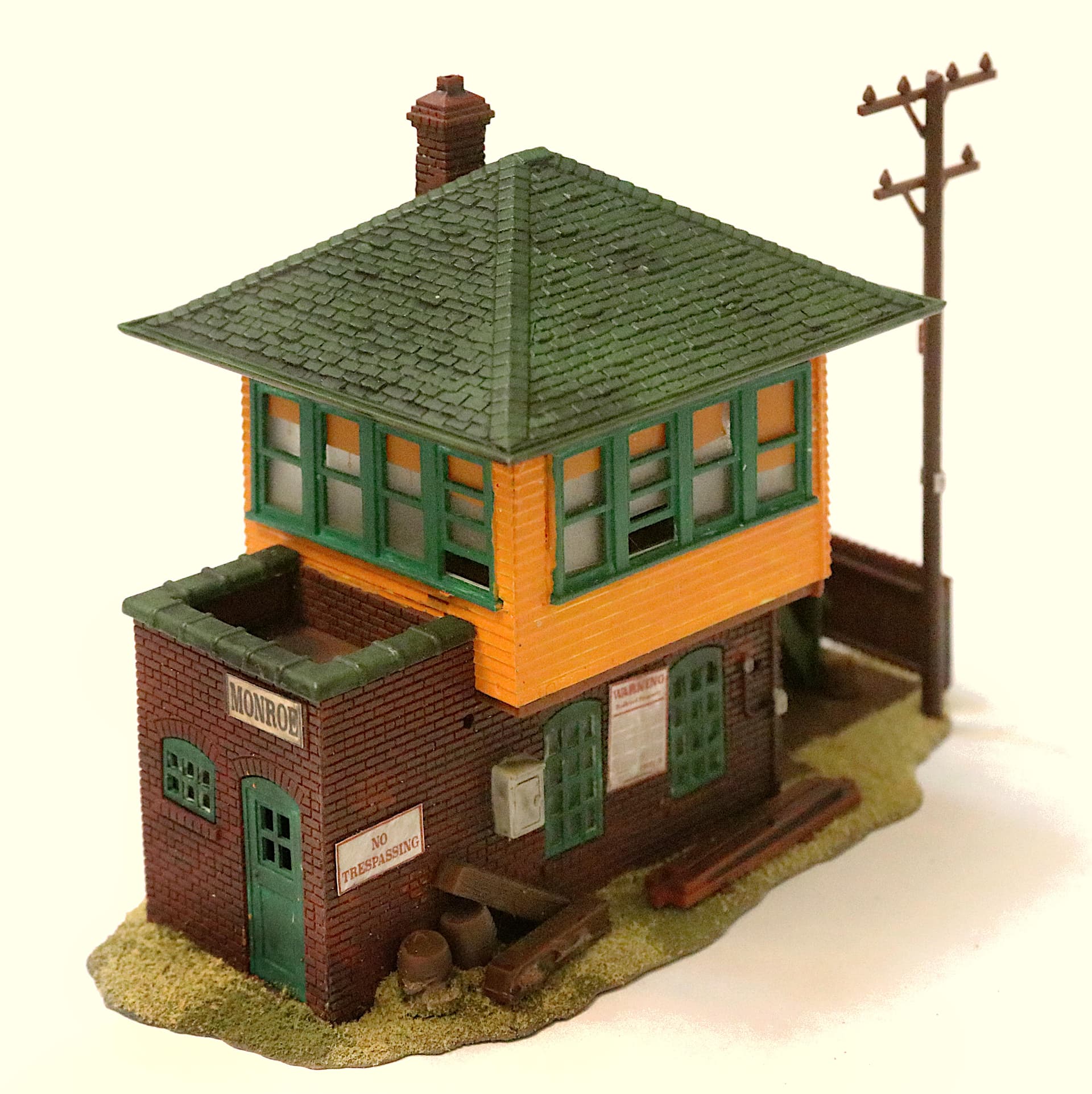
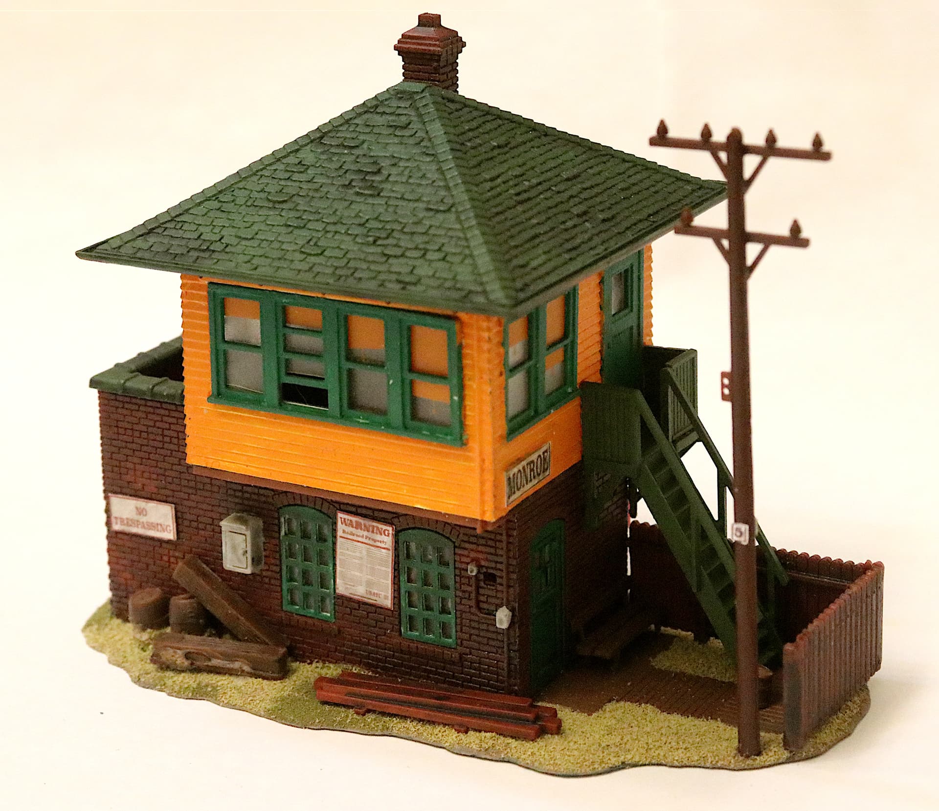
John M - mechanical genius.
1 Like
And another period sign brought back from obscurity:
Once again I will point out that these signs can be downloaded here, directly from the KitMaker site then resized and printed on your own home computer. For tin signs and billboards I recommend photo quality printing paper. For paper signs or signs that have been painted onto a wall I recommend printing them on the cheapest regular (I mean cheap/thin) typing paper you can find and soaking them either in diluted white glue (Elmer’s) or in Future Floor wax as they are applied. (Soaked not in a bowl but as you apply them. First coat the structure surface then lay down the sign and continue to soak it in white glue or Future.) For the photo quality “tin” signs I just glue them on with a few spots of super glue.

2 Likes
Anyone else have signage artwork they may have created for their models?
Feel free to add your contributions!
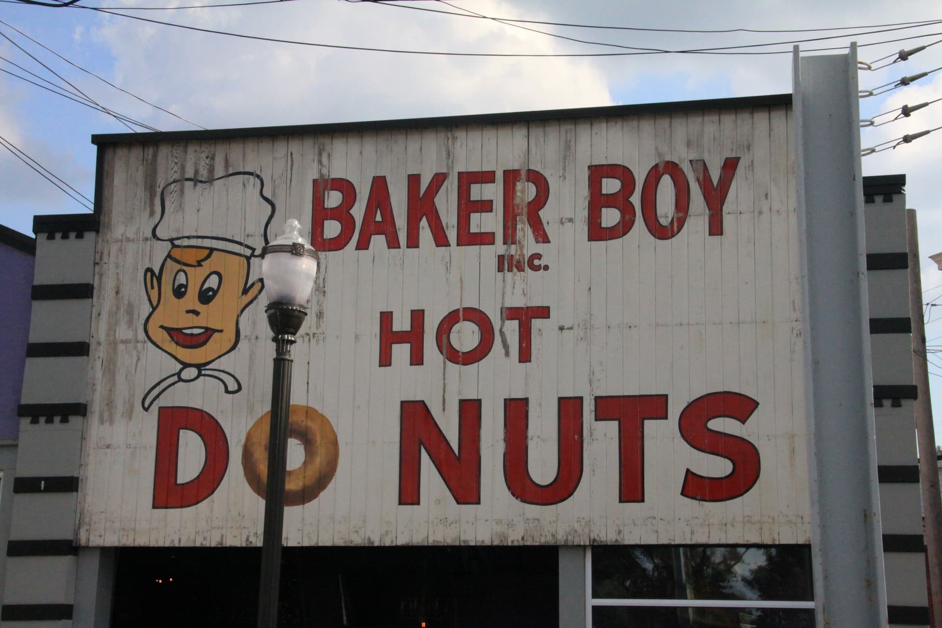
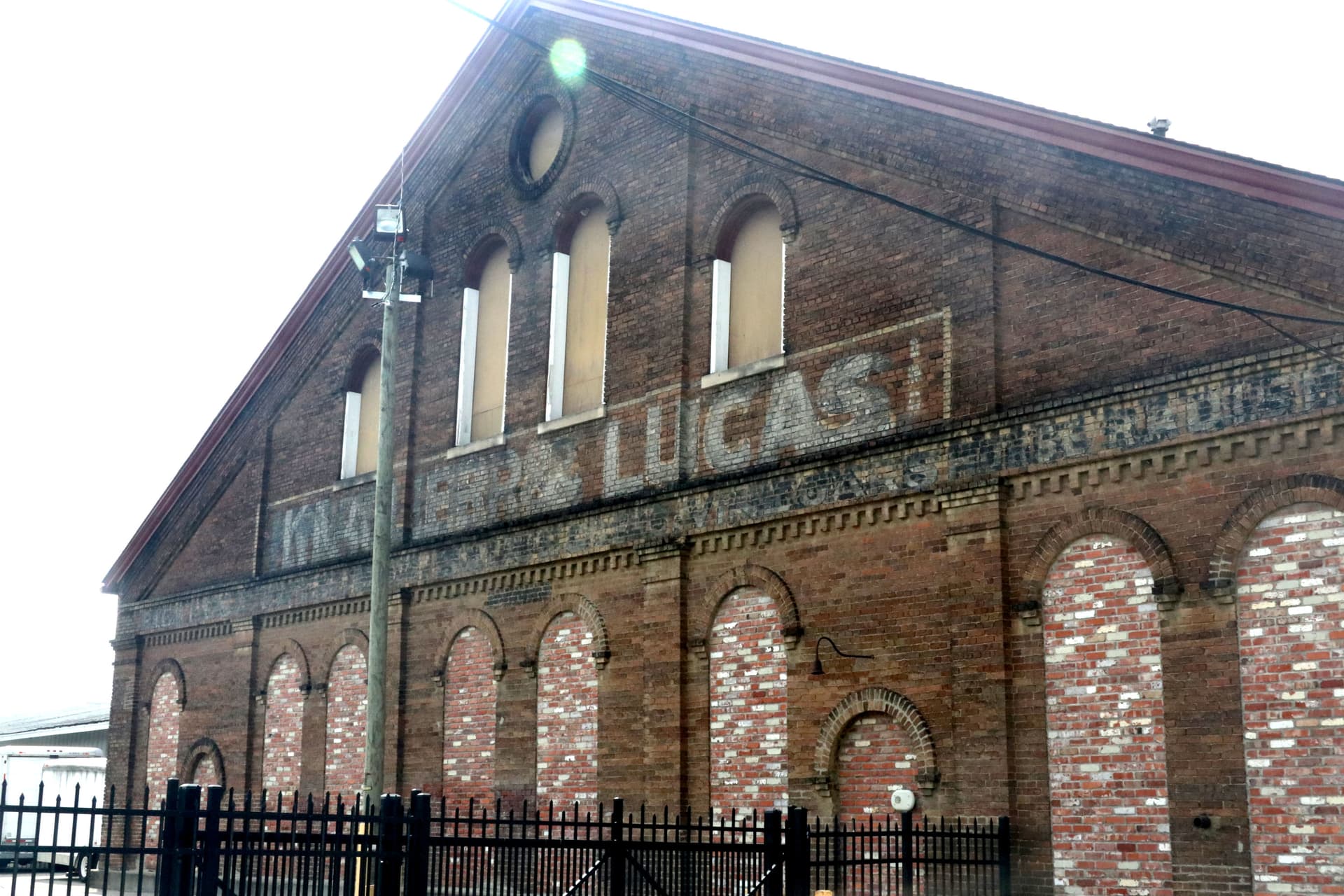
I don’t know how much direct use it will be, but the lileks.com website has a section on ‘ghost’ signage – advertisements and signage that were painted directly on buildings that have undergone wear and defacement for decades.
1 Like
That site is both interesting and inspirational though it does run awfully slow. Thank you for the link!
Obviously I am trying to breathe some new life into many of these “ghost signs.”
______________________
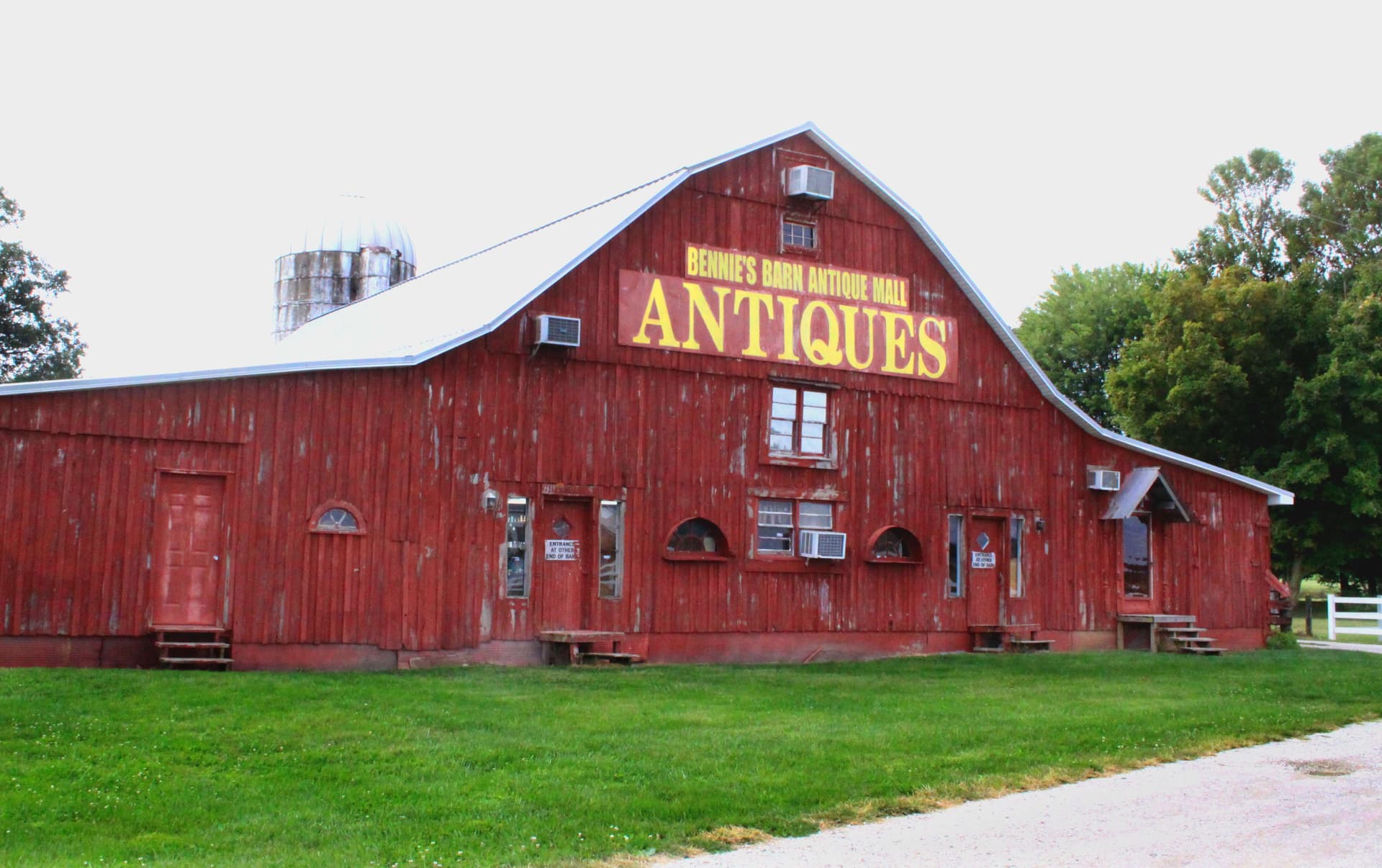
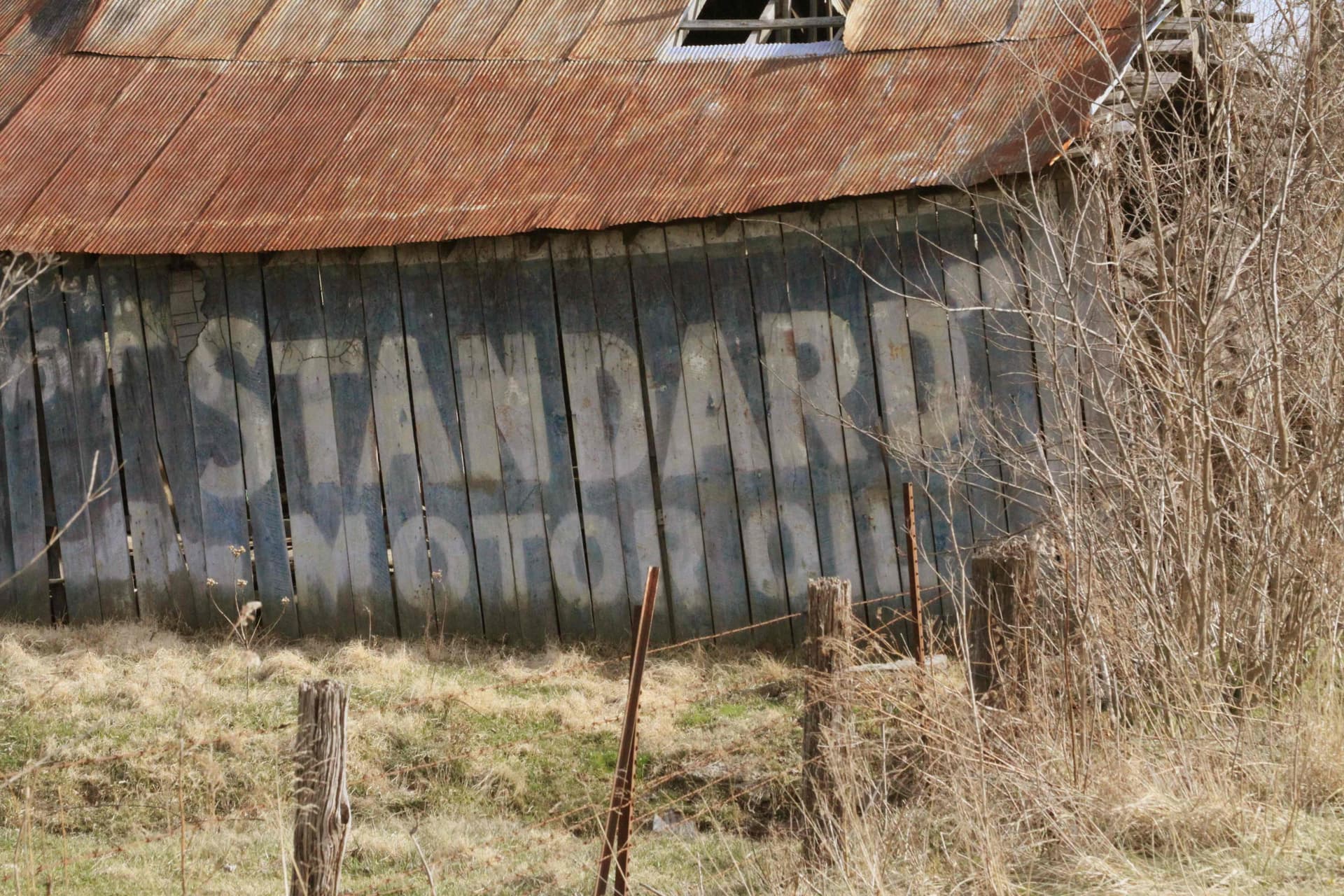
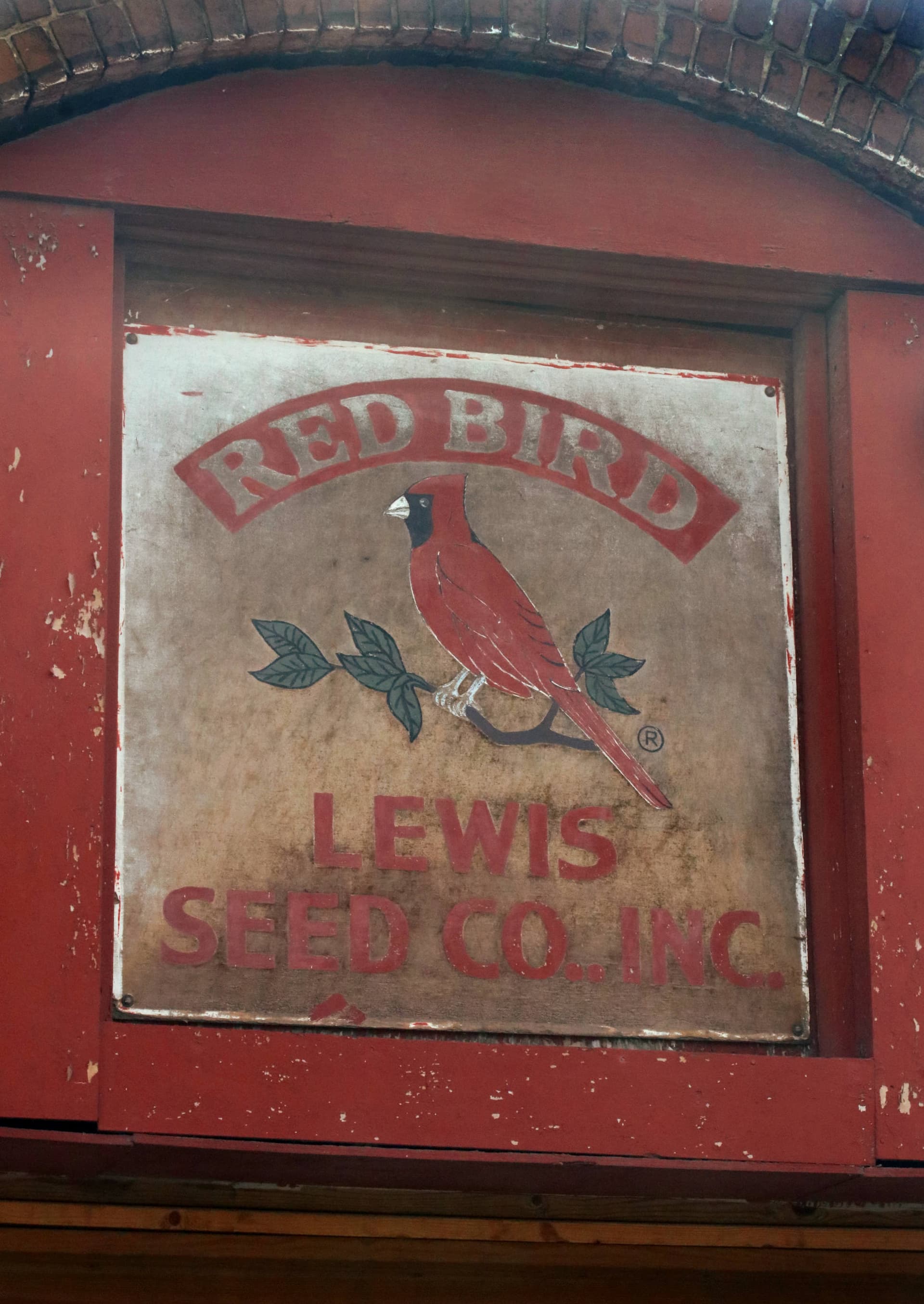
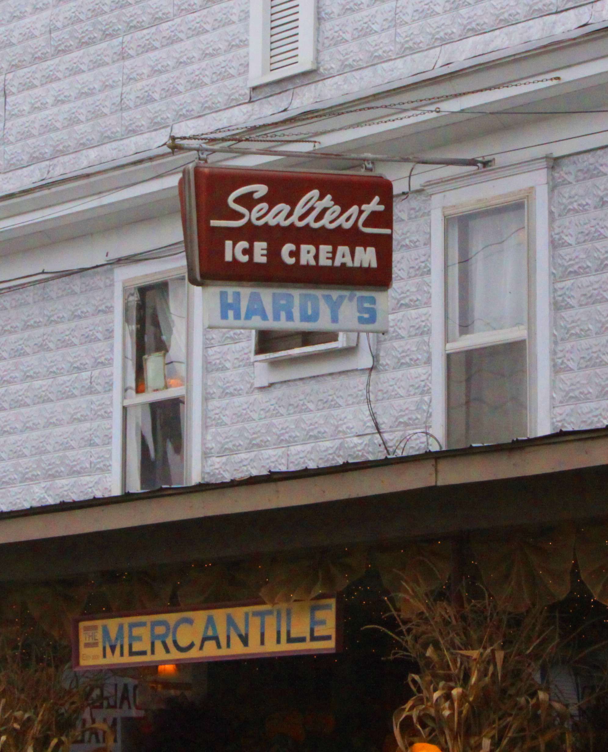
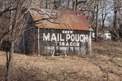
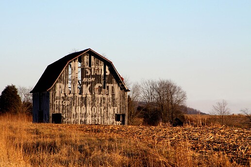
Here is my contribution to the “Ghost Signs.”
Image found online
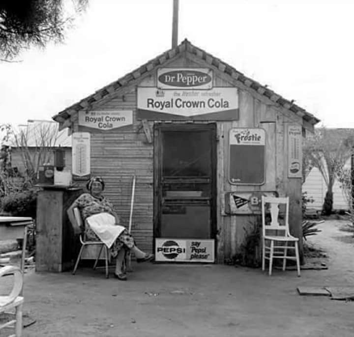
Image found online
__________________
And a few of my own photographs:


2 Likes
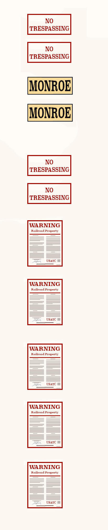
A small assortment of Railroad Yard Warning signs"
Art is all in one continuous image. The artwork here is currently scaled to print in HO but can be enlarged or reduced for other scales:
1 Like
If you feel the signs are too bright on your model a little brush of Citadel Transparent Black Shader (they call it Nuln Oil) will tone them down and age them.
Example:
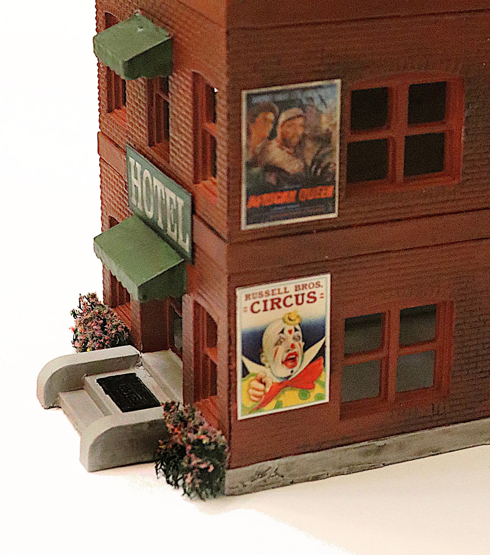
The second story sign represents signage that has been up for a time and has weathered and darkened. I went over that one and the Hotel sign with a light coat of Citadel transparent black (Nuln Oil) to age it.
The Circus sign represents a fresh sign as these were posted a few weeks in advance by the “Advance Man” and were cheaply printed and only intended to last a few weeks.
Small confession: The upper sign is printed on photo grade computer paper and represents a tin sign. The lower sign I really should have printed on cheap typing paper as this should represent a cheaply printed paper sign applied with wall paper paste, that would have the texture of the brick wall showing through.
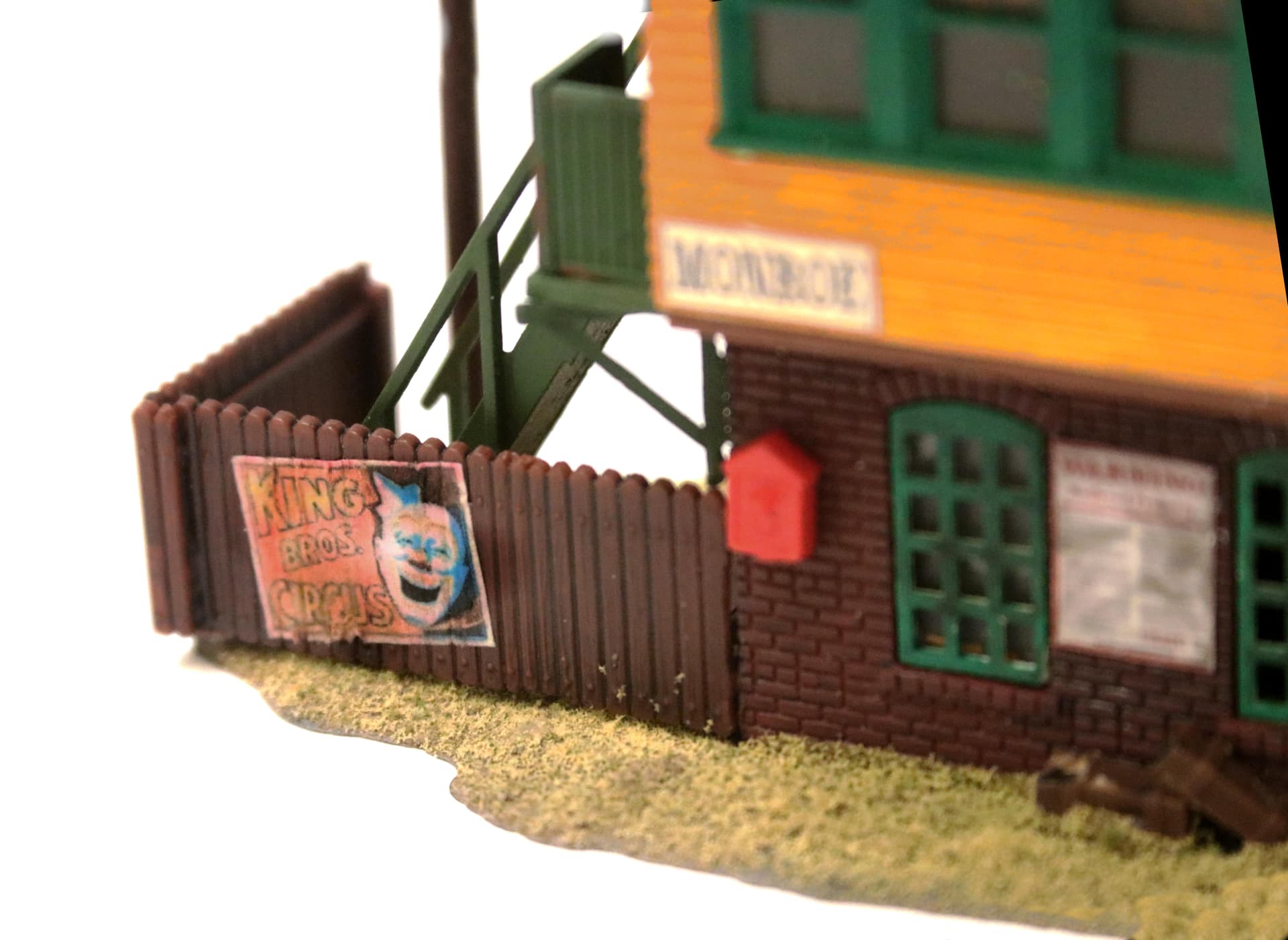
Here below is another example of a Circus sign but this time printed on the cheap typing paper, soaked in Future Floor Wax and then applied to the fence having some of the fence texture then showing thru.
After the Future dries I spray the whole thing with matte clear to kill any shine that remains.
And of course my big Coke sign, again printed on cheap typing paper and applied using Future Floor Wax.
3 Likes
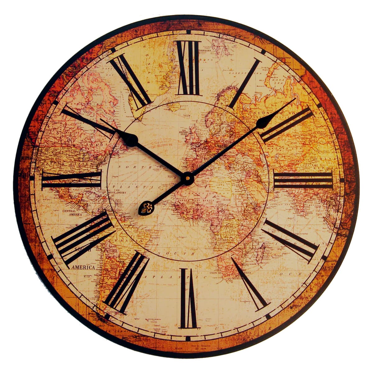
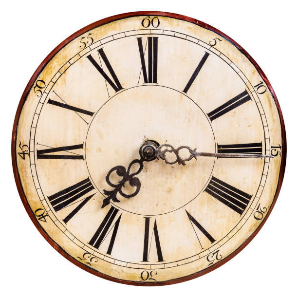
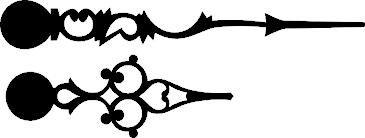
Clock Faces:
Sooner of later everyone will need to repair/replace a model clock face - or two! Or perhaps you would just like to add a clock to your favorite city town hall or church steeple.
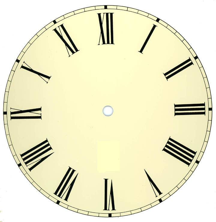
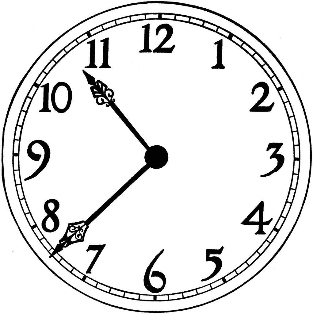
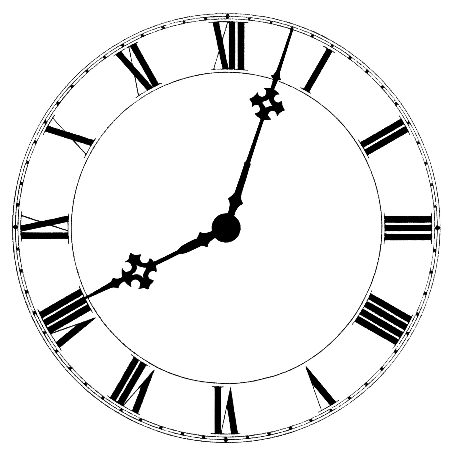
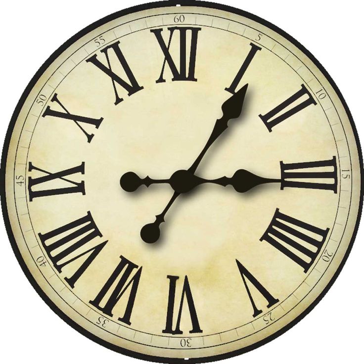
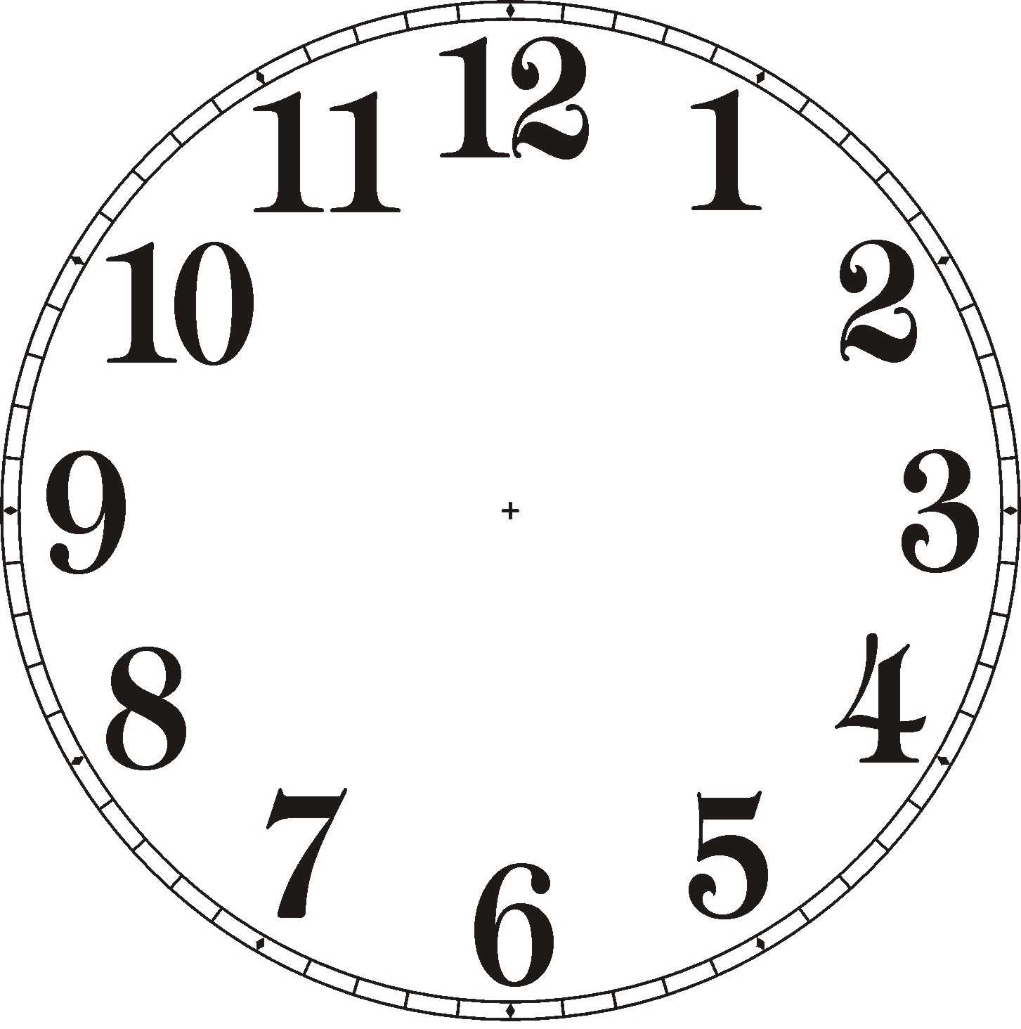
Plus Hands for the Clocks:
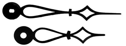
2 Likes
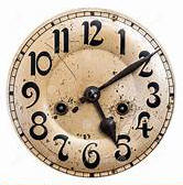
An HO waiting shed with a double faced clock that I had to replace just today:
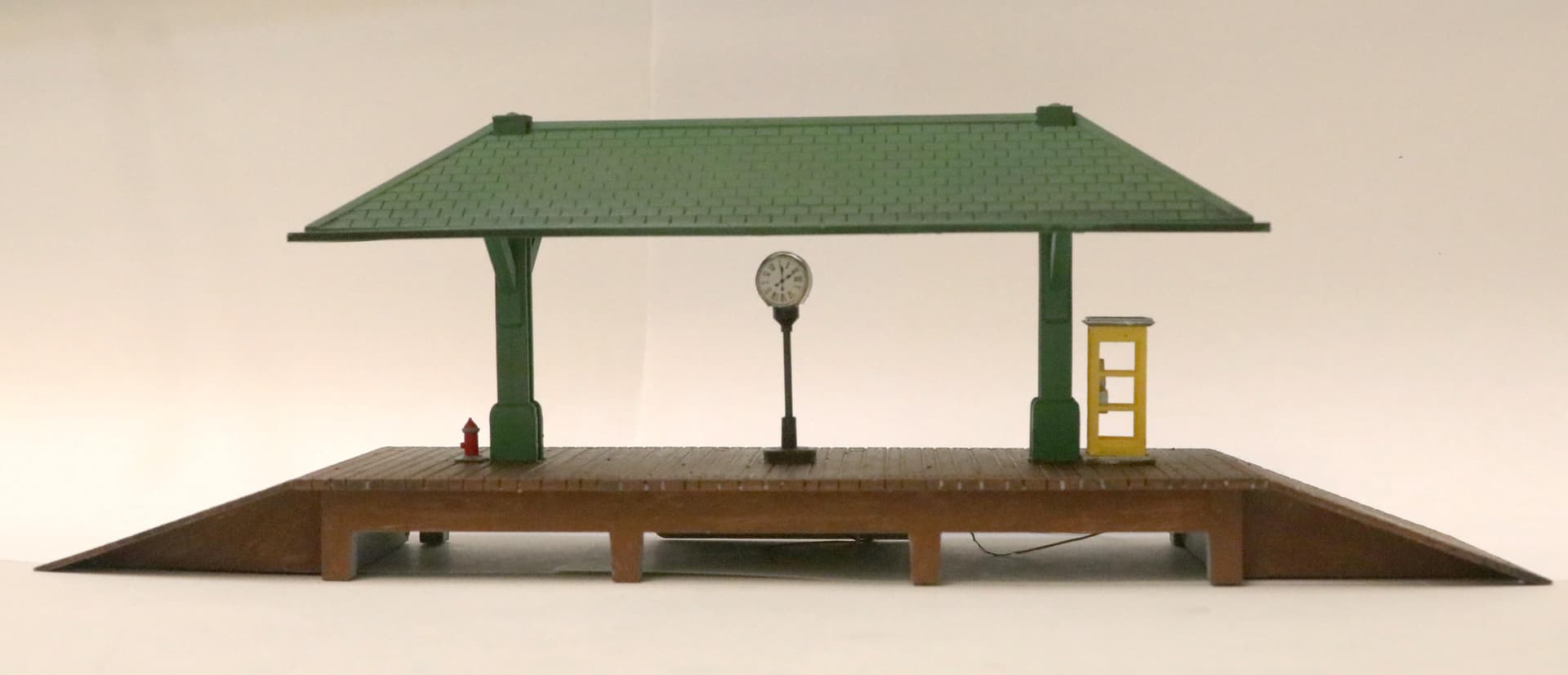
New clock faces installed. Then also I repainted the roof a more realistic shade of green and added a black transparent shader (Citadel Nuln Oil) to the roof and the platform deck to bring out the texture and detail.
1 Like