Thank you!
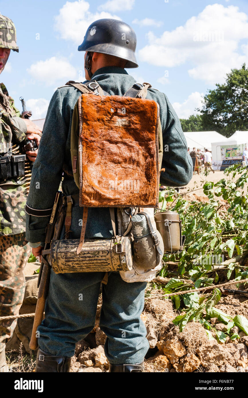
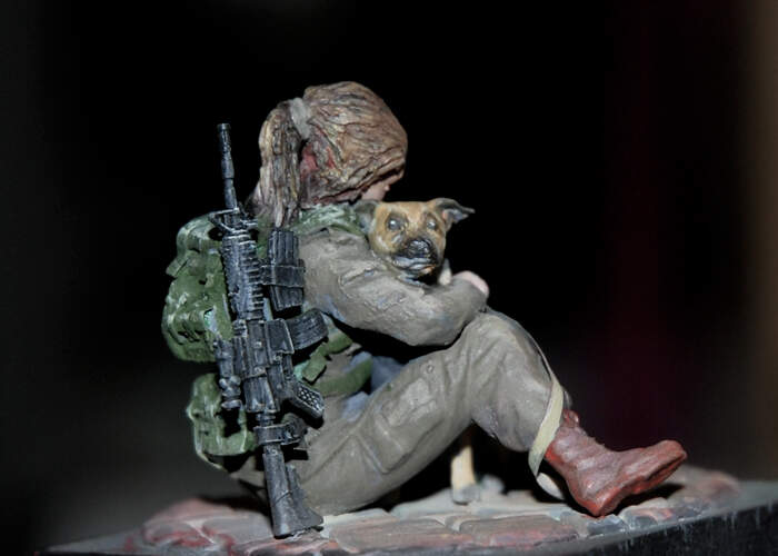
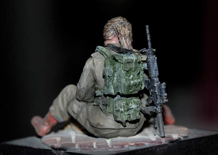
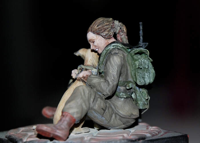
Two more shots of reenactors in gear showing some weathering. Notice the gas mask carrier with sand repaint. Also the degree of wear of the other photo mess kit.

2 Likes
Do highlights have to match the color of the thing being highlighted? (Match, in the sense of same color but lighter)
And this is what I’ve done so far:
2 Likes
Some people use black added to the base color to shadow and white to highlight. That works. Other use similar darker or lighter colors related to the base color. For some colors (like red) it’s what you may need to do.
The first method is easy and predictable but may result in a muted result.
The latter may end up with color shifts if you’re not careful.
For the most part I’m a black and white guy.
2 Likes
I just kinda forgot about highlights and changed the color by mixing in new paint for the different parts of the uniform, so I’ll try to do the second method and approximate the colors.
1 Like
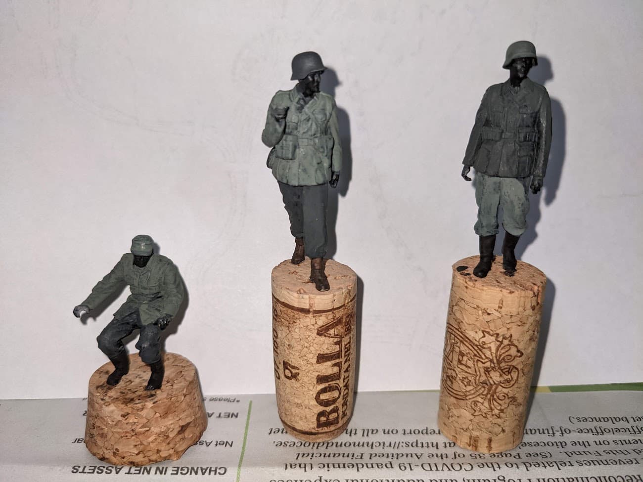
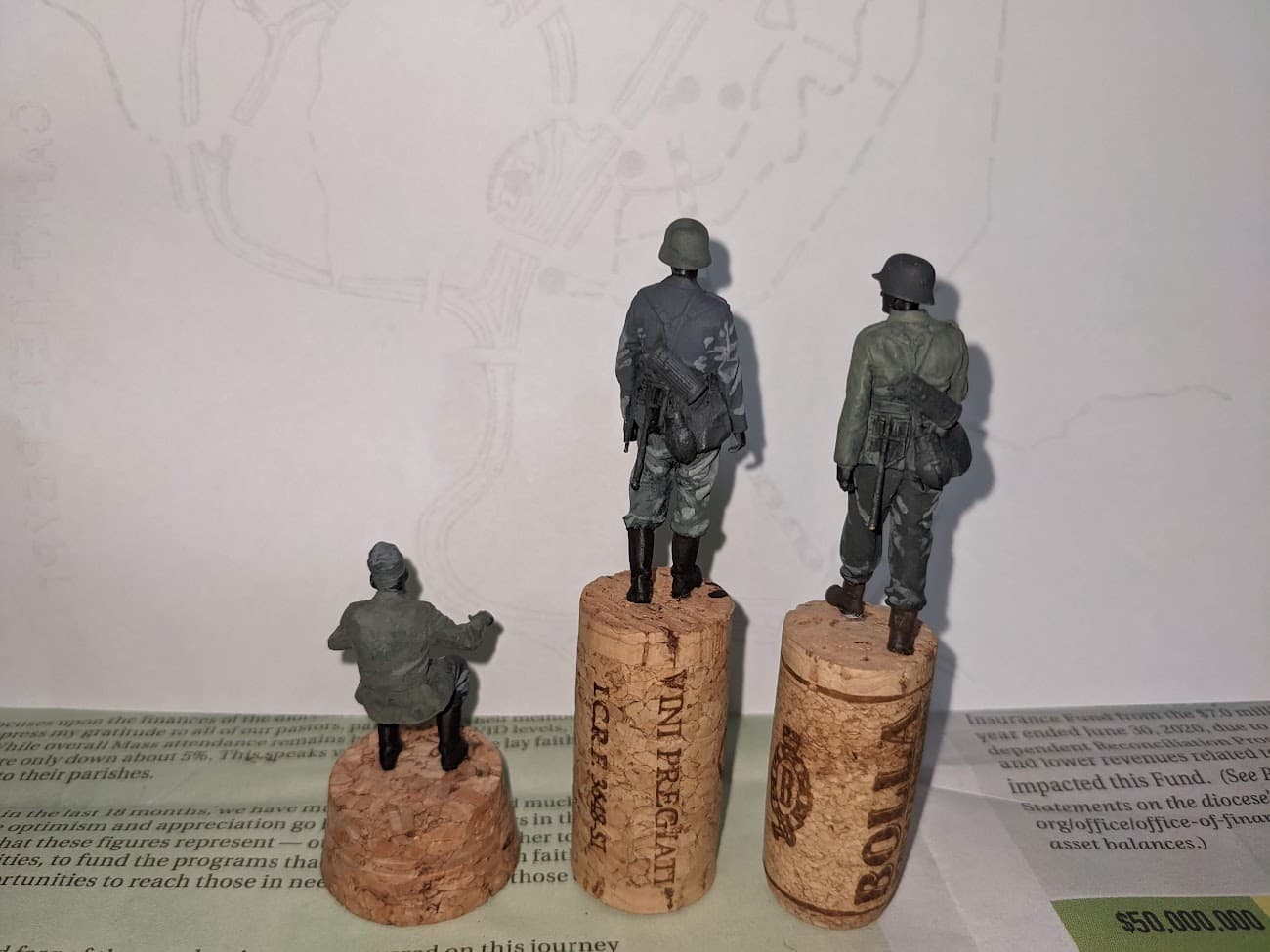
Which time period are you going for? Early German army looked similar to the middle figure although the pants were a gray color called steingrau (stone gray). The tunic would be a bit greener.
After that they did away with the stingray pants and used a shade of feldgrau (refer again to @Jan_Degryse excellent photo). That era would have less contrast between tunic and pants.
The end of war uniform would be the most muted in color though could range from green to gray to brown hues of feldgrau.
Have that in mind to capture the appliance you’re looking for.
Color variations don’t need to be drastic from one clothing item to another to be noticeable and effective.
I personally like the light shade you used.
1 Like
I’m going for more of a early/mid-war type thing since it is a mid-war Kettenkrad and a pak 36, but I kinda like the contrasting colors between soldiers, but I’ll make the tunic of the one soldier lighter.
I did some more research and it would be around 1943, but I will still use the mid to late-war uniform schemes, because I like it.
1 Like
First session of paint, still some things I wont to improve.
But overall satisfy with the result and the direction it’s going to
10 Likes

The keys to highlights and shading are blending and observing where the light hits (and doesn’t hit).
1 Like
How’d I do, then? After the paint has dried, it seems like most of the highlights work well.
A little more progress on my Star Wars legion figure. Getting close to the finish Line.
More to follow ![]()
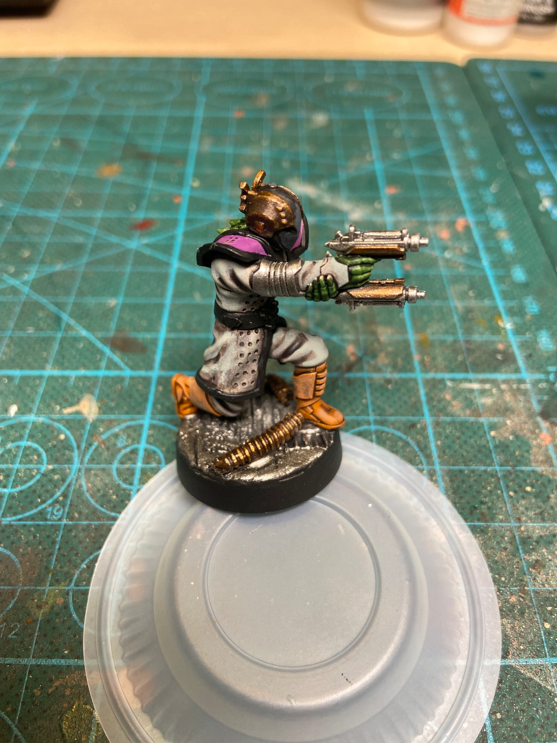
7 Likes
I was searching for german ww2 tarp colors, and I found this awesome reference guide for German ww2 uniforms by Vallejo:
1 Like
Outstanding. They go together perfectly
Wow, that’s cool!
sure starts to look like that picture, great work!!
1 Like
Some great updates to various builds chaps, my hat off to the amazing skills shown by you, one and all, ![]()
![]() .
.
G, ![]()
2 Likes
@ RougePilot.
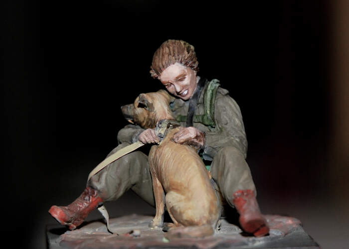
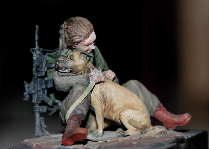
I just got around to putting your pics up on the big screen and thought I’d comment. The paint on the center figure’s left arm came out looking too much like a stripe. The other figures also have very drastic highlights — pockets, pant creases, etc.
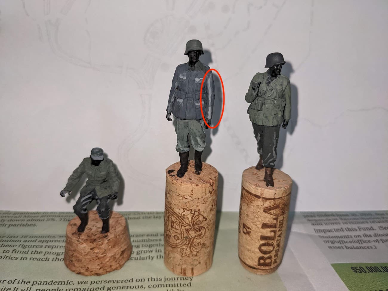
Looks like you’re having some difficulties with the paint palette and blending. Maybe thin-down the highlight color and don’t load-up the paintbrush too much. … Give it another shot. ![]()
![]()
Good luck!
—mike
PS: By no means do I consider myself an expert. Just like you, I’m here to share in the experience and learn how to improve my figures.
5 Likes
Has the Campaign Ribbon been created for this 2022 figure campaign? If so, can we have a sneak peek?
Thank you! I’ll do my best fix those highlights, and luckily, my wet palette still has the colors I used for the highlights.
2 Likes