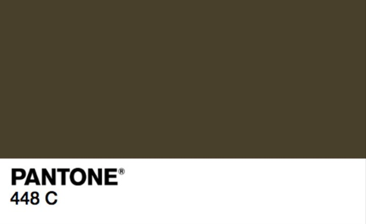
Why do they allow the mentally disturbed, “…a group of academics and market researchers…”, to perform research? Pantone 448 C, “The ugly brown colour has been associated with dirt, tar, and even death, without any positive adjectives…” - obviously not wise enlightened uber-cool modelers. Sounds like orcish mischief to me.
New plain cigarette packaging in the UK, Ireland and France will bear a colour deemed the ugliest in the world by researchers in Australia.
Pantone 448 C, also known as ‘opaque couché’, is the shade chosen as most likely to put smokers off, a group of academics and market researchers decided after three months of research.
Marketing agency GfK Bluemoon, who headed the project, conducted seven studies with more than 1000 smokers to design the most unappealing packaging possible, according to the Sydney Morning Herald*.
Our beloved olive drab! The most beautiful color in the world - next to purple and unicorn barf.
The subversives continue their insidious attack against civilization and culture. OD ‘world’s ugliest colour’ because it resembles tar? Heathen! Where is my tar and feathers?
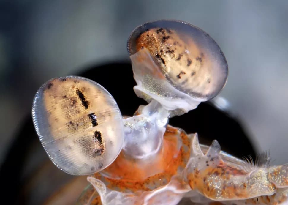
Robin, good question, but I am not at liberty to say. All I will say is that there is a Pantone code for humans, and one developed by mantis shrimp, of which I am privy to yet sworn to secrecy concerning thereof.
Man, we really need some sort of LMAO emoji that we can just click on instead of the single “I Heart” emoji, 'cause obviously the researchers down under didn’t poll any armor modelers about this…
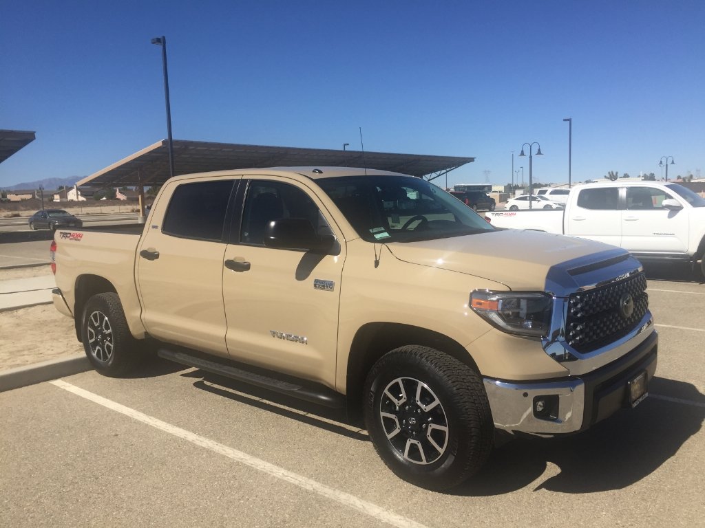
Precisely. My next vehicle was going to be a Toyota Tacoma in honor of my ride in 2002. But since they pulled “quicksand” from their color lineup last year, I’m tempted to look elsewhere.
Hang on, hang on – firstly that “plain cig packaging” link is dated 13th January 2014. Secondly I haven’t been offended for at least 10 minutes, it’s an outrage they’re blaming Aussies for voting that colour the worst. I was smoking back then & I voted for shocking pink. Second choice – baby poo.
Hah not as slow as me, trust me – I’ve only recently realised years now have a 20xx in front rather than a 19xx. Anyhow it doesn’t affect the point of your post, and I’m still getting me head around why “research” conducted Down Under was deemed the ultimate test of what’s the most dissuasive colour for tobacco product packaging in the UK. Mainly because in Oz, they decided to go with WHITE!
My dad had a from factory-door NEW Ford Taunus Mk3 (German built Ford Cortina), it was “Metallic Bronze” [$h1t-brown], with a puke inducing brown interior, the second the sun hit it, it would sweat formaldehyde like a gas attack.
50 YEARS later the thought still makes my gills green…
Never been car-sick before or since, just that car.