Am I crazy or hallucinating that it’s customary to paint smaller scale (1/72) models a slightly lighter shade of it’s 1/35 counterpart to adjust for it’s apparent further distance? A modeler on another site claims just the opposite (smaller scale = darker color) and I seem to be the only person contradicting him. ![]()
![]()
![]()
I believe the conventional wisdom is what you stated. Smaller scale lighter paint.
1 Like
I agree with both of you. Smaller scale lighter paint. Darker paint on small scale subjects makes it harder to see fine details and just doesn’t look right.
Considered the “scale lighting” effect.
The full-sized prototype has orders of magnitude more surface area to reflect light than the scale model. The smaller the scale model, the less surface area. Using a lightened shade of the same color paint used on the prototype compensates somewhat for this effect, making the model appear more reflective than it actually would be if painted in the exact prototype color.
Also imagine the effects of distance and atmospheric interference on light transmission. Paint a color chip card to precisely match the color of the prototype when held against the prototype’s surface. Now back away from the prototype until it appears to be about the same size as a scale model of it. Hold the color chip card up in front of your eye while partially covering the viewed image of the prototype. The prototype will appear much lighter in tone than the color chip card even though you know the two colors match exactly.
Again, using a lighter shade of the prototype color also helps to match the viewer’s expectation of what the prototype should look like when viewed across the apparent “scale distance” represented by the model. The model may only actually be a foot or two from the viewer, but the scale size makes it appear to be many, many times that distance away. The viewer expects (usually unconsciously) the model to appear the same shade of the prototype when viewed from a distance.
Both of these effects, the actual reduction in size of the reflective area of the model AND the apparent scale distance that it is being viewed from, suggest strongly that to replicate the reality of the prototype the model color should be lightened from that of the actual prototype color.
The trick, of course, is to determine by exactly how much the model color should be lightened as compared to the prototype color. This is one of the artistry sides of scale model building, and because it’s a matter of art and aesthetic preferences and biases, there is no end to the debate about what “looks the best”, an exact match for the prototype color or some lightened variation of it.
Good luck! LOL!
BTW, these same effects, reduced surface area for reflectance and apparent scale viewing distance, are also why modelers employ other painting techniques to enhance highlights and shadows, to “force” with shades of color what cannot be done with the normal or average intensity of the light available for viewing their models. So, not only are the “base” colors used usually lightened shades of the prototype colors, but shadows and highlights are also painted on using other variations in the shades of the “base” color.
3 Likes
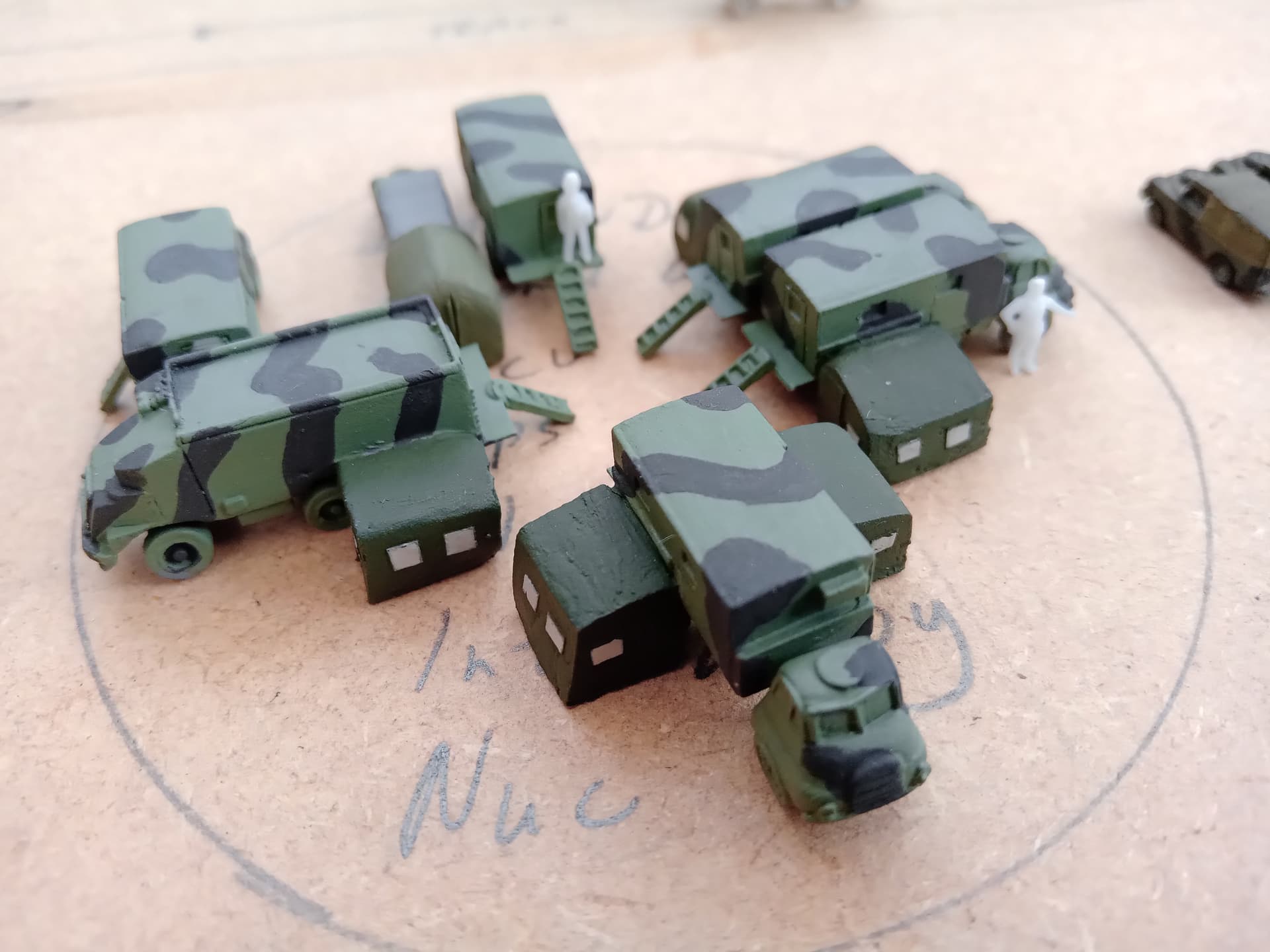
It would seem to make sense; in a recent experiment using 1:300 (I know, I know) I initially tried using a “normal” greenish OD for the base colour of my Brit vehicles, but any detail, or effect was totally lost. I gave it some thought and came up with a totally different colour - I hasten to add this is for the standard Cold War scheme for Brit stuff post 1971, green and black. Anyway, using the lighter colours enabled me to achieve, in my opinion, a much better effect:
2 Likes
IMO, exactly! The lighter shade of the prototype color also helps in allowing the available intensity of the viewing light to create the expected visible shadows, thus creating enough contrast for the viewer to perceive the expected details (that are visible when looking at the prototype under normal light).
1 Like
I was given to understand that for a true scale effect the saturation of the colour also had to be reduced so the scale colour is not just lighter but tending towards monochrome. Have you come across this?
Regards,
M
2 Likes
To illustrate his point, the person in question on the other site posted two pics - one of a column of vehicles about 1/4 kilometer away, and (allegedly) one of the same vehicles close up. The distant vehicles actually appeared very dark, and the near vehicle, normal color. His reasoning: close vehicles have more reflective surface therefore reflecting more light and color; distant vehicles have less reflection therefore darker. However, no matter the distance of the vehicle, they are still actually the same size and same amount of reflection. But reflected light from the distant vehicle has to travel further to the viewer, and because of diffraction, appears lighter. Maybe the eye/brain perceives the color differently than the camera.
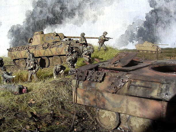
As Tom said it’s as much about fading the colours, typically that means lightening them but there could be some exceptions - maybe what the difference of opinion is about. In this old example, looking back now I think I went too light on the 1:72 Panther but all the colours were faded too. It’s standing about 30cms/12” back from the 1:35 one…
1 Like
I believe this is technically correct, but the variations also depend on the colors themselves, in that some colors loose saturation over distance at a greater or lesser rate than others. This has to do with the amount of blue and or red in the color.
However, I also don’t believe that there has ever been any sort of precise scientific measure of this effect of viewing distance through the atmosphere by specific color that can be used to apply to mixing ratios to produce the particular color adjusted for some exact “scale” distance. There are many (almost an endless number) of variables that come into play, such as the strength and direction of the natural light (time of day, latitude and season, clouds, reflective conditions of the surroundings, etc.), on the prototype as well as the many different things that can affect the transmission of light through the atmosphere at any given moment (dust, humidity, rain, snow, etc.) not to mention the actual differences in distance that the prototype (or model, for that matter) is viewed from.
On the matter of viewing distance, one might imagine that since the model’s scale ratio is something that can be (more or less) precisely measured, that the apparent scale viewing distance is also a simple calculation. However, one must also keep in mind that the scale model, itself, is also viewed from various actual distances, so these various distances also contribute to the “perceived” scale distance, too. That is, a 1/72 scale model viewed from 1" has a different perceived “scale distance” than the same model viewed from 3" (or any other different actual viewing distance). Thus, even “scale viewing distance” is hugely variable.
In the end, I think the matter ultimately boils down to artistic interpretation, aesthetic preferences and biases, as well as the desired or intended portrayal / depiction of the subject. In short, there is no objective “right” or “wrong,” only what the modeler and the viewer judge to be “realistic” according to each’s own subjective assessment.
Speaking for myself, though, I do believe that the effects of “scale lighting” and “scale distance” are real and that the most realistic looking models are finished to account for them. For me, finishing and painting scale models is as much an artistic endeavor as it is a technical one. There is simply no exact objective standard that can be applied to the overall effect achieved. (Although there may be particular aspects of the work that can be objectively assessed, but that is another matter.)
2 Likes
green is green
Agreed Michael there’s no single rule, in the end it’s what looks right given the variables. And photography can have the final say in unexpected ways…
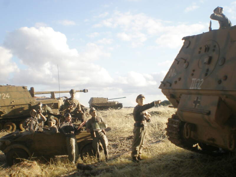
An example of fading and lightening the paintwork on the far 1:76 Ferdinand compared to the foreground 1:35 ones. It’s only a few inches back which kept it largely in focus (intentional), but prevailing light somehow nullified the lighter faded camo & made it look like identical colours. It turned out OK if only by luck, if I hadn’t made the adjustment it would probably have looked way too dark.
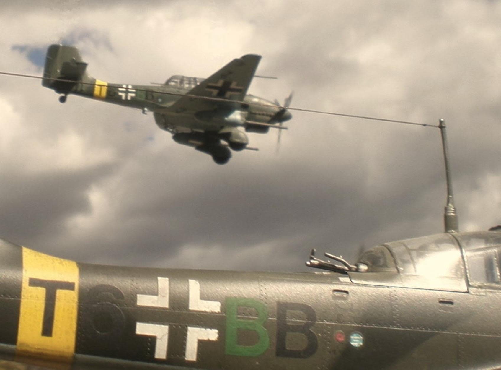
Here the foreground 1:32 Stuka & the far 1:72 plane had exactly the same paints on them, no attempt at scale colour. The image is deceptive because the far plane’s more than twice the distance away as the distant Ferdinand – as a result it’s more out of focus, which achieved the desired distancing result but similarly by fluke.
6 Likes
I very much like the even greater contrast/variety you have created in the tanks by showing one in shade, one in direct sunlight and one in direct sunlight with the addition of atmospheric filtering!
Kudos!
1 Like
When in the Marine corps, I built a Tamiya 1/32 F-4 Initially i painted it using the actual paints we used to paint the real F-4s.
It did not look right. Too dark.
I repainted it using enamals, somewhat lighter and it looked great.
I ended up giving it to the squadren commander. Good times!
2 Likes
Interesting observation there. So it wouldn’t be wrong to lighten the base color a little I guess.
I usually lighten up my base/camo colors pretty heavily. If you start too dark it hard to go back and lighten. I know I can always darken them a bit with washes and filters. I also usually use a dark brown wash as my initial weathering step which also deepens the colors. Again, if you start dark it will only get darker.
1 Like
That Stuka pic is amazing
2 Likes
I forgot to mention it, but the color scheme was gull grey upper and white lower with red on exposed control surfaces (the sides of the ailerons, flaps, etc were red, the standard USMC/Navy colors from the 70’s)
Have fun!
Thanks Richard, in fact that photo would never have looked as good as it does without the great help of none other than Mike Koenig alias 165thspc. His photoshopping erased the fishing line suspending both planes, and nailed down the gunner’s canopy on the nearer plane which never sat flush in real life. So Kudos to him, we collaborated a lot on that project back in 2017, posted on the old Armorama site. A couple more photo-bombs which incorporated his tweaks, see if you can spot ‘em…
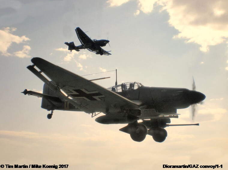
(I should add that none of the planes or trucks were “moved”, all positions were as per original photos)
4 Likes
Tim, while I do appreciate it and thank you, totally unnecessary to give me so much credit regarding the above images. You are the artist here and I just the technician/assistant. Though please know that I would be happy to give similar assistance in the future should it be of use.
2 Likes